

Volume 9–2 (Low Res).pdf
Volume 9–2 (Low Res).pdf
Volume 9–2 (Low Res).pdf

Create successful ePaper yourself
Turn your PDF publications into a flip-book with our unique Google optimized e-Paper software.
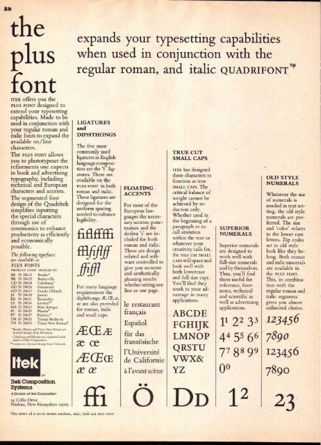
58<br />
the<br />
plus<br />
font<br />
ITEK offers you the<br />
PLUS FONT designed to<br />
extend your typesetting<br />
capabilities. Made to be<br />
used in conjunction with<br />
your regular roman and<br />
italic fonts to expand the<br />
available on/line<br />
characters.<br />
The PLUS FONT allows<br />
you to phototypeset the<br />
refinements one expects<br />
in book and advertising<br />
typography, including<br />
technical and European<br />
characters and accents.<br />
The segmented font<br />
design of the Quadritek<br />
simplifies inputting<br />
the special characters<br />
through use of<br />
mnemonics to enhance<br />
productivity as efficiently<br />
and economically<br />
possible.<br />
The following typefaces<br />
are available as<br />
PLUS FONTS<br />
PRODUCT CODE SIMILAR TO<br />
BE 55 28612 Bembo*<br />
BK 55 28632 Baskerville<br />
CD 55 28628 Caledonia"<br />
GD 55 28626 Garamond<br />
GO 55 28633 Goudy Oldstyle<br />
JA 55 28630 Janson<br />
KE 55 28631 Kennerley<br />
LE 55 28634 Lectura* *<br />
MA 55 28623 Matt Antique<br />
PL 55 28629 Plantin*<br />
PT 55 28627 Palatino'<br />
TM 55 28635 Trump Medieval<br />
TN 55 28625 Times New Roman*<br />
*Bembo, Plantin and Times New Roman are<br />
licensed designs from Monotype<br />
Caledonia and Palatino are registered trade<br />
marks of Eltra Corporation<br />
**Lectura is a licensed design from Tetterode<br />
Itek<br />
TM<br />
Itek Composition<br />
Systems<br />
A Division of Itek Corporation<br />
34 Cellu Drive<br />
Nashua, New Hampshire 03063<br />
expands your typesetting capabilities<br />
when used in conjunction with the<br />
regular roman, and italic QUADRIFONT TM<br />
LIGATURES<br />
and<br />
DIPHTHONGS<br />
The five most<br />
commonly used<br />
ligatures in English<br />
language composition<br />
are the 'f' ligatures.<br />
These are<br />
available on the<br />
PLUS FONT in both<br />
roman and italic.<br />
These ligatures are<br />
designed for the<br />
uniform spacing<br />
needed to enhance<br />
legibility.<br />
fiflffffi<br />
ffifififf<br />
For many language<br />
requirements the<br />
diphthongs CE,<br />
ce are also provided<br />
for roman, italic<br />
and small caps.<br />
lECLE<br />
ce<br />
./ECEcE<br />
ce cr<br />
This entire ad is set in BEMBO medium, italic, bold and PLUS FONT.<br />
FLOATING<br />
ACCENTS<br />
For most of the<br />
European languages<br />
the necessary<br />
accents, punctuation<br />
and the<br />
dotless '1' are included<br />
for both<br />
roman and italic.<br />
These are design<br />
related and software<br />
controlled to<br />
give you accurate<br />
and aesthetically<br />
pleasing results<br />
whether setting one<br />
line or one page.<br />
le restaurant<br />
francais<br />
Espaiiol<br />
fur das<br />
franzosische<br />
l'Universite<br />
de Californie<br />
a l'avant scene<br />
0<br />
TRUE CUT<br />
SMALL CAPS<br />
ITEK has designed<br />
these characters to<br />
function as true<br />
SMALL CAPS. The<br />
critical balance of<br />
weight cannot be<br />
achieved by reduction<br />
only.<br />
Whether used in<br />
the beginning of a<br />
paragraph or to<br />
call attention<br />
within the text or<br />
whatever your<br />
creativity calls for,<br />
the true cut SMALL<br />
CAPS will space and<br />
look well with<br />
both lowercase<br />
and full size caps.<br />
You'll find they<br />
work to your advantage<br />
in many<br />
applications.<br />
ABCDE<br />
FGHIJK<br />
LMNOP<br />
QRSTU<br />
VWX&<br />
YZ<br />
DD<br />
SUPERIOR<br />
NUMERALS<br />
Superior numerals<br />
are designed to<br />
work well with<br />
full-size numerals<br />
and by themselves.<br />
Thus, you'll find<br />
them useful for<br />
reference, footnotes,<br />
technical<br />
and scientific as<br />
well as advertising<br />
applications.<br />
11 2 2 3 3<br />
4 4 5' 6 6<br />
7 7 8 8 9 9<br />
0°<br />
1 2<br />
OLD STYLE<br />
NUMERALS<br />
Whenever the use<br />
of numerals is<br />
needed in text setting,<br />
the old style<br />
numerals are preferred.<br />
The size<br />
and 'color' relates<br />
to the lower case<br />
letters. Zip codes<br />
set in old style<br />
look like they belong.<br />
Both roman<br />
and italic numerals<br />
are available in<br />
the PLUS FONT.<br />
This, in combination<br />
with the<br />
regular roman and<br />
italic segments<br />
gives you almost<br />
unlimited choice.<br />
123456<br />
789 0<br />
123456<br />
7890<br />
23


