

Volume 9–2 (Low Res).pdf
Volume 9–2 (Low Res).pdf
Volume 9–2 (Low Res).pdf

Create successful ePaper yourself
Turn your PDF publications into a flip-book with our unique Google optimized e-Paper software.
36<br />
The Saga of The Two Mo's: By the<br />
time you finish reading this color<br />
section of U&Ic you are likely to be<br />
much better acquainted with two<br />
singular artists.The fact that their<br />
names share a syllable in common is only<br />
a coincidence.The real reason for coupling<br />
Mo Lebowitz with Mozart (Wolfgang A.) is<br />
that the former is a graphic designer/<br />
artist/conceptualist/writer with a passion-<br />
ate fixation on the latter. For his guest<br />
appearance in U&Ic, Lebowitz has chosen<br />
to not only design, but also write,the entire<br />
color section as a tribute,a love letter; a<br />
paean of praise to his favorite of all sub-<br />
jects, Wolfgang Amadeus Mozart, genius<br />
composer of the 18th century.<br />
Mo Lebowitz is not only extraordinarily<br />
knowledgeable about Mozart and his<br />
music in the large sense—the history and<br />
form—but he is nosy and funny besides.<br />
He has uncovered juicy morsels about per-<br />
tinent people and relationships; he names<br />
names, quotes from letters,tells who said<br />
what about whom, how they looked and<br />
how they behaved.All in all, he paints a<br />
lively, lovely portrait of a beloved subject.<br />
We have reason to believe that if<br />
Mozart were alive today he would be equally<br />
admiring of Lebowitz.They would have a lot<br />
in common—both energetic, happy fellows<br />
who love good food, good wine, good friends,<br />
good conversation and hard work. You can<br />
deduce a good deal about Lebowitz the<br />
designer from studying the design and<br />
typography he has selected for this love-<br />
project of his. But we would also like to fill<br />
in some pertinent details about his per-<br />
sonal and professional life.<br />
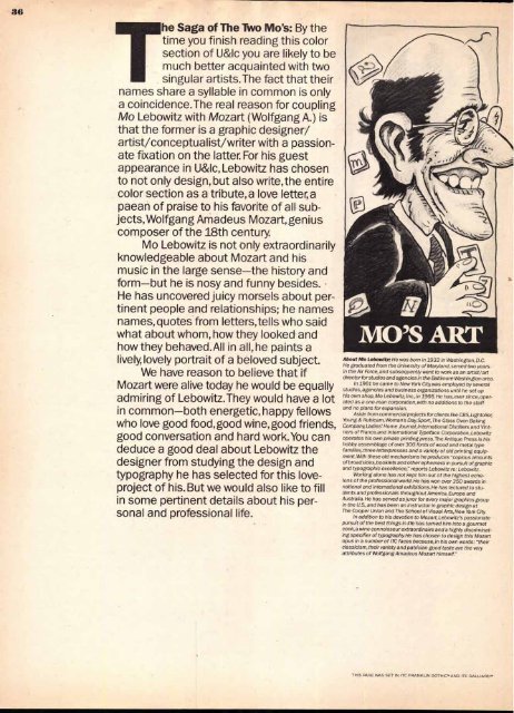
About Mo Lebowitz: He was born in 1932 in Washington, D.C.<br />
He graduated from the University of Maryland, served two years<br />
in the Air Force, and subsequently went to work as an artist/art<br />
director for studios and agencies in the Baltimore-Washington area.<br />
In 1961 he came to New York City, was employed by several<br />
studios,agencies and business organizations until he set up<br />
his own shop, Mo Lebowitz, Inc., in 1966. He has, ever since, operated<br />
as a one-man corporation, with no additions to the staff<br />
and no plans for expansion.<br />
Aside from commercial projects for clients like CBS,Lightolier,<br />
Young & Rubicam, Woman's Day, Sport, The Glass Oven Baking<br />
Company, Ladies' Home Journal, International Distillers and Vintners<br />
of France.and International Typeface Corporation, Lebowitz<br />
operates his own private printing press. The Antique Press is his<br />
hdbby assemblage of over 300 fonts of wood and metal type<br />
families, three letterpresses and a variety of old printing equipment.<br />
With these old mechanisms he produces "copious amounts<br />
of broadsides, booklets and other ephemera in pursuit of graphic<br />
and typographic excellence," reports Lebowitz re: Lebowitz.<br />
Working alone has not kept him out of the highest echelons<br />
of the professional world. He has won over 350 awards in<br />
national and international exhibitions.He has lectured to students<br />
and professionals throughout America, Europe and<br />
Australia. He has served as juror for every major graphics group<br />
in the U.S.,and has been an instructor in graphic design at<br />
The Cooper Union and The School of Visual Arts, New York City.<br />
In addition to his devotion to Mozart,Lebowitz's passionate<br />
pursuit of the best things in life has turned him into a gourmet<br />
cook, a wine connoisseur extraordinaire and a highly discriminating<br />
specifier of typography. He has chosen to design this Mozart<br />
opus in a number of ITC faces because,in his own words: "their<br />
classicism, their variety and patrician good taste are the very<br />
attributes of Wolfgang Amadeus Mozart himself."<br />
THIS PAGE WAS SET IN ITC FRANKLIN GOTHICT.AND ITC GALLIARD"


