Analysis of microarray data - VSN International
Analysis of microarray data - VSN International
Analysis of microarray data - VSN International
- No tags were found...

Create successful ePaper yourself
Turn your PDF publications into a flip-book with our unique Google optimized e-Paper software.
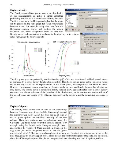
18<strong>Analysis</strong> <strong>of</strong> Microarray Data in GenStatExplore densityThe Density menu allows you to look at the distribution<strong>of</strong> the measurements as either a kernel smoothedprobability density or as a cumulative density function.The first is similar to the Histogram display, but the slidescan be plotted on the same graph for easier comparisonsbetween slides. For example, using that <strong>data</strong> from theHistogram example above, and plotting the variateB1_Mean (the mean background levels <strong>of</strong> red) withDensity menu, and completing it as shown to the right, and with optionsset as right, gives the following plots.The first graph gives the probability density function (pdf) <strong>of</strong> the log 2 transformed red background valuesas estimated by a kernel density function for each slide. This shows similar trends as the Histogram menu,but as the pdf curves can be superimposed on the same graph, the comparisons are easier to make.However, these curves require smoothing <strong>of</strong> the <strong>data</strong>, and may miss small-scale features that a histogrammay detect. The second curve is cumulative density function (cdf), again estimated from a kernel densityestimator, and allows estimates <strong>of</strong> the quantiles <strong>of</strong> the distributions, so for example the median values <strong>of</strong>the logged values can be read <strong>of</strong>f by obtaining the points on the curves where the cumulative percentage is50.Explore 2d plotsThe Density menu allows you to look at the relationshipbetween 2 measurements for each slide. Common plots usedfor <strong>microarray</strong> are the M-A plot that plots the log <strong>of</strong> ratio <strong>of</strong>red to green against the combined intensity <strong>of</strong> the twocolours. These two statistics can be calculated using theCalculate | Log-ratios menu covered in the next section. Forexample, using that <strong>data</strong> from the Histogram example above,and plotting the variate F1_Mean against F2_Mean on thelog 2 scale (the mean foreground levels <strong>of</strong> red and greenrespectively) with 2D Plots menu, and completing it as shown to the right, and with options set as on thenext page, gives the following plot. Note, Block indexes the print tips that printed the slide, and so on eachslide, the different print tips will be plotted in separate colours, allowing us to look for print tip effects.