Analysis of microarray data - VSN International
Analysis of microarray data - VSN International
Analysis of microarray data - VSN International
- No tags were found...

You also want an ePaper? Increase the reach of your titles
YUMPU automatically turns print PDFs into web optimized ePapers that Google loves.
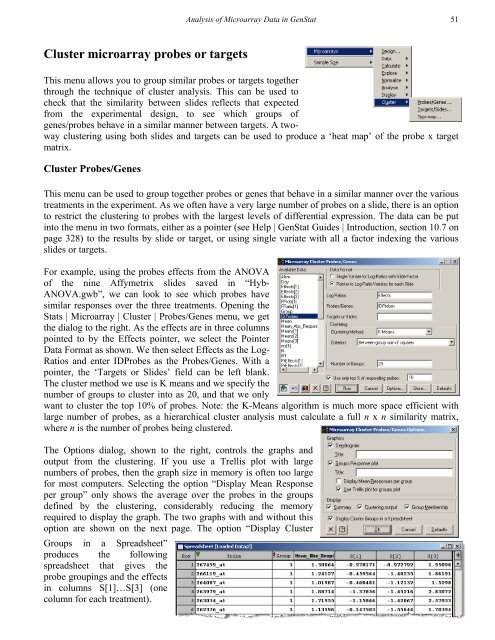
<strong>Analysis</strong> <strong>of</strong> Microarray Data in GenStat 51Cluster <strong>microarray</strong> probes or targetsThis menu allows you to group similar probes or targets togetherthrough the technique <strong>of</strong> cluster analysis. This can be used tocheck that the similarity between slides reflects that expectedfrom the experimental design, to see which groups <strong>of</strong>genes/probes behave in a similar manner between targets. A twowayclustering using both slides and targets can be used to produce a ‘heat map’ <strong>of</strong> the probe x targetmatrix.Cluster Probes/GenesThis menu can be used to group together probes or genes that behave in a similar manner over the varioustreatments in the experiment. As we <strong>of</strong>ten have a very large number <strong>of</strong> probes on a slide, there is an optionto restrict the clustering to probes with the largest levels <strong>of</strong> differential expression. The <strong>data</strong> can be putinto the menu in two formats, either as a pointer (see Help | GenStat Guides | Introduction, section 10.7 onpage 328) to the results by slide or target, or using single variate with all a factor indexing the variousslides or targets.For example, using the probes effects from the ANOVA<strong>of</strong> the nine Affymetrix slides saved in “Hyb-ANOVA.gwb”, we can look to see which probes havesimilar responses over the three treatments. Opening theStats | Microarray | Cluster | Probes/Genes menu, we getthe dialog to the right. As the effects are in three columnspointed to by the Effects pointer, we select the PointerData Format as shown. We then select Effects as the Log-Ratios and enter IDProbes as the Probes/Genes. With apointer, the ‘Targets or Slides’ field can be left blank.The cluster method we use is K means and we specify thenumber <strong>of</strong> groups to cluster into as 20, and that we onlywant to cluster the top 10% <strong>of</strong> probes. Note: the K-Means algorithm is much more space efficient withlarge number <strong>of</strong> probes, as a hierarchical cluster analysis must calculate a full n x n similarity matrix,where n is the number <strong>of</strong> probes being clustered.The Options dialog, shown to the right, controls the graphs andoutput from the clustering. If you use a Trellis plot with largenumbers <strong>of</strong> probes, then the graph size in memory is <strong>of</strong>ten too largefor most computers. Selecting the option “Display Mean Responseper group” only shows the average over the probes in the groupsdefined by the clustering, considerably reducing the memoryrequired to display the graph. The two graphs with and without thisoption are shown on the next page. The option “Display ClusterGroups in a Spreadsheet”produces the followingspreadsheet that gives theprobe groupings and the effectsin columns S[1]…S[3] (onecolumn for each treatment).