Untitled - Malaysian Institute of Planners
Untitled - Malaysian Institute of Planners
Untitled - Malaysian Institute of Planners

You also want an ePaper? Increase the reach of your titles
YUMPU automatically turns print PDFs into web optimized ePapers that Google loves.
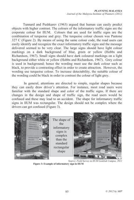
PLANNING MALAYSIAJournal <strong>of</strong> the Malaysia <strong>Institute</strong> <strong>of</strong> <strong>Planners</strong> (2012)Tunnard and Pushkarev (1963) argued that human can easily predictobjects with higher contrast. The colours <strong>of</strong> the informatory traffic signs are thecorporate colour for IIUM. Colours that are used for traffic signs are thecombination <strong>of</strong> turquoise and grey. The turquoise colour chosen was Pantone327 C (Figure 2). By means <strong>of</strong> using the same colour code, the road users caneasily identify and recognize the exact informatory traffic signs and the messagedelivered seemed to be very clear. The large signs should have light colourmarkings on a dark background <strong>of</strong> blue, green or yellow (Hobbs andRichardson, 1967). Small signs should have dark coloured markings on a lightbackground either white or yellow (Hobbs and Richardson, 1967). Grey colouris used in background; hence the wording must use the dark colour such asblack, to provide a contrasting effect in order to create attraction. However, thewording use turquoise colour. To increase detectability, the suitable colour <strong>of</strong>the wording could be black in order to contrast the colour <strong>of</strong> light grey.In general, attentions are directed to simple, regular shapes becausethey can easily draw driver’s attention. For instance, most road users werefamiliar with the standard shape and color <strong>of</strong> the traffic signs. If there arechanges in the design and shape <strong>of</strong> traffic sign, the road users would beconfused and these may lead to an accident. The shape for informatory trafficsigns in IIUM was rectangular. The design should not be complex where thedrivers can get confused (Figure 3).The shape <strong>of</strong>theinformatorysigns iscomplexthan thestandardrectangularshapeSource: Field Survey in IIUM Gombak Campus, 2011Figure 3: Example <strong>of</strong> informatory sign in IIUM85© 2012 by MIP