

TEACHER DIVERSITY
The State of Teacher Diversity_0
The State of Teacher Diversity_0
- No tags were found...

You also want an ePaper? Increase the reach of your titles
YUMPU automatically turns print PDFs into web optimized ePapers that Google loves.
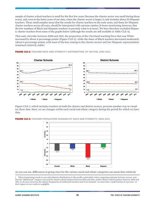
sample of charter school teachers is small for the first few years (because the charter sector was small during those<br />
years), and, even in the latter years of our data, when the charter sector is larger, it only includes about 20 Hispanic<br />
teachers. These small samples mean that the results for charter teachers in the early years, and those for Hispanic<br />
charter teachers across all years, should be interpreted with extreme caution (it bears mentioning, however, that<br />
the low numbers of Black and Hispanic teachers is precisely what is at issue). We have therefore excluded Hispanic<br />
charter teachers from some of the graphs below (although the results are still available in Table CLE-A).<br />
That said, citywide, between 2000 and 2011, the proportion of the Cleveland teaching force that was White<br />
increased by about 4 percentage points (Figure CLE-2), while the share of Black teachers decreased moderately<br />
(about 6 percentage points, with most of the loss coming in the charter sector) and low Hispanic representation<br />
remained relatively stable. 1<br />
FIGURE CLE-2: <strong>TEACHER</strong> RACE AND ETHNICITY DISTRIBUTION, BY SECTOR, 2000–2011<br />
100<br />
90<br />
Charter Schools<br />
85.4<br />
100<br />
90<br />
District Schools<br />
80<br />
70<br />
66.7<br />
80<br />
70<br />
66.7 65.3<br />
60<br />
60<br />
50<br />
50<br />
40<br />
30<br />
20<br />
30.7<br />
12.4<br />
40<br />
30<br />
20<br />
29.6 28.3<br />
10<br />
0<br />
1.8 1.1<br />
10<br />
0<br />
2.8<br />
3.8<br />
White Black Hispanic<br />
White Black Hispanic<br />
Figure CLE-3, which includes teachers in both the charter and district sectors, presents another way to visualize<br />
these data. Here, we see changes within each racial and ethnic category during the period for which we have<br />
data.<br />
FIGURE CLE-3: <strong>TEACHER</strong> POPULATION CHANGES BY RACE AND ETHNICITY, 2000–2011<br />
50<br />
40<br />
Decreasing Increasing<br />
30<br />
20<br />
10<br />
0<br />
-10<br />
-20<br />
-30<br />
-17.4<br />
-12.0<br />
-9.4<br />
-40<br />
-33.9<br />
-50<br />
Overall White Black Hispanic<br />
As you can see, differences in group sizes for the various racial and ethnic categories can mean that relatively<br />
1 When interpreting trends in race and ethnicity distributions in this profile, particularly when comparing estimates between sectors, note<br />
that the “Multiracial” category was used for charter school teachers between 2003 and 2011, and for district school teachers between 2008 and<br />
2011. In all cases, however, the relative frequencies of multiracial teachers tend to be minimal—no more than a small fraction of 1 percent—so<br />
their impact on our results is negligible.<br />
ALBERT SHANKER INSTITUTE 46 THE STATE OF <strong>TEACHER</strong> <strong>DIVERSITY</strong>