- Page 1 and 2: RETAIL LIGHTING 2016
- Page 3 and 4: KNOW-HOW IN-HOUSE DESIGN & ENGINEER
- Page 5 and 6: FAST DELIVERY 95% de los pedidos ex
- Page 7 and 8: ÍNDICE DE CONTENIDOS TABLE OF CONT
- Page 9 and 10: DOWNLIGHTS CUADRADOS | SQUARE DOWNL
- Page 11 and 12: OUTDOOR BAÑADORES DE PARED / WALL
- Page 13 and 14: 13
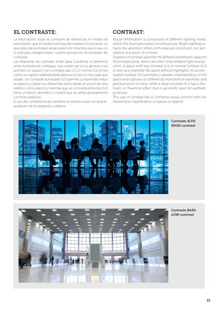
- Page 15 and 16: 1.- Absorción: Es el fenómeno seg
- Page 17 and 18: ORIGEN DEL DISEÑO DE LA ILUMINACI
- Page 19: Luz para mirar: Luz directa, enfoca
- Page 23 and 24: ILUMINACIÓN EN RETAIL La iluminaci
- Page 25 and 26: Luz para contemplar o iluminación
- Page 27 and 28: 2.- CONVERSIÓN En esta fase del pr
- Page 29 and 30: Probadores Changing rooms “La cla
- Page 31 and 32: ILUMINACIÓN EN SUPERMERCADOS SUPER
- Page 33 and 34: PRODUCTOS FRESCOS Se trata de prese
- Page 35 and 36: APARCAMIENTOS La función de la ilu
- Page 37 and 38: LUZ Y COLOR La luz blanca está for
- Page 39 and 40: FLUJO LUMINOSO Es la cantidad de lu
- Page 41 and 42: RENDIMIENTO O EFICACIA LUMINOSA Es
- Page 43 and 44: VALORES UGR El método UGR (Unified
- Page 45 and 46: 45
- Page 47 and 48: ASICS STORE MONTPELLIER FRANCE 47
- Page 49 and 50: KFC MADRID SPAIN 49
- Page 51 and 52: COSTA COFFEE BARCELONA SPAIN 51
- Page 53 and 54: HAKKASAN LONDON UK 53
- Page 55 and 56: 55
- Page 57 and 58: 57
- Page 59 and 60: 59
- Page 61 and 62: COFFEE REPUBLIC BARCELONA SPAIN 61
- Page 63 and 64: 63
- Page 65 and 66: GAP MEXICO DF MEXICO 65
- Page 67 and 68: McDONALD’S SABADELL SPAIN 67
- Page 69 and 70: 69
- Page 71 and 72:
KIBUC BARCELONA SPAIN 71
- Page 73 and 74:
73
- Page 75 and 76:
LA PEPITA A CORUÑA SPAIN 75
- Page 77 and 78:
CC MAJADAS GUATEMALA GUATEMALA 77
- Page 79 and 80:
PANS&COMPANY BARCELONA SPAIN 79
- Page 81 and 82:
81
- Page 83 and 84:
83
- Page 85 and 86:
85
- Page 87 and 88:
TUC TUC A CORUÑA SPAIN 87
- Page 89 and 90:
89
- Page 91 and 92:
CAFFÈ DI FIORE BARCELONA SPAIN 91
- Page 93 and 94:
93
- Page 95 and 96:
95
- Page 97 and 98:
PULL&BEAR MADRID SPAIN 97
- Page 99 and 100:
99
- Page 101 and 102:
101
- Page 103 and 104:
CC LAS ARENAS BARCELONA SPAIN 103
- Page 105 and 106:
105
- Page 107 and 108:
JAMAICA BARCELONA SPAIN 107
- Page 109 and 110:
109
- Page 111 and 112:
BANANA REPUBLIC MEXICO DF MEXICO 11
- Page 113 and 114:
DEHESA SANTA MARÍA BARCELONA SPAIN
- Page 115 and 116:
115
- Page 117 and 118:
117
- Page 119 and 120:
TOUS BARCELONA SPAIN 119
- Page 121 and 122:
121
- Page 123 and 124:
123
- Page 125 and 126:
125
- Page 127 and 128:
MINI BOND TUBE 32 236 Ø80 183 228
- Page 129 and 130:
BOND TUBE MEDIUM NEW Ø100 252 244
- Page 131 and 132:
BOND TUBE 32 14 AL IP 20 RF 850ºC
- Page 133 and 134:
BOND TUBE Ø116 42 Max.2500 14 AL I
- Page 135 and 136:
135
- Page 137 and 138:
MARC RODÓ DOBLE 180 ESTRUCTURA BON
- Page 139 and 140:
ACTION RETAIL 43 270 193 88 14 60 A
- Page 141 and 142:
ACTION 43 270 193 225 88 14 60 AL G
- Page 143 and 144:
ACTION 270 193 88 43 247.5 14 60 AL
- Page 145 and 146:
ACTION WALL WASHER 270 214,5 192 88
- Page 147 and 148:
MACH3 147
- Page 149 and 150:
MACH3 MEDIUM 223 Ø96 223 14 60 AL
- Page 151 and 152:
MACH3 OPTIC CONTROL 233 Ø115 260 1
- Page 153 and 154:
KEY 160 14 60 AL IP 20 RF 850ºC 0,
- Page 155 and 156:
Accesorios de conexión / Connectio
- Page 157 and 158:
OUT SQUARE NEW 145 11 238 100 220x1
- Page 159 and 160:
OUT S Ø150 Ø150 120 Ø 135 188 0-
- Page 161 and 162:
CARDEX C Ø175 144 14 AL 23 IP RF 8
- Page 163 and 164:
DELTA COB 138 Ø138 Ø138 138 4 98
- Page 165 and 166:
165
- Page 167 and 168:
MULTIDIR EVO L AL RF 850ºC 0,5M 10
- Page 169 and 170:
MULTIDIR EVO L POSITION 1 POSITION
- Page 171 and 172:
IN Ø50 Ø50 Ø50 56 80 14 AL PC IP
- Page 173 and 174:
PLAY DECO ROUND 173
- Page 175 and 176:
175
- Page 177 and 178:
PLAY DECO ROUND Ø53 Ø53 Ø53 Ø53
- Page 179 and 180:
PLAY DECO SQUARE 179
- Page 181 and 182:
Ø53 Ø53 Ø53 Ø53 Ø53 Ø48 62,4
- Page 183 and 184:
PLAY DECO SURFACE NEW 71-5174 Ø65
- Page 185 and 186:
PLAY 185
- Page 187 and 188:
PLAY Ø53 Ø53 Ø53 Ø53 Ø53 Ø48
- Page 189 and 190:
PLAY EMERGENCY Ø53 NEW Ø53 Ø53 6
- Page 191 and 192:
MINI PLAY Ø28 14 AL 0,5M 37 PC 24
- Page 193 and 194:
EQUAL S 14 N3 AL PMMA IP 54 0,2M 80
- Page 195 and 196:
BACKLIGHT 14 54 ST PMMA IP 54 120°
- Page 197 and 198:
ECOFIT 14 54 N3 AL ANOD PMMA IP 40
- Page 199 and 200:
EXIT Ø180 205 14 60 AL GLA PUR IP
- Page 201 and 202:
BACO 324 180 14 60 ST AL IP 23 RF 8
- Page 203 and 204:
INFINITE LED 80 50 1134 14 N3 AL PC
- Page 205 and 206:
INFINITE C LED / INFINITE C STEP 1
- Page 207 and 208:
PEK Ø 320 Ø330 Ø330 min. 470 max
- Page 209 and 210:
PEK Ø 320 Ø330 Ø330 Ø 320 min.4
- Page 211 and 212:
ON ECO 5000 2,4 10 IP 20 120° 24 D
- Page 213 and 214:
ON SP 5000 2 12 5m + IP 20 120° 24
- Page 215 and 216:
DEEP NEW 10000 PUR IP 67 120° DIMM
- Page 217 and 218:
LINEAL 54 AL ANOD No compatible con
- Page 219 and 220:
LINEAL 71-5482-14-00 80 71-5482-N3-
- Page 221 and 222:
VINTAGE Ø140 Z6-20 - ST RF 850ºC
- Page 223 and 224:
VINTAGE 255 280 max. 1500 Z5-10 - 1
- Page 225 and 226:
VINTAGE Ø105 E4-37 - ST RF 850ºC
- Page 227 and 228:
SUGAR NEW 50 Ø155 14-23 Z5-23 AL A
- Page 229 and 230:
RAW 242 334 290 15 ST IP 20 RF 850
- Page 231 and 232:
DROP 21 ST RF 850ºC 6 14 GLA OPAL
- Page 233 and 234:
STYLUS NEW Ø55 05 AL IP 20 100 14
- Page 235 and 236:
STYLUS NEW 100 Ø55 05-CY - 14-CY -
- Page 237 and 238:
PIPE PIPE 140 14-05 - 05-23 - AL IP
- Page 239 and 240:
CHERRY NEW 50 Ø130 50 Ø130 50 Ø1
- Page 241 and 242:
NEO 640 Ø130 E2-16 - AL RF 850ºC
- Page 243 and 244:
FUNK 264 180 max. 610 CI-23 - ST RF
- Page 245 and 246:
POWELL POWELL max.260 164 34 AL PUR
- Page 247 and 248:
APRIL NEW 56 200 Z5 AL PUR 90º 25
- Page 249 and 250:
TRON 90 41 60 180° 54 AL UVA GLA P
- Page 251 and 252:
CONVERT 95 70 CONVERT CONVERT LED C
- Page 253 and 254:
AFRODITA NEW 220 90 220 90 120 14 Z
- Page 255 and 256:
COTTAGE Ø124 424 CC INOX AISI 202
- Page 257 and 258:
SOLID NEW 34 PC PC MAT IP 65 8 1260
- Page 259 and 260:
GEA Ø130 90 CA INOX AISI 316 GLA H
- Page 261 and 262:
CITIZEN 3000 800 Ø 220 BB AL INJ P
- Page 263 and 264:
205 ELIPSE 340 BQ AL INJ IP 65 MEAN
- Page 265 and 266:
INVISIBLE Ø110 05 AL PUR PC OPAL I
- Page 267 and 268:
CISNE Ø155 M1 PMMA OPAL IP 44 4 Ma
- Page 269 and 270:
MOONLIGHT Ø154 14 PE 6-8h 8h 230 I
- Page 271 and 272:
QPAR16 / MR16 LED 46 55 46 55 25º
- Page 273 and 274:
273
- Page 275 and 276:
DIMMABLE 1-10V PUSH DALI 1-10V PUSH
- Page 277 and 278:
CONTROLLERS WHITE RGB Controller wi
- Page 279 and 280:
CONTROLLERS WHITE RGB Controller wi
- Page 281 and 282:
REGULABLE / DIMMABLE REGULABLE / DI
- Page 283 and 284:
TRANSFORMADOR / TRANSFORMER ACT-TRA
- Page 285 and 286:
RGB CONTROLADORES RGB CON MANDO A D
- Page 287 and 288:
DATOS FOTOMÉTRICOS / PHOTOMETRIC D
- Page 289 and 290:
Paso Step 4 71-2952-14-00 IN MULTID
- Page 291 and 292:
Fotometría Photometric Data Permit
- Page 293 and 294:
INDEX REFERENCES REFERENCE PAGE REF
- Page 295 and 296:
INDEX REFERENCES REFERENCE PAGE REF
- Page 297 and 298:
IMPORTANT INFORMATION Todos los der