Post- Digital Print - Monoskop
Post- Digital Print - Monoskop
Post- Digital Print - Monoskop

You also want an ePaper? Increase the reach of your titles
YUMPU automatically turns print PDFs into web optimized ePapers that Google loves.
2.5 the underground press boom,<br />
offset colour dripping and the network (again).<br />
In the mid-1960s, new countercultural and revolutionary movements<br />
were emerging which would give rise to a further transformation of<br />
alternative print, spawning countless new magazines by the end of the<br />
decade. Probably the first important sign of things to come was the<br />
Greenwich Village Voice, founded in 1955 in a two-bedroom apartment<br />
in New York, and positioning itself from the start in fierce opposition<br />
to the ‘bourgeois’ culture of the glossy New Yorker magazine. For almost<br />
a decade, the Village Voice would remain the one and only point of<br />
reference for the radical cultural critique it embodied.<br />
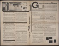
Then in September 1966, all the way on the other end of the country,<br />
the first issue of the San Francisco Oracle was published, giving a<br />
legitimate and superlative voice to the Haight-Ashbury counterculture,<br />
while once again revolutionising print design. Affordable offset<br />
printing had gradually improved to the point where it could now effectively<br />
reproduce the psychedelic aesthetic, originally produced using<br />
silkscreen printing. The Oracle was designed by Allen Cohen and his<br />
staff, who tormented the printers with endless requests for special colours,<br />
until the printers finally gave up and left the presses in the hands<br />
of Cohen and his associates so they could do it their own way. They<br />
soon started filling the various inkwells of the printing presses without<br />
paying too much attention to where any particular colour went, resulting<br />
in rainbows of colours splashed and blended all across the pages. 53<br />
The Oracle (which peaked at a print run of 150,000 copies) epitomised<br />
the idea that a magazine could be more than simply a handful<br />
of paper conveying literary and political information. By doing away<br />
with the traditional ‘static’ typographical structure, headlines could be<br />
designed rather than composed, and texts were no longer laid out as<br />
blocks of letters, but were allowed to penetrate the illustrations spread<br />
across multiple pages. Thus the magazine became an object to behold,<br />
an image to experience – in one word, a ‘trip’. 54 This use of colour<br />
broke with the established modalities of information transmission, and<br />
the result, besides being a popular success, was also a masterly reflection<br />
of the aesthetic and the spirit of the times, soon to be imitated by<br />
countless other underground magazines. Once again, this new alternative<br />
publishing scene was able to survive through the support of a few<br />
sympathetic printers. And soon enough, the first printing cooperatives<br />
were being set up.<br />
The geographical on-the-road ‘trip’ of the 1960s generation was<br />
also reflected in publishing, the best example of which is probably<br />
41