Waikato Business News September/October 2018
Waikato Business News has for a quarter of a century been the voice of the region’s business community, a business community with a very real commitment to innovation and an ethos of co-operation.
Waikato Business News has for a quarter of a century been the voice of the region’s business community, a business community with a very real commitment to innovation and an ethos of co-operation.
You also want an ePaper? Increase the reach of your titles
YUMPU automatically turns print PDFs into web optimized ePapers that Google loves.
“The most useful part of Designwell’s<br />
approach was the fact that they went<br />
beyond colours and logos,” says partner<br />
Matthew Peploe. “They took us through<br />
a much wider process, looking at our values<br />
and our direction, and it gave us the time<br />
and purpose to reassess those thoroughly.”<br />
Joan was impressed with the depth of the<br />
process – “Designwell talked us through<br />
the impact that design can have on the<br />
culture of a firm, the impression it can give<br />
to clients, for staff, and for new employees<br />
coming in,” she says.<br />
Part of what Designwell focused on was<br />
talking to many people in the Harkness<br />
Henry team to get a real feel for culture,<br />
the physical and non-physical aspects<br />
of the brand, says Joan.<br />
“This process gave us the chance<br />
to really look at ourselves as a<br />
company – what are the things<br />
that we value? Are they still<br />
relevant? What kind of firm are<br />
we? And as a company, are we<br />
properly living out those values,<br />
or do we need to redefine them?”<br />
For the most part, it simply grounded them<br />
as a company. There were no big revelations<br />
in the process, but more a refining and<br />
honing of their purpose and position.<br />
As Matthew states, “It made us conscious<br />
of things that had otherwise been<br />
subconscious.”<br />
The Harkness Henry team came back to<br />
four key values:<br />
• The experts – The skills and knowledge<br />
in their team are vital in achieving<br />
the best for clients.<br />
• A team that cares – Client relationship<br />
is key for the team at Harkness Henry.<br />
• A trusted wise counsel – They strongly<br />
value their rich heritage and the trust<br />
and loyalty it has built over the years.<br />
• Agile and responsive – Not restrained<br />
by their history, Harkness Henry is more<br />
than ever thorough, accurate and always<br />
one step ahead.<br />
“These values have been held at the heart of<br />
our business for a long time, but this process<br />
simply allowed us to hone them, and of<br />
course put them on paper so to speak. This<br />
was what we want to be known for, now and<br />
in the future – they’re fundamental to all we<br />
do,” Sarah says.<br />
They’re big statements, but how do you<br />
convey this in a logo or a few words on a<br />
website? This is not a simple task.<br />
But after working closely with the team<br />
to extract the ‘essence’ of the Harkness<br />
Henry brand, the Designwell team were<br />
well cued, and developed three distinct<br />
options which summed up the company<br />
visually as well as verbally.<br />
The logic behind all that right brain creative<br />
thinking really gave depth to the designs<br />
that Designwell presented to the Harkness<br />
Henry team.<br />
“It was a relatively straightforward process,”<br />
says Joan, “We worked through the<br />
designs together and chose the option we<br />
like the best – and tried to resist the urge to<br />
alter things!”<br />
“Just as we’re experts in law, Designwell are<br />
skilled in design, and have purpose in doing<br />
things a certain way – leave the details to<br />
the experts we say!”<br />
“It’s a look that’s sleek, simple<br />
and approachable. Yes we’re a<br />
professional law firm, but we<br />
hope we’ve dusted off any old<br />
fashioned legal constraints and<br />
avoided any corporate ‘sheen’ in<br />
the new look,”<br />
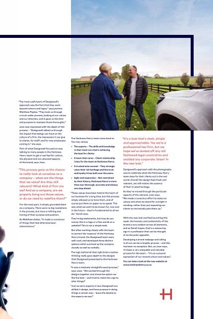
Designwell’s approach with the photography<br />
was to celebrate what the Harkness Henry<br />
team does for their clients out in the real<br />
world. Overall the design feels fresh and<br />
relevant, yet still retains the essence<br />
of their trusted heritage.<br />
As they’ve moved through the particular<br />
aspects of the rebrand, Joan says,<br />
“We made a conscious effort to state our<br />
values and what we stand for outright in<br />
wording, rather than just expecting our<br />
clients to intrinsically pick them up.”<br />
With the new look and feel launching this<br />
week, the honesty and authenticity of the<br />
brand is very evident across all elements,<br />
and as Sarah hopes, that’s a reassuring<br />
sign in a profession that can be thought<br />
of as the polar opposite.<br />
Developing a brand redesign and rolling<br />
it all out can be a lengthy process – and this<br />
has been no exception. But, as Joan says,<br />
it’s been a very enjoyable and valuable<br />
process for the team – “It’s an outward<br />
expression of our inward culture and values”.<br />
You can take a look at the new website at<br />
www.harknesshenry.co.nz


