


You also want an ePaper? Increase the reach of your titles
YUMPU automatically turns print PDFs into web optimized ePapers that Google loves.
tion. Holly's task is to<br />
preserve the feeling and<br />
the gesture of the orig-<br />
inal letters sculpted at<br />
size on a bar of steel.<br />
This has to be done with-<br />
out making the type a<br />
photo-realistic interpre-<br />
tation showing every<br />
bump and lump from the<br />
enlargements of printed<br />
letters.<br />
Janice Prescott<br />
Fishman begins working<br />
on the large size based<br />
on the Papale. Here the<br />
challenge is different.<br />
We want to capture the<br />
Papale's engraved ele-<br />
gance. In both the small<br />
and large sizes care is<br />
taken not to introduce<br />
oversimplified geome-<br />
try into the characters—<br />
a common practice in<br />
making previous Bodoni<br />
revivals.<br />
Shortly after return-<br />
ing from Parma, we real-<br />
ize that we would need<br />
more opportunities to<br />
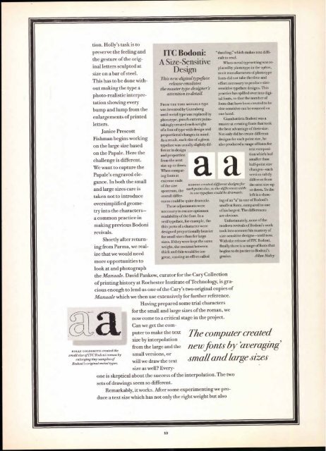
HOLLY GOLDSMITH created the<br />
small size of ITC Bodoni roman by<br />
enlarging tiny samples of<br />
Bodoni's original metal types.<br />
ITC Bodoni:<br />
A Size-Sensitive<br />
Design<br />
This new digital typeface<br />
release emulates<br />
the master type designer's<br />
attention to detail.<br />
FROM THE TIME MOVABLE type<br />
was invented by Gutenberg<br />
until metal type was replaced by<br />
phototype, punch cutters painstakingly<br />
created each weight<br />
of a font of type with design and<br />
proportional changes in mind.<br />
As a result, each size of a given<br />
typeface was usually slightly dif-<br />
ferent in design<br />
and proportion<br />
from the next<br />
size up or down.<br />
When comparing<br />
fonts at<br />
extreme ends<br />
of the size<br />
spectrum, the<br />
overall differ-<br />
ences could be quite dramatic.<br />
These adjustments were<br />
necessary to ensure optimum<br />
readability of the font. In a<br />
serif typeface, for example, the<br />
thin parts of a character were<br />
designed proportionally heavier<br />
for small sizes than for large<br />
sizes. If they were kept the same<br />
weight, the contrast between<br />
thick and thin would be too<br />
great, causing an effect called<br />
"dazzling:' which makes text diffi-<br />
cult to read.<br />
When metal typesetting was replaced<br />
by phototype in the 196os,<br />
most manufacturers of phototype<br />
fonts did not take the time and<br />
effort necessary to produce sizesensitive<br />
typeface designs. This<br />
practice has spilled over into digital<br />
fonts, so that the number of<br />
fonts that have been created to be<br />
size-sensitive can be counted on<br />
one hand.<br />
Giambattista Bodoni was a<br />
master at creating fonts that took<br />
the best advantage of their size.<br />
Not only did he create different<br />
designs for each point size, he<br />
also produced a range of fonts for<br />
text composi-<br />
tion which had<br />
smaller than<br />
half-point size<br />
changes—each<br />
version subtly<br />
BODONI created d ifferent designs for<br />
each point size, so the differences with-<br />
in one typeface could be dramatic.<br />
look at and photograph<br />
the Manuale. David Pankow, curator for the Cary Collection<br />
of printing history at Rochester Institute of Technology, is gra-<br />
cious enough to lend us one of the Cary's two original copies of<br />
Manuale which we then use extensively for further reference.<br />
Having prepared some trial characters<br />
for the small and large sizes of the roman, we<br />
now come to a critical stage in the project.<br />
Can we get the com-<br />
puter to make the text<br />
size by interpolation<br />
from the large and the<br />
small versions, or<br />
will we draw the text<br />
size as well? Every-<br />
one is skeptical about the success of the interpolation. The two<br />
sets of drawings seem so different.<br />
Remarkably, it works. After some experimenting we pro-<br />
duce a text size which has not only the right weight but also<br />
different from<br />
the next size up<br />
or down. To the<br />
left is a show-<br />
ing of an "a" in one of Bodoni's<br />
smallest fonts, compared to one<br />
of his largest. The differences<br />
are obvious.<br />
Unfortunately, none of the<br />
modern revivals of Bodoni's work<br />
took into account his mastery of<br />
size-sensitive designs—until now.<br />
With the release of ITC Bodoni,<br />
finally there is a range of fonts that<br />
begins to do justice to Bodoni's<br />
genius.<br />
Allan Haley<br />
The computer created<br />
new fonts by 'averaging'<br />
4711 all and large sizes


