Create successful ePaper yourself
Turn your PDF publications into a flip-book with our unique Google optimized e-Paper software.
of Caslon, the dynasty that created them. It is those<br />
that have a life of their own which are propelled<br />
through time.<br />
I would love to make something that was infinitely<br />
popular, but you can never know what will suc-<br />
ceed. The typefaces I did at Adobe were like that.<br />
I had no idea that Lithos would be successful, and<br />
Tekton barely got made. It was based on the lettering<br />
that architects use on their drawings. I think a<br />
Lot of successful typefaces grow out of very utilitar-<br />
ian purposes like that.<br />
JOYCE RUTTER KAYE,<br />
Tthatie d'Harcoru,rt,<br />
e form and function.<br />
:tively usable.<br />
s should be<br />
legible anb reababk,<br />
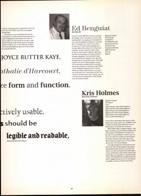
Ed Benguiat<br />
New York, NY<br />
I think it's rather difficult to create a new type-<br />
face design, or for that matter, to create a new<br />
anything that's in everyday use. A new piece of<br />
music would parallel the creation of a new typeface.<br />
For example, the notes of music don't<br />
change, and the letters of the alphabet don't<br />
change, either. It's a matter of how they're put<br />
together. The most important feature must<br />
be that its newness has a reflection all its own<br />
29<br />
and fits into the pattern of today's generation<br />
of graphic designers. The new creation must<br />
have something in its character that makes the<br />
potential user sit up and take notice. These typographic<br />
traits could create a popular demand<br />
but we must also consider that this popularity<br />
may only be temporary. Personally, I don't think<br />
there's anything wrong with that. I know we<br />
all feel our designs will last forever, but some<br />
things like music don't last either. It's like "here<br />
today and forgotten tomorrow:' Anyway, you and<br />
I can be sure of one thing: the number of type-<br />
faces will surely increase.<br />
Typefaces include:<br />
ITC Benguiat®<br />
ITC Panache ®<br />
ITC Modern No. 216®<br />
Bauhaus Geometries<br />
Charisma Script<br />
Congressional Script<br />
AT&T Garamond<br />
Montage<br />
Spectra<br />
Kris Holmes<br />
Menlo Park, California<br />
Typefaces include:<br />
ITC Isadora®<br />
Sierra<br />
Apple Chancery (with Charles Bigelow)<br />
Apple New York (with Charles Bigelow)<br />
Apple Chicago (with Charles Bigelow)<br />
Apple Geneva (with Charles Bigelow)<br />
Apple Monaco (with Charles Bigelow)<br />
Lucida (with Charles Bigelow)<br />
I was trying to think about this question while<br />
Looking at a plastic version of a cuneiform, from<br />
a system of writing about 3000 years old, sitting<br />
on top of my ultramodern computer.<br />
What I think makes a typeface popular is the<br />
balance between sensual beauty and logic—the<br />
internal logic of the typeface, and how it will<br />
be used. As a type designer, everything you do<br />
has to be examined in order to create a beauti-<br />
ful system of shapes. But if that were all you<br />
did, the typeface would have a clinical, medici-<br />
nal look and not a sensual beauty.<br />
It is logic and beauty working against each<br />
other that makes things progress. My calligraphy<br />
teacher used to say that in the history of<br />
writing, the mind and eye are the conservative<br />
forces, and the hand is the radical element that<br />
would rather be scratching out something with<br />
a stick. I think that there is a primitive spirit at<br />
work in people that can ignore the vast texture<br />
of graphics around us and do its own thing.


