Create successful ePaper yourself
Turn your PDF publications into a flip-book with our unique Google optimized e-Paper software.
sting,<br />
niversai.<br />
note that<br />
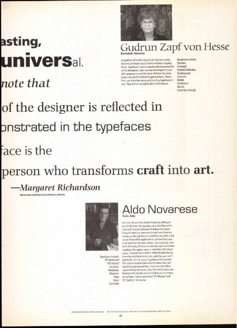
Gudrun Zapf von Hesse<br />
Darmstadt, Germany<br />
A typeface of continuity should not be modish, Typefaces include:<br />
but should follow classic forms without copying Diotima<br />
them. Typefaces have to express the personalities Smaragd<br />
of the designers. Each era has developed its spe- Ariadne Initialen<br />
cific letterforms and the best of them has been Shakespeare<br />
taken over by the following generations. There- Carmina<br />
fore, our time has many outstanding typefaces in Nofret<br />
use. They will be accepted also in the future. Christiana<br />
Alcuin<br />
Colombine Script<br />
of the designer is reflected in<br />
nstrated in the typefaces<br />
ace is the<br />
person who transforms craft into art.<br />
Margaret Richardson<br />
Photina Semi Bold Italic by Jose Mendoza y Almeida<br />
HEADLINE/CAPTIONS: ITC OFFICINA SANS BOLD<br />
Typefaces Include:<br />
ITC Novarese®<br />
ITC Fenice®<br />
Garaldus<br />
Nadianne<br />
Magister<br />
Stop<br />
Estro<br />
Eurostile<br />
Aldo Novarese<br />
Turin, Italy<br />
One can discuss the matter from two different<br />
points of view: the typeface as a starting point,<br />
vital and timeless because it allows the possibility<br />
of reaching new results and new develop-<br />
ments, or the typeface in practical use with a full<br />
range of possible applications. In the first case,<br />
I can mention the basic forms, the classical ones<br />
(which I really think of as eternal) such as Roman<br />
Lapidary (for upper case) or Venetian (for lower<br />
case). I would also mention Didot Bodoni for its<br />
linearity and Garamond, too, and the sans serif<br />
typefaces. In the case of typefaces being used,<br />
the main characteristics of a timeless face are<br />
legibility and readability. These are too often<br />
neglected by designers, but I do think these two<br />
features will be the ones to influence a timeless<br />
use of type. Some examples? ITC Mixage® and<br />
ITC Symbol,' of course.<br />
TEXT: ITC OFFICINA SANS BOOK, BOOK ITALIC, ITC OFFICINA SERIF BOOK, BOOK ITALIC, BOLD<br />
31


