Create successful ePaper yourself
Turn your PDF publications into a flip-book with our unique Google optimized e-Paper software.
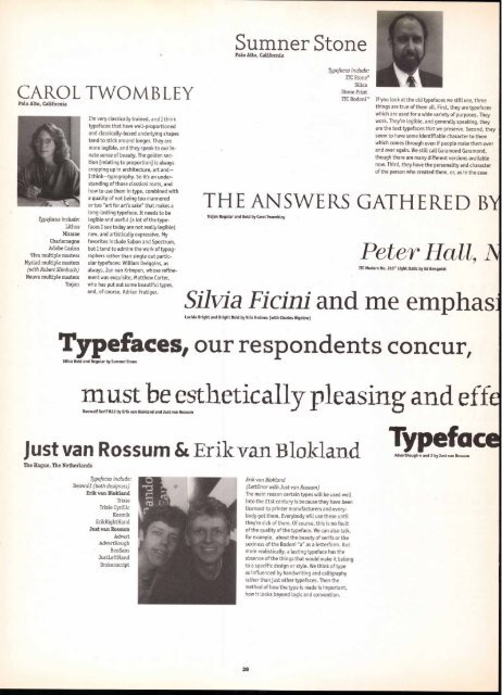
CAROL TWOMBLEY<br />
Palo Alto, California<br />
Typefaces include:<br />
Lithos<br />
Mirarae<br />
Charlemagne<br />
Adobe Casion<br />
Viva multiple masters<br />
Myriad multiple masters<br />
(with Robert Slimbach)<br />
Neuva multiple masters<br />
Trajan<br />
I'm very classically trained, and I think<br />
typefaces that have well-proportioned<br />
and classically-based underlying shapes<br />
tend to stick around longer. They are<br />
more legible, and they speak to our in-<br />
nate sense of beauty. The golden section<br />
[relating to proportion] is always<br />
cropping up in architecture, art and—<br />
I think—typography. So it's an understanding<br />
of those classical roots, and<br />
how to use them in type, combined with<br />
a quality of not being too mannered<br />
or too "art for art's sake" that makes a<br />
long-Lasting typeface. It needs to be<br />
legible and useful (a lot of the typefaces<br />
I see today are not really legible)<br />
new, and artistically expressive. My<br />
favorites include Sabon and Spectrum,<br />
but I tend to admire the work of typographers<br />
rather than single out particular<br />
typefaces: William Dwiggins, as<br />
always, Jan van Krimpen, whose refine-<br />
ment was exquisite, Matthew Carter,<br />
who has put out some beautiful types,<br />
and, of course, Adrian Frutiger.<br />
Sumner Stone<br />
Palo Alto, California<br />
THE ANSWERS GATHERED BY<br />
Trajan Regular and Bold by Carol Twombley<br />
Peter Hall, A<br />
ITC Modern No. 216° Light Italic by Ed Benguiat<br />
Silvia Ficini and me emphasi<br />
Lucida Bright and Bright Bold by Kris Holmes (with Charles Bigelow)<br />
Typefaces include:<br />
ITC Stone®<br />
Silica<br />
Stone Print<br />
ITC Bodoni" If you Look at the old typefaces we still use, three<br />
things are true of them all. First, they are typefaces<br />
which are used for a wide variety of purposes. They<br />
work. They're legible, and generally speaking, they<br />
are the text typefaces that we preserve. Second, they<br />
seem to have some identifiable character to them<br />
which comes through even if people make them over<br />
and over again. We still call Garamond Garamond,<br />
though there are many different versions available<br />
now. Third, they have the personality and character<br />
of the person who created them, or, as in the case<br />
Typefaces, our respondents concur,<br />
Silica Bold and Regular by Sumner Stone<br />
must be esthetically pleasing and effe<br />
Beowulf Serif R22 by Erik van Blokland and Just van Rossum<br />
Just van Rossum & Erik van Blokland<br />
The Hague, The Netherlands<br />
Typefaces include:<br />
Beowulf (both designers)<br />
Erik van Blokland<br />
Trixie<br />
Trixie Cyrillic<br />
Kosmik<br />
ErikRightHand<br />
Just van Rossum<br />
Advert<br />
AdvertRough<br />
BeoSans<br />
JustLeftHand<br />
Brokenscript<br />
Erik van Blokland<br />
(LettError with Just van Rossum)<br />
The main reason certain types will be used well<br />
into the 21st century is because they have been<br />
licensed to printer manufacturers and every-<br />
body got them. Everybody will use these until<br />
they're sick of them. Of course, this is no fault<br />
of the quality of the typeface. We can also talk,<br />
for example, about the beauty of serifs or the<br />
sexiness of the Bodoni "a" as a letterform. But<br />
more realistically, a lasting typeface has the<br />
absence of the things that would make it belong<br />
to a specific design or style. We think of type<br />
as influenced by handwriting and calligraphy<br />
rather than just other typefaces. Then the<br />
method of how the type is made is important,<br />
how it looks beyond logic and convention.<br />
28<br />
Ty eface<br />
AdvertRough 4 and 2 by Just van Rossum


