Create successful ePaper yourself
Turn your PDF publications into a flip-book with our unique Google optimized e-Paper software.
asidered a<br />
ant to focus on which typetaces<br />
ch typefaces<br />
Typefaces include:<br />
Ru.ach<br />
Klee<br />
Letraset Pink<br />
Ulysses<br />
Quad & Quadsoft<br />
Pneuma<br />
Cheshire, England<br />
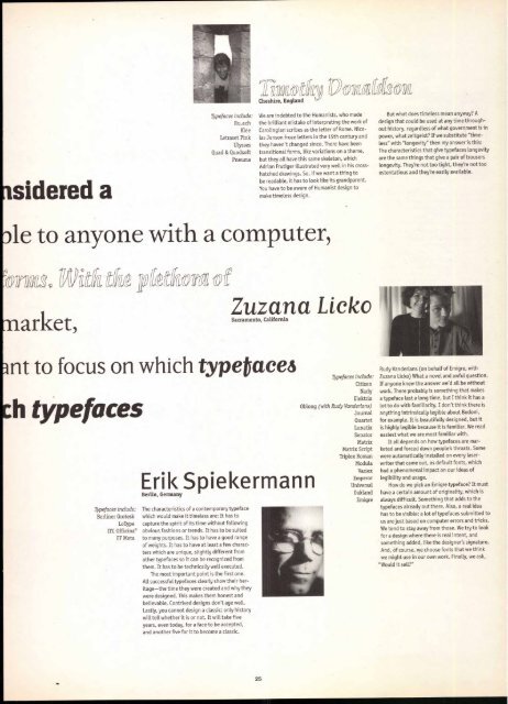
We are indebted to the Humanists, who made<br />
the brilliant mistake of interpreting the work of<br />
Carolingian scribes as the letter of Rome. Nicolas<br />
Jenson froze letters in the 15th century and<br />
they haven't changed since. There have been<br />
transitional forms, like variations on a theme,<br />
Eirik ySpiekermann<br />
Uvwaiffiox<br />
but they all have this same skeleton, which<br />
Adrian Frutiger illustrated very well in his cross-<br />
hatched drawings. So, if we want a thing to<br />
be readable, it has to look like its grandparent.<br />
You have to be aware of Humanist design to<br />
make timeless design.<br />
31e to anyone with a computer,<br />
market,<br />
Typefaces include:<br />
Berliner Grotesk<br />
LoType<br />
ITC Officina®<br />
FF Meta<br />
ation Zuzana Licko<br />
The characteristics of a contemporary typeface<br />
which would make it timeless are: It has to<br />
capture the spirit of its time without following<br />
obvious fashions or trends. It has to be suited<br />
to many purposes. It has to have a good range<br />
of weights. It has to have at least a few characters<br />
which are unique, slightly different from<br />
other typefaces so it can be recognized from<br />
them. It has to be technically well executed.<br />
The most important point is the first one.<br />
All successful typefaces clearly show their heritage—the<br />
time they were created and why they<br />
were designed. This makes them honest and<br />
believable. Contrived designs don't age well.<br />
Lastly, you cannot design a classic; only history<br />
will tell whether it is or not. It will take five<br />
years, even today, for a face to be accepted,<br />
and another five for it to become a classic.<br />
25<br />
Typefaces include:<br />
Citizen<br />
Narly<br />
Elektrix<br />
Oblong (with Rudy Vanderlans)<br />
Journal<br />
Quartet<br />
Lunatix<br />
Senator<br />
Matrix<br />
Matrix Script<br />
Triplex Roman<br />
Modula<br />
Variex<br />
Emperor<br />
Universal<br />
Oakland<br />
Emigre<br />
But what does timeless mean anyway? A<br />
design that could be used at any time throughout<br />
history, regardless of what government is in<br />
power, what zeitgeist? If we substitute "timeless"<br />
with "longevity" then my answer is this:<br />
The characteristics that give typefaces longevity<br />
are the same things that give a pair of trousers<br />
longevity. They're not too tight, they're not too<br />
ostentatious and they're easily available.<br />
Rudy Vanderlans (on behalf of Emigre, with<br />
Zuzana Licko) What a novel and awful question.<br />
If anyone knew the answer we'd all be without<br />
work. There probably is something that makes<br />
a typeface last a Long time, but I think it has a<br />
Lot to do with familiarity. I don't think there is<br />
anything intrinsically legible about Bodoni,<br />
for example. It is beautifully designed, but it<br />
is highly legible because it is familiar. We read<br />
easiest what we are most familiar with.<br />
It all depends on how typefaces are marketed<br />
and forced down people's throats. Some<br />
were automatically installed on every laser-<br />
writer that came out, as default fonts, which<br />
had a phenomenal impact on our ideas of<br />
Legibility and usage.<br />
How do we pick an Emigre typeface? It must<br />
have a certain amount of originality, which is<br />
always difficult. Something that adds to the<br />
typefaces already out there. Also, a real idea<br />
has to be visible; a lot of typefaces submitted to<br />
us are just based on computer errors and tricks.<br />
We tend to stay away from those. We try to look<br />
for a design where there is real. intent, and<br />
something added, like the designer's signature.<br />
And, of course, we choose fonts that we think<br />
we might use in our own work. Finally, we ask,<br />
"Would it sell?"


