


You also want an ePaper? Increase the reach of your titles
YUMPU automatically turns print PDFs into web optimized ePapers that Google loves.
tIlly %Ida aptelt, 6 (,. ..11■W<br />
Mina naio is timi t Apar ilk: roil<br />
Ilie Mvkidinurui luicand,and.futpshA<br />
76 (eAttrol oarra is banned<br />
`thr beS°: LIL 0114ictof<br />
4c 1:4 iitAboato udeft,ity<br />
c.;<br />
faCI ,<br />
UAW:7 ,<br />
au mosalikaar woutatilin<br />
CIEJaclatlatlatovinnittle<br />
r. aaattsham: *7.1.111.1<br />
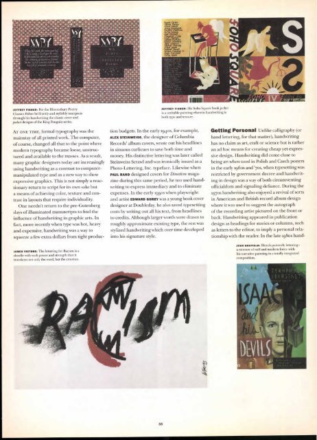
JEFFREY FISHER: For the Bloomsbury Poetry<br />
Classics Fisher brilliantly and stylishly interprets<br />
through his handwriting the classic cover and<br />
jacket designs of the King Penguin series.<br />
AT ONE TIME, formal typography was the<br />
mainstay of all printed work. The computer,<br />
of course, changed all that to the point where<br />
modern typography became loose, unstructured<br />
and available to the masses. As a result,<br />
many graphic designers today are increasingly<br />
using handwriting as a contrast to computermanipulated<br />
type and as a new way to show<br />
expressive graphics. This is not simply a reactionary<br />
return to script for its own sake but<br />
a means of achieving color, texture and contrast<br />
in layouts that require individuality.<br />
One needn't return to the pre-Gutenberg<br />
days of illuminated manuscripts to find the<br />
influence of handwriting in graphic arts. In<br />
fact, more recently when type was hot, heavy<br />
and expensive, handwriting was a way to<br />
squeeze a few extra dollars from tight produc-<br />
JAMES VICTORE: The lettering for Racism is a<br />
doodle with such power and strength that it<br />
translates not only the word, but the emotion.<br />
/I.A 1S<br />
Irt<br />
p dents<br />
tfss<br />
Ziltaiumtu<br />
IC SCAM.<br />
/51.10S.:<br />
OCNIDINCI<br />
111061USD*<br />
*Ct111000013<br />
* 11/04*13/110<br />
r 110801113110<br />
*01.0100.<br />
* ii0i0 1.0 10<br />
,..-aci sacts.<br />
0 0 ... 01UALinallialw....<br />
o 9 pltsiimugaltatitt2<br />
*;111101111D44SUIllf111<br />
f 0 suillialliCtltil<br />
Angela Carter<br />
Sharon rnesen<br />
filbert Wendt<br />
Jinn lorp holelt<br />
Vine 0 Snaivan<br />
avieo<br />
il<br />
alyn axwell<br />
Margaret Malty<br />
Pl'agergZ<br />
rt Gr ie<br />
nec;i avgrel<br />
t<br />
4¢amfet Teaney<br />
Lisald'ittea<br />
Simeon Damflom Jr<br />
Owen Marshall<br />
Philip salt?'<br />
JEFFREY FISHER: His Soho Square book jacket<br />
is a veritable painting wherein handwriting is<br />
both type and texture.<br />
Lion budgets. In the early ig4os, for example,<br />
ALEX STEINWEISS, the designer of Columbia<br />
Records' album covers, wrote out his headlines<br />
in sinuous curlicues to save both time and<br />
money. His distinctive lettering was later called<br />
Steinweiss Scrawl and was ironically issued as a<br />
Photo-Lettering, Inc. typeface. Likewise when<br />
PAUL RAND designed covers for Direction magazine<br />
during this same period, he too used handwriting<br />
to express immediacy and to eliminate<br />
expenses. In the early 195os when playwright<br />
and artist EDWARD GOREY was a young book cover<br />
designer at Doubleday, he also saved typesetting<br />
costs by writing out all his text, from headlines<br />
to credits. Although larger words were drawn to<br />
roughly approximate existing type, the rest was<br />
stylized handwriting which over time developed<br />
into his signature style.<br />
33<br />
Getting Personal Unlike calligraphy (or<br />
hand lettering, for that matter), handwriting<br />
has no claim as art, craft or science but is rather<br />
an ad hoc means for creating cheap yet expressive<br />
design. Handwriting did come close to<br />
being art when used in Polish and Czech posters<br />
in the early 196os and '7os, when typesetting was<br />
restricted by government decree and handwriting<br />
in design was a way of both circumventing<br />
officialdom and signaling defiance. During the<br />
197os handwriting also enjoyed a revival of sorts<br />
in American and British record album design<br />
where it was used to suggest the autograph<br />
of the recording artist pictured on the front or<br />
back. Handwriting appeared in publication<br />
design as headings for stories or columns, such<br />
as letters to the editor, to imply a personal relationship<br />
with the reader. In the late 198os hand-<br />
JOSH GOSFIELD: Blends painterly lettering—<br />
a mixture of naïf and modern form—with<br />
his narrative painting in a totally integrated<br />
composition.


