


Create successful ePaper yourself
Turn your PDF publications into a flip-book with our unique Google optimized e-Paper software.
STEVEN GUARNACCIA' s spaghetti-like handwriting<br />
goes perfectly well with these signs which<br />
are forged from pieces of soldered steel.<br />
are those where he has done little or no manipulation.<br />
Such is the case with his artwork for<br />
a rqqo single for the Sub Pop band called Hole,<br />
where his writing is so resolutely unpretentious<br />
that it's hard to decide where design begins<br />
and ad hocism leaves off.<br />
Integrating Word and Picture For his<br />
signature style STEVEN GUARNACCIA also borrows<br />
from other sources, but he bases his writing<br />
more on the comics than on the street. Guarnaccia<br />
is an illustrator with an intense interest<br />
in typographic ephemera and has devised<br />
curvilinear and rectilinear handwriting styles<br />
that are integrated into his ostensibly linear<br />
work. His cartoons for Spy magazine were driven<br />
by the word with spiderweb-like letterforms<br />
integrally woven through the pictures so that<br />
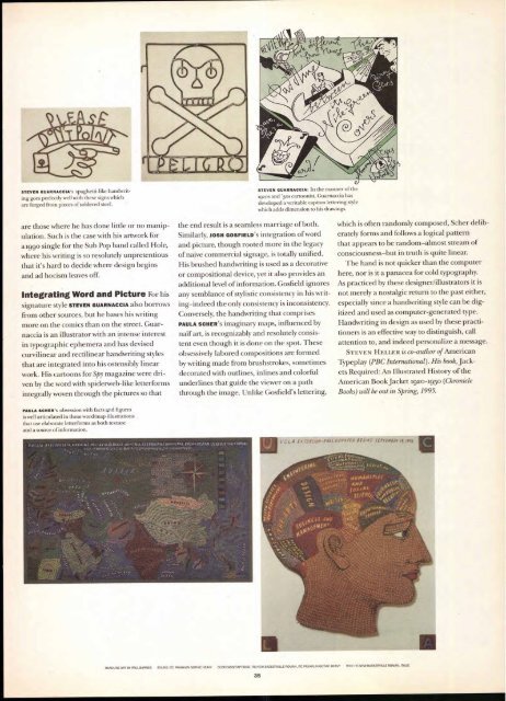
PAULA SCHERs obsession with facts 4nd figures<br />
is well articulated in these word/map illustrations<br />
that use elaborate letterforms as both texture<br />
and a source of information.<br />
L T ,<br />
k'A<br />
0<br />
STEVEN GUARNACCIA: In the manner of the<br />
192os and '3os cartoonist, Guarnaccia has<br />
developed a veritable caption lettering style<br />
which adds dimension to his drawings.<br />
the end result is a seamless marriage of both.<br />
Similarly, JOSH GOSFIELD'S integration of word<br />
and picture, though rooted more in the legacy<br />
of naive commercial signage, is totally unified.<br />
His brushed handwriting is used as a decorative<br />
or compositional device, yet it also provides an<br />
additional level of information. Gosfield ignores<br />
any semblance of stylistic consistency in his writing—indeed<br />
the only consistency is inconsistency.<br />
Conversely, the handwriting that comprises<br />
PAULA SCHER'S imaginary maps, influenced by<br />
naïf art, is recognizably and resolutely consistent<br />
even though it is done on the spot. These<br />
obsessively labored compositions are formed<br />
by writing made from brushstrokes, sometimes<br />
decorated with outlines, inlines and colorful<br />
underlines that guide the viewer on a path<br />
through the image. Unlike Gosfield's lettering,<br />
1111<br />
(,ci.A ixrE,415,m-rAil Q4/ARreR BE Gil i 5 flPrf#BEN r9, ifft<br />
`jet f<br />
.1AN 0 Atvf<br />
i4EMIAriy<br />
044141"4",,,,i r,<br />
NVPIANI ri ES<br />
A ND<br />
5 a ci . dater<br />
5(1 E N4r, I"<br />
HEADUNE ART BY PAUL BARNES BYLINE: ITC FRANKLIN GOTHIC HEAW SUBHEADS/CAPTIONS: ITC NEW BASKERVILLE ROMAN, ITC FRANKLIN GOTHIC HEAW TEXT: ITC NEW BASKERVILLE ROMAN, ITALIC<br />
35<br />
which is often randomly composed, Scher deliberately<br />
forms and follows a logical pattern<br />
that appears to be random—almost stream of<br />
consciousness—but in truth is quite linear.<br />
The hand is not quicker than the computer<br />
here, nor is it a panacea for cold typography.<br />
As practiced by these designer/illustrators it is<br />
not merely a nostalgic return to the past either,<br />
especially since a handwriting style can be digitized<br />
and used as computer-generated type.<br />
Handwriting in design as used by these practitioners<br />
is an effective way to distinguish, call<br />
attention to, and indeed personalize a message.<br />
STEVEN HELLER is co-author of American<br />
Typeplay (PBC International). His book, Jackets<br />
Required: An Illustrated History of the<br />
American Book Jacket 1920-1950 (Chronicle<br />
Books) will be out in Spring, 1995.<br />
iroMfo<br />
1 Ei


