


Create successful ePaper yourself
Turn your PDF publications into a flip-book with our unique Google optimized e-Paper software.
Z Ss Cr I. W1CCLE trIcK 2. li.00 BUCKS 3, Tut DE<br />
vIt'S (*MAW! HE LIVJN' oN TNE iDOE (oF wou from)<br />
5. you CAN'T &ET AWAY FRon H E g.l3EER:3<br />
LITTLE IlAer 8.1.twso<br />
rti %BALE'S o F C-<br />
t o. 0/0121)<br />
VRTUM ny pig/<br />
N AND To- VIC ifit.oEf<br />
ORO f`N<br />
AM 0,-<br />
AOCA<br />
T A 2<br />
gEcoRPED II<br />
RE V.<br />
MEMPHIS Al' Ho RToW<br />
ARDENT ST- HEAT<br />
uDios. pRoa -\ \ ;VI 1/4i,<br />
uCED BY 6108? LEAD VOCA<br />
ilAYNES.ENCINEE -1<br />
AERk- ER1K FI-ETTRIM<br />
FoR A<br />
a &go ri: sup pop,<br />
P. 01 06 if<br />
FREE CATAL.0-<br />
writing was used less extensively, because digital<br />
fontography made eclectic design styles possible.<br />
This anything-goes, high-tech potential<br />
eventually contributed to a revived appreciation<br />
of informal, personal handwriting in design.<br />
The designers represented in this brief survey<br />
tend to be influenced by either turn-ofthe-century<br />
design which combined images<br />
with words, or modern and contemporary<br />
artists who wed letterforms to abstract and<br />
narrative compositions.<br />
The seamless weavings that characterize<br />
JEFFREY FISHER'S book jackets for Soho Square<br />
are art-based with communication as the goal.<br />
By using raw handscrawls he avoids the otherwise<br />
artificial imposition of formal typography<br />
onto images that are rough by nature. In a<br />
somewhat more refined manner, Fisher's hand-<br />
Vit iser<br />
VocALILX/ ttp°<br />
199? Sufi Pop<br />
C)1 1143 NoRreN<br />
noUSE Pu$1.1-<br />
/501,40 tentte<br />
_jxcEPT"maitTu<br />
Rs flY rle10 Loco<br />
oesidm erA<br />
PH6TVS<br />
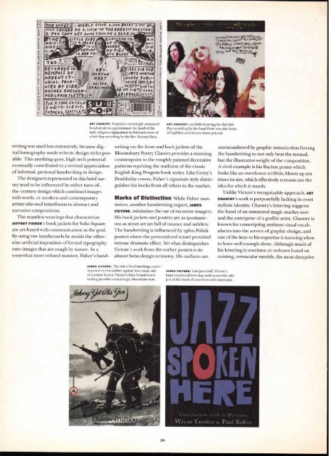
ART CHANTRY: Employs a seemingly untutored<br />
brushstroke to approximate the hand of the<br />
nail; religious signpainter in this back cover of<br />
a Sub Pop recording by the Rev. Horton Heat.<br />
ART CHANTRY'S scribble lettering for this Sub<br />
Pop recording by the band Hole tests the limits<br />
of legibility as it invites closer perusal.<br />
writing on the front and back jackets of the<br />
Bloomsbury Poetry Classics provides a stunning<br />
counterpoint to the roughly painted decorative<br />
patterns reprising the tradition of the classic<br />
English King Penguin book series. Like Gorey's<br />
Doubleday covers, Fisher's signature style distinguishes<br />
his books from all others in the market.<br />
Marks of Distinction While Fisher max-<br />
imizes, another handwriting expert, JAMES<br />
VICTORE, minimizes the use of excessive imagery.<br />
His book jackets and posters are as spontaneous<br />
as street art yet full of nuance and subtlety.<br />
The handwriting is influenced by 196os Polish<br />
posters where the personalized scrawl provided<br />
intense dramatic effect. Yet what distinguishes<br />
Victore's work from the earlier posters is its<br />
almost Swiss design economy. His surfaces are<br />
JAMES VICTORS: The side o' beef markings superimposed<br />
on this soldier update this classic tale<br />
of wartime horror. Victore's faux formal handwriting<br />
provides a hauntingly discordant note.<br />
34<br />
JAMES VICTORS: Like jazz itself, Victore's<br />
improvisational lettering underscores the subject<br />
of this book of interviews with musicians.<br />
C J."' t/ions with 22<br />
ee<br />
y3sCk Et'1" .'‘E-4'?"44rt".<br />
koy V tGYA 513&L'Llt VI<br />
C*riOkE/970<br />
114A.,t! le,d<br />
\AT., i ■ i l &. Paul Rubin<br />
unencumbered by graphic minutia thus forcing<br />
the handwriting to not only bear the textual,<br />
but the illustrative weight of the composition.<br />
A vivid example is his Racism poster which<br />
looks like an overdrawn scribble, blown up ten<br />
times its size, which effectively screams out the<br />
idea for which it stands.<br />
Unlike Victore's recognizable approach, ART<br />
CHANTRY'S work is purposefully lacking in overt<br />
stylistic identity. Chantry's lettering suggests<br />
the hand of an untutored magic marker user<br />
and the enterprise of a graffiti artist. Chantry is<br />
known for conscripting ambient visual vocabularies<br />
into the service of graphic design, and<br />
one of the keys to his expertise is knowing when<br />
to leave well enough alone. Although much of<br />
his lettering is rewritten or redrawn based on<br />
existing, vernacular models, the most deceptive


