


Create successful ePaper yourself
Turn your PDF publications into a flip-book with our unique Google optimized e-Paper software.
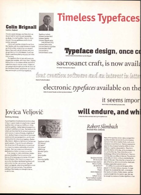
Colin Brignall<br />
London, England<br />
I'm not a great visionary, but first of all, we<br />
should look for legibility and readability,<br />
as always, in a text typeface. Second, there<br />
shouldn't be any quirkiness and it should<br />
not be mannered.<br />
I think we'll see the oldstyle Roman faces<br />
Like Palatino with its angled stresses and gradual<br />
thick to thins replaced by more modern<br />
Roman faces with upright stresses and more<br />
abrupt thick to thins like Bodoni. I can't see<br />
Palatino and Goudy being very popular in the<br />
21st century.<br />
The typefaces that do last will have to be<br />
elegant and readable, with clean lines. Slightly<br />
thicker thins on the strokes will be required to<br />
make them easy to read on screen. People are<br />
still going to be brought up on the structure of<br />
the traditional Roman letterforms—as much as<br />
they are brought up on Emigre typefaces.<br />
.Typefaces include:<br />
Letraset Aachen Bold<br />
Letraset Epoldta<br />
Letraset Figural series<br />
(with Michael Gills)<br />
Letraset Italia series<br />
Letraset Premier Lightline<br />
Letraset Retro Bold<br />
Letraset Revue<br />
Letraset Romic series<br />
Typefaces include:<br />
ITC Veljovic®<br />
ITC Esprit®<br />
ITC Gamma®<br />
URW Script<br />
Mirostav Cyrillic<br />
Drina<br />
Drina Cyrillic<br />
Hector<br />
Simonida Cyrillic<br />
Linnea MM<br />
Timeless Typefaces<br />
peface design, once c<br />
Letraset Aachen Bold and Roman by Colin Brignall<br />
sacrosanct craft, is now avail<br />
ITC Gamma ® Book by Jovica Veljovk<br />
fokt crgadioz mft lt' gire mum intaat atitg<br />
Klee by Timothy Donaldson<br />
electronic typefaces available on th<br />
Adobe Garamond Regular and Italic by Robert Slimbach<br />
it seems impor<br />
Matrix Book and Script Bold by Zuzana Licko<br />
Jovica Veljovie will endure, and wh<br />
Hamburg, Germany<br />
A good typeface should provoke emotions that<br />
bring on a good mood and a joyfulness. A good<br />
typeface does not leave us indifferent. It has<br />
positive qualities, mainly balanced proportions<br />
and good legibility in all sizes. The details on its<br />
Letters are important for its general appearance<br />
and structure. A sense of beauty, simplicity of<br />
form, clarity of style and precision of statement,<br />
combined with good proportions, are the main<br />
prerequisites for a functional typeface. Baskerville,<br />
Bodoni, Walbaum, Optima and Frutiger are<br />
good examples. They are the work of human-<br />
ists whose love of life and wisdom is combined<br />
in a mosaic to create a solid entity of possible<br />
symbols. Their joy is silent and introverted,<br />
dedicated to a better and more human life.<br />
If we manage to resist primitivism, intolerance<br />
and stupidity; if we can preserve the<br />
beauty of the language and a sense of the positive<br />
and human, then there is no reason to<br />
worry that the above mentioned typefaces will<br />
not survive into the next century. They will<br />
remain as legends, only being modified to meet<br />
new technical requirements. They will lose<br />
nothing of the beauty and strength that we<br />
so admire now.<br />
24<br />
FF Meta Plus Black and Black Italic by Erik Spiekermann<br />
Robert slimbach<br />
Mountain View, California<br />
Typefaces include:<br />
ITC Slimbach®<br />
Minion multiple masters<br />
Minion Cyrillic<br />
ITC Giovanni®<br />
Poetica<br />
Utopia<br />
Adobe Garamond<br />
Sanvito<br />
Caflisch Script<br />
Myriad multiple masters<br />
(with Carol Thrombley)<br />
Many of the qualities which make a composition<br />
typeface timeless can also be found in timeless<br />
examples from other creative fields, such as art,<br />
literature and architecture. Timeless expressions<br />
speak to the universal humanity within all of us,<br />
without a need for interpretation. They transcend<br />
the fashion of the day, while encompassing<br />
the spirit of the day. They utilize the current<br />
technology without being limited by it. They successfully<br />
balance utility and beauty. They possess<br />
originality and vision, without abandoning the<br />
ideals of the past. They obey the universal principles<br />
of harmony, balance and clarity; simply put,<br />
timeless expressions possess grace.<br />
It is difficult to predict which types will be<br />
popular in the next century; however, if a type<br />
designer has mastered the craft, understands<br />
the classic principles of letter design, and has<br />
creative insight into the modern age, this may<br />
be enough to produce a timeless typeface or two.


