Adaptability of cashpoints for the disabled
Adaptability of cashpoints for the disabled
Adaptability of cashpoints for the disabled
- No tags were found...

Create successful ePaper yourself
Turn your PDF publications into a flip-book with our unique Google optimized e-Paper software.
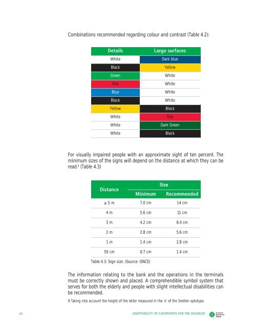
Combinations recommended regarding colour and contrast (Table 4.2):DetailsWhiteBlackGreenRedBlueBlackYellowWhiteWhiteWhiteLarge surfacesDark blueYellowWhiteWhiteWhiteWhiteBlackRedDark GreenBlackFor visually impaired people with an approximate sight <strong>of</strong> ten percent. Theminimum sizes <strong>of</strong> <strong>the</strong> signs will depend on <strong>the</strong> distance at which <strong>the</strong>y can beread. 9 (Table 4.3)SizeDistanceMinimum Recommended≥ 5 m 7.0 cm 14 cm4 m 5.6 cm 11 cm3 m 4.2 cm 8.4 cm2 m 2.8 cm 5.6 cm1 m 1.4 cm 2.8 cm50 cm 0.7 cm 1.4 cmTable 4.3: Sign size. (Source: ONCE)The in<strong>for</strong>mation relating to <strong>the</strong> bank and <strong>the</strong> operations in <strong>the</strong> terminalsmust be correctly shown and placed. A comprehendible symbol system thatserves <strong>for</strong> both <strong>the</strong> elderly and people with slight intellectual disabilities canbe recommended.9 Taking into account <strong>the</strong> height <strong>of</strong> <strong>the</strong> letter measured in <strong>the</strong> ‘e’ <strong>of</strong> <strong>the</strong> Snellen optotype.24 ADAPTABILITY OF CASHPOINTS FOR THE DISABLED