Create successful ePaper yourself
Turn your PDF publications into a flip-book with our unique Google optimized e-Paper software.
APHY<br />
RY<br />
of the factors that may contribute to a peripheral<br />
status.<br />
Perhaps the most potent single source of poten<br />
tial peripherality is the size of a culture’s population.<br />
The size of the population is quite relevant<br />
because the smaller the group of people<br />
the less work is needed to reach a new cultural<br />
consensus about associating a meaning<br />
or sensibility with a letter style. The same<br />
thing applies to the acceptability and identity<br />
of a new or altered letter form. 5 Sometimes<br />
it isn’t a new form but instead a substitution<br />
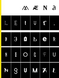
of a form, for instance the letter “é” replacing<br />
the combination “je” in icelandic in 1929.<br />
See Figure 1.<br />
Another potential contributor is the degree to<br />
which the population is to some degree made<br />
culturally isolated or distinct. The peripherality<br />
that is generated in this case is not deliberate<br />
but is instead a kind of side effect. It<br />
1. Between the years 1708–1710 Czar Peter<br />
the Great launched a reform of the Cyrillic<br />
alphabet and all the letterforms changed<br />
to new shapes he had chosen. Although<br />
he didn’t have new shapes designed the<br />
founder of modern Turkey, Mustafa Kemal<br />
Atatürk forced Turkey to stop using Arabic<br />
letters and to start using Latin ones in<br />
1928. But the most extreme example<br />
of radical change in writing systems is<br />
the complete invention of the Hangul<br />
Korean alphabet. Reportedly it was designed<br />
by the fourth king of the Joseon<br />
Dynasty, Sejong in the mid fifteenth<br />
century.<br />
This last example is especially amazing<br />
because it is a new writing system rather<br />
than a modification of one. Hangul system<br />
replaced Chinese writing.<br />
2. When you write about typography you<br />
may be talking about two things - letters<br />
(or more broadly glyphs) and their design,<br />
and/or the design of things that make use<br />
those letters. This article is limited to a<br />
consideration of glyphs both typographic<br />
and written.<br />
3. Deconstructing legibility further the<br />
identifiability of a letter also comes from<br />
the presence of specific letter features;<br />
from the way in which these features are<br />
arranged; and from their relative proportion<br />
to each other. A series of optical and<br />
perceptual factors are also be relevant.<br />
4. Questions of style and essential form<br />
do also interact and so the distinction<br />
made here should not be seen as absolute.<br />
Similarly our interpretation of the voice<br />
or atmosphere is not absolute and so may<br />
vary as well.<br />
5. Consider Iceland’s population which in<br />
excess of 300,000 and contrast this with<br />
the population of France which is in<br />
excess of 64 million. Or Russia at 141<br />
Million. Or China at over 1.3 billion. Figures<br />
are from the November 2009 CIA<br />
world fact book https://www.cia.gov/<br />
library/publications/the-world-factbook/<br />
index.html