You also want an ePaper? Increase the reach of your titles
YUMPU automatically turns print PDFs into web optimized ePapers that Google loves.
82. — TYPOGRAPHY ON THE PERIPHERY<br />
“Subcultures often<br />
choose to create<br />
identity using<br />
visual means and<br />
often this includes<br />
making adopting<br />
distinct letterforms<br />
or the creating<br />
of new ones.”<br />
could even be described as a kind of passive<br />
peripherality. This isolation can come from<br />
a combination of education, geography, or<br />
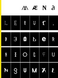
language. These factors can result in “naive”<br />
or unorthodox letter forms. See Figures 2-6.<br />
Completely new glyph shapes are sometimes<br />
invented for use by educationally isolated<br />
elites. An example of this can be found in<br />
the the special symbols used by physicians.<br />
See Figure 7.<br />
Subcultures are another vehicle for potential<br />
peripherality. The peripherality they generate<br />
is unlike isolation in that it involves<br />
a deliberate and conscious choice. When<br />
members of the broader culture become<br />
motivated to create and maintain an identity<br />
in contrast to, and clearly in relationship with,<br />
the larger culture, they form a subculture.<br />
Subcultures often choose to create identity<br />
using visual means and often this includes<br />
adopting distinct letterforms or creating of<br />
new ones. An example of this can be seen in<br />
the work of François Chastanet. It shows new<br />
and distinctive letter shapes used by Hispanic<br />
gangs in Los Angeles. 6 See Figures 8-10.<br />
And finally type designers may also choose to<br />
consciously adapt shapes they feel belong<br />
to a culture in order to make type which is<br />
meant to evoke a feeling specific to that<br />
culture. This kind of letter-making is probably<br />
the most deliberate form of all. An example<br />
of this is Gabriel Martínez Meave’s type<br />
Presidencia made in 2007. Gabriel explained<br />
this year at ATypI in Mexico City that he set<br />
out to design type in precisely this manner. In<br />
this case he has not changed the structure of<br />
the letters in any radical way but has instead<br />
opted to embed a new sensibility into the<br />
familiar letter forms. This font was made for<br />
the Mexican government and appears frequently<br />
on public notices. It has also been<br />
used to brand each of the branches of government.<br />
Presidencia won the 2008 TDC award<br />
in the category of Text / Type Family. See figures<br />
11-13.<br />
Of course this article is far too short to be a complete<br />
exploration of the subject, but hopefully<br />
it is clear that there are many ways for a culture<br />
to be peripheral, and that this peripherality<br />
can exist either by accident or intent;<br />
and that it is a fertile source of new semantics<br />
and aesthetics, and occasionally even of<br />
new letterforms.<br />
6. Cholo Writing: Latino Gang Graffiti in<br />
Los Angeles, François Chastanet, Chaz<br />
Bojorquez, 2009