

TMS iCL DEVELOPERS GUIDE - TMS Software
TMS iCL DEVELOPERS GUIDE - TMS Software
TMS iCL DEVELOPERS GUIDE - TMS Software

Create successful ePaper yourself
Turn your PDF publications into a flip-book with our unique Google optimized e-Paper software.
<strong>TMS</strong> SOFTWARE<br />
<strong>TMS</strong> <strong>iCL</strong><br />
<strong>DEVELOPERS</strong> <strong>GUIDE</strong><br />
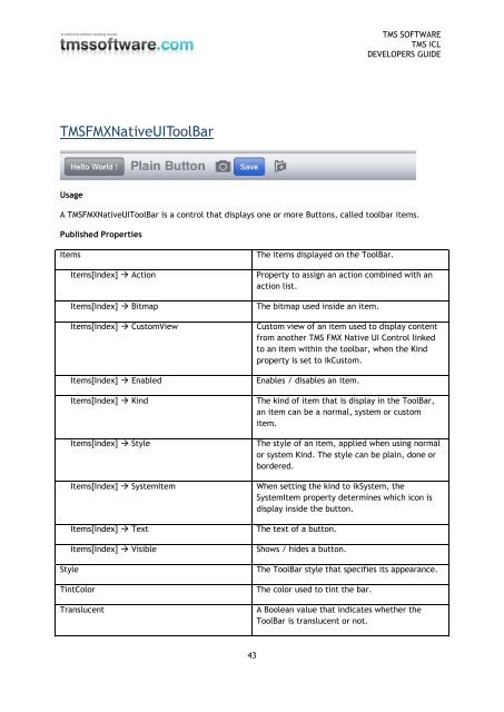
<strong>TMS</strong>FMXNativeUIToolBar<br />
Usage<br />
A <strong>TMS</strong>FMXNativeUIToolBar is a control that displays one or more Buttons, called toolbar items.<br />
Published Properties<br />
Items<br />
Items[Index] Action<br />
Items[Index] Bitmap<br />
Items[Index] CustomView<br />
Items[Index] Enabled<br />
Items[Index] Kind<br />
Items[Index] Style<br />
Items[Index] SystemItem<br />
Items[Index] Text<br />
Items[Index] Visible<br />
Style<br />
TintColor<br />
Translucent<br />
The items displayed on the ToolBar.<br />
Property to assign an action combined with an<br />
action list.<br />
The bitmap used inside an item.<br />
Custom view of an item used to display content<br />
from another <strong>TMS</strong> FMX Native UI Control linked<br />
to an item within the toolbar, when the Kind<br />
property is set to ikCustom.<br />
Enables / disables an item.<br />
The kind of item that is display in the ToolBar,<br />
an item can be a normal, system or custom<br />
item.<br />
The style of an item, applied when using normal<br />
or system Kind. The style can be plain, done or<br />
bordered.<br />
When setting the kind to ikSystem, the<br />
SystemItem property determines which icon is<br />
display inside the button.<br />
The text of a button.<br />
Shows / hides a button.<br />
The ToolBar style that specifies its appearance.<br />
The color used to tint the bar.<br />
A Boolean value that indicates whether the<br />
ToolBar is translucent or not.<br />
43


 Change language