The Inflation Cycle of 2002 to 2015 - Uhlmann Price Securities
The Inflation Cycle of 2002 to 2015 - Uhlmann Price Securities
The Inflation Cycle of 2002 to 2015 - Uhlmann Price Securities

You also want an ePaper? Increase the reach of your titles
YUMPU automatically turns print PDFs into web optimized ePapers that Google loves.
Industrial Portfolio Strategy<br />
<strong>The</strong> <strong>Inflation</strong> <strong>Cycle</strong> <strong>of</strong> <strong>2002</strong> <strong>to</strong> <strong>2015</strong> ⎯ April 19, <strong>2002</strong> -42- Legg Mason Wood Walker, Inc.<br />
• Deflation 1951 <strong>to</strong> 1965: Postwar peace dividend, with overseas oil production growth that caused<br />
U.S. oil imports <strong>to</strong> grow at a rate <strong>of</strong> 6.8% per year. Also, U.S. vehicle growth matured.<br />
• <strong>Inflation</strong> 1965 <strong>to</strong> 1981: OPEC supply embargoes, U.S. oil output peaked in 1970, U.S. oil imports<br />
grew 8.2% annually, there were cold winters. Energy prices rose 13.2% per annum from 1965 <strong>to</strong> 1981.<br />
• Deflation 1981 <strong>to</strong> 2001: Conservation, non-OPEC supply, a utility power glut, Gulf and Cold War<br />
peace dividends; $1 million <strong>of</strong> real GDP in 2000 used 765 barrels <strong>of</strong> oil, versus 1,537 barrels in 1972.<br />
We believe that the price mechanism still drives the energy market, and prices periodically inflate<br />
and deflate. For one <strong>to</strong> accept the argument that oil prices will perennially deflate (recall that disinflation is<br />
relative deflation) from the last cyclical peak in 1981 <strong>to</strong> infinity, then one must also believe that the price<br />
mechanism resulting from the push-pull relationship <strong>of</strong> supply and demand, and the effect it has on oil producer<br />
investment in new technologies,<br />
has been suspended.<br />
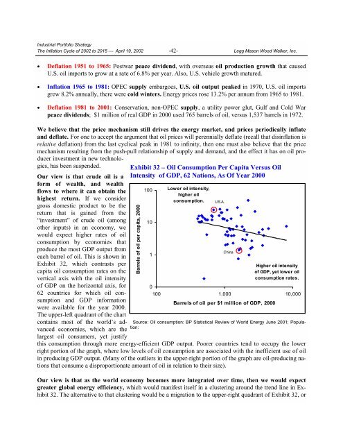
Our view is that crude oil is a<br />
form <strong>of</strong> wealth, and wealth<br />
flows <strong>to</strong> where it can obtain the<br />
highest return. If we consider<br />
gross domestic product <strong>to</strong> be the<br />
return that is gained from the<br />
“investment” <strong>of</strong> crude oil (among<br />
other inputs) in an economy, we<br />
would expect higher rates <strong>of</strong> oil<br />
consumption by economies that<br />
produce the most GDP output from<br />
each barrel <strong>of</strong> oil. This is shown in<br />
Exhibit 32, which contrasts per<br />
capita oil consumption rates on the<br />
vertical axis with the oil intensity<br />
<strong>of</strong> GDP on the horizontal axis, for<br />
62 countries for which oil consumption<br />
and GDP information<br />
were available for the year 2000.<br />
<strong>The</strong> upper-left quadrant <strong>of</strong> the chart<br />
contains most <strong>of</strong> the world’s advanced<br />
economies, which are the<br />
largest oil consumers, yet justify<br />
Exhibit 32 – Oil Consumption Per Capita Versus Oil<br />
Intensity <strong>of</strong> GDP, 62 Nations, As Of Year 2000<br />
Barrels <strong>of</strong> oil per capita, 2000<br />
100<br />
10<br />
1<br />
Lower oil intensity,<br />
higher oil<br />
consumption.<br />
Higher oil intensity<br />
<strong>of</strong> GDP, yet lower oil<br />
consumption rates.<br />
0<br />
100 1,000 10,000<br />
Barrels <strong>of</strong> oil per $1 million <strong>of</strong> GDP, 2000<br />
Source: Oil consumption: BP Statistical Review <strong>of</strong> World Energy June 2001; Population:<br />
this consumption through more energy-efficient GDP output. Poorer countries tend <strong>to</strong> occupy the lower<br />
right portion <strong>of</strong> the graph, where low levels <strong>of</strong> oil consumption are associated with the inefficient use <strong>of</strong> oil<br />
in producing GDP output. (Many <strong>of</strong> the outliers in the upper-right portion <strong>of</strong> the graph are oil-producing nations<br />
that consume a disproportionate amount <strong>of</strong> oil in relation <strong>to</strong> their size).<br />
Our view is that as the world economy becomes more integrated over time, then we would expect<br />
greater global energy efficiency, which would manifest itself in a clustering around the trend line in Exhibit<br />
32. <strong>The</strong> alternative <strong>to</strong> that clustering would be a migration <strong>to</strong> the upper-right quadrant <strong>of</strong> Exhibit 32, or<br />
U.S.A.<br />
China