User Guide and Manual for Project Canary
User Guide and Manual for Project Canary
User Guide and Manual for Project Canary

Create successful ePaper yourself
Turn your PDF publications into a flip-book with our unique Google optimized e-Paper software.
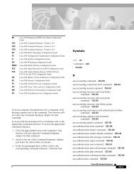
The CPU Profiles report page looks like this:<br />
On the CPU Profiles page, there is a submenu to the left. This submenu has a number of choices of reports<br />
which can be displayed in the web browser.<br />
There are two types of reports available from the submenu on the left. Reports labeled with the red icon denote<br />
a graphical report whereas the blue icon denotes a text report.<br />
Each report under the CPU Profiles menu has both a graph <strong>and</strong> a data file. The data file is needed to note<br />
where on each graph a particular machine is plotted. Machines are grouped by “Campus” as described earlier<br />
in this document <strong>and</strong> are plotted on the graph. Typically, groups of machines tend to be configured similarly<br />
so they will appear on the graph with similar CPU usage profiles.<br />
These graphs are useful mostly to compare different groups of machines against each other.<br />
The available reports under the CPU Profiles report submenu are:<br />
• automount png: This is a graph showing the CPU utilization of the automount(1M) daemon across<br />
all servers monitored by <strong>Project</strong> <strong>Canary</strong> software<br />
• automount dat: The raw data file used to generate the automount png graph<br />
• esd png: A graph showing the CPU utilization of the esd (SunMC) daemon across all servers being<br />
<strong>User</strong> <strong>Guide</strong> <strong>and</strong> <strong>Manual</strong> <strong>for</strong> <strong>Project</strong> <strong>Canary</strong> Page 105