Lunenburg Part 2 - Section 5 - Social Vulnerability - August 30.pdf
Lunenburg Part 2 - Section 5 - Social Vulnerability - August 30.pdf
Lunenburg Part 2 - Section 5 - Social Vulnerability - August 30.pdf

You also want an ePaper? Increase the reach of your titles
YUMPU automatically turns print PDFs into web optimized ePapers that Google loves.
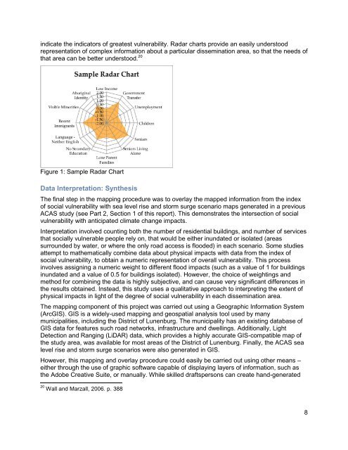
indicate the indicators of greatest vulnerability. Radar charts provide an easily understood<br />
representation of complex information about a particular dissemination area, so that the needs of<br />
that area can be better understood. 20<br />
Figure 1: Sample Radar Chart<br />
Data Interpretation: Synthesis<br />
The final step in the mapping procedure was to overlay the mapped information from the index<br />
of social vulnerability with sea level rise and storm surge scenario maps generated in a previous<br />
ACAS study (see <strong>Part</strong> 2, <strong>Section</strong> 1 of this report). This demonstrates the intersection of social<br />
vulnerability with anticipated climate change impacts.<br />
Interpretation involved counting both the number of residential buildings, and number of services<br />
that socially vulnerable people rely on, that would be either inundated or isolated (areas<br />
surrounded by water, or where the only road access is flooded) in each scenario. Some studies<br />
attempt to mathematically combine data about physical impacts with data from the index of<br />
social vulnerability, to obtain a numeric representation of overall vulnerability. This process<br />
involves assigning a numeric weight to different flood impacts (such as a value of 1 for buildings<br />
inundated and a value of 0.5 for buildings isolated). However, the choice of weightings and<br />
method for combining the data is highly subjective, and can cause very significant differences in<br />
the results obtained. Instead, this study uses a qualitative approach to interpreting the extent of<br />
physical impacts in light of the degree of social vulnerability in each dissemination area.<br />
The mapping component of this project was carried out using a Geographic Information System<br />
(ArcGIS). GIS is a widely-used mapping and geospatial analysis tool used by many<br />
municipalities, including the District of <strong>Lunenburg</strong>. The municipality has an existing database of<br />
GIS data for features such road networks, infrastructure and dwellings. Additionally, Light<br />
Detection and Ranging (LiDAR) data, which provides a highly accurate GIS-compatible map of<br />
the study area, was available for most areas of the District of <strong>Lunenburg</strong>. Finally, the ACAS sea<br />
level rise and storm surge scenarios were also generated in GIS.<br />
However, this mapping and overlay procedure could easily be carried out using other means –<br />
either through the use of graphic software capable of displaying layers of information, such as<br />
the Adobe Creative Suite, or manually. While skilled draftspersons can create hand-generated<br />
20 Wall and Marzall, 2006. p. 388<br />
8