

Volume 2–3.pdf
Volume 2–3.pdf
Volume 2–3.pdf

Create successful ePaper yourself
Turn your PDF publications into a flip-book with our unique Google optimized e-Paper software.
20<br />
the inner<br />
You asked me for "my best with<br />
letters" and I (77) hope that I<br />
have not yet done my best with<br />
letters....?<br />
I am most fascinated by the white<br />
inside the letter—and the shape<br />
of the white around, or between<br />
two letters—like with Egyptian<br />
faces where the serif embraces<br />
the white between the type.<br />
And so, for this text, I chose this<br />
particular Egyptianese (from<br />
Hamilton, Chicago, ca. 1860).<br />
This page comes from my "Experiments<br />
lypographica II; which I<br />
composed in October 1944, and<br />
was published by "Galeria der<br />
Spiegal, Cologne" in 1956<br />
and '58. WILL SANDBERG<br />
This is the shoe<br />
that trod the way<br />
as pretty as May<br />
that shod<br />
the mrtircrclamo way<br />
straight as a<br />
LiLIENLIMEILIlf0]<br />
principle<br />
I chose this piece because,<br />
although it was done about seven<br />
years ago, I would probably do it<br />
the same way today— even<br />
though I'm (inevitably) older and<br />
(supposedly) wiser.<br />
Playing with type is my fun &<br />
games and especially gratifying<br />
when it is the keystone supporting<br />
the idea and the design.<br />
Originally designed as a paper<br />
placemat for use in all the<br />
Pappagallo Shops, it was later<br />
adapted for newspaper ads. It<br />
was to be light & playful & evoke<br />
nostalgia by nursery rhyme &<br />
jingle. The type selection, frankly<br />
primer-ish yet feminine, to skip<br />
lightly in cadence from illustrated<br />
stop to stop until the last stop—<br />
the Shop where the shopper<br />
would stop to shop. REBA SOCHIS<br />
that shod the foot<br />
that led to the shop<br />
that sold the shoe<br />
the foot , that leads<br />
for all to follow<br />
swallow, to<br />
MY BEST WITH LETTERS<br />
If a father is questioned about<br />
which of his kids he likes best, he<br />
comes in conflict with himself,<br />
with the mother and with his<br />
children. They are all pretty or<br />
handsome and all useful in this<br />
world. Normally, he would say,<br />
I like them all—light or heavy—;<br />
but if he must make a definite<br />
decision for only one, you can<br />
well imagine the difficult situation<br />
he's in. Well, I will whisper in your<br />
ear: I like, of all my kids, "Optima':<br />
especially. She has an elegant<br />
face, a body well proportioned<br />
like a beauty-queen, and is a star<br />
since birth in 1954 in Frankfurt,<br />
Germany. Now she is 20 years<br />
old. The best age! Of course you<br />
always like your babies above all.<br />
This is natural, for they are so<br />
charming, untouched, just to kiss.<br />
I have a new baby named "Zapf-<br />
Roman:' born, 1974, in New York<br />
City on the East Side and baptized<br />
with Atlantic water. I hope I can<br />
show all my many friends in the<br />
typographic world a picture of<br />
this new baby "Zapf-Roman" very<br />
soon. HERMANN ZAPF<br />
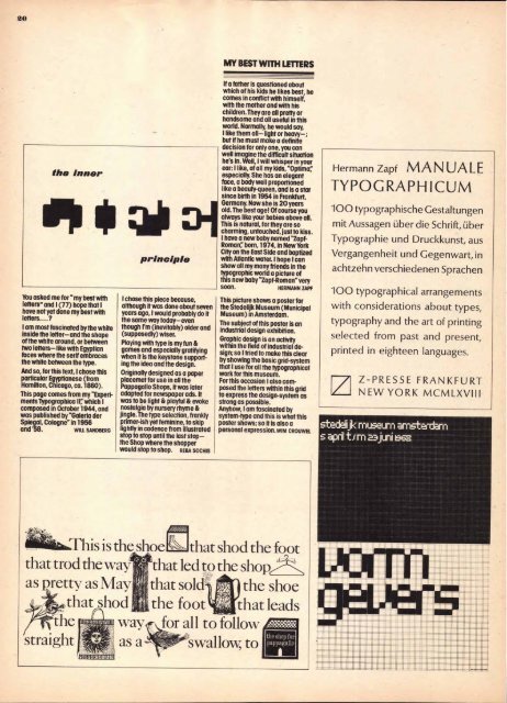
This picture shows a poster for<br />
the Stedelijk Museum (Municipal<br />
Museum) in Amsterdam.<br />
The subject of this poster is an<br />
industrial design exhibition.<br />
Graphic design is an activity<br />
within the field of industrial design;<br />
so I tried to make this clear<br />
by showing the basic grid-system<br />
that I use for all the typographical<br />
work for this museum.<br />
For this occasion I also composed<br />
the letters within this grid<br />
to express the design-system as<br />
strong as possible.<br />
Anyhow, I am fascinated by<br />
system-type and this is what this<br />
poster shows; so it is also a<br />
personal expression.wIM CROUWEL<br />
the shop for<br />
pappagallo<br />
I<br />
Hermann Zapf MANUALE<br />
TYPOGRAPHICUM<br />
100 typographische Gestaltungen<br />
mit Aussagen Ober die Schrift, Ober<br />
Typographie und Druckkunst, aus<br />
Vergangenheit und Gegenwart, in<br />
achtzehn verschiedenen Sprachen<br />
100 typographical arrangements<br />
with considerations about types,<br />
typography and the art of printing<br />
selected from past and present,<br />
printed in eighteen languages.<br />
Z-PRESSE FRANKFURT<br />
NEW YORK MCMLXVIII<br />
stedeli jk museum amsterdam<br />
s april tsm juni 196s<br />
■omommi■ ■ i■ i<br />
■■I NJ Mt Fil<br />
Et NO ■■■■■p ■■m<br />
Itop op upriptomisiii<br />
NE ER ow oppitttlitm<br />
I■i r an tilEmmom<br />
t smmotot itemommommilm<br />
No ■mm 1I limo<br />
iii! tilt ii ■i dili<br />
poi to ■i■■m<br />
■in!<br />
1) Ui Mali ■■■ MINIM<br />
lompottim onowneummomm..<br />
irmio ■it■■r■oo■■t■■pttspr■mmum<br />
11:111111111111111:111511111111111<br />
0115.11..NIMILI■6. .<br />
■119641111'11 1111 IN Mgt "'"1111111111111111<br />
! !WM! ._


