

Volume 2–3.pdf
Volume 2–3.pdf
Volume 2–3.pdf

You also want an ePaper? Increase the reach of your titles
YUMPU automatically turns print PDFs into web optimized ePapers that Google loves.
3<br />
6<br />
Simplified Keyboarding and<br />
the Ability to Re-format<br />
Time was when there were only two<br />
stages in machine typesetting— keyboarding<br />
the copy and setting the<br />
type. The first completely controlled<br />
the second, and all typographic decisions<br />
had to be made prior to keyboarding.<br />
Not so any more. Now,<br />
keyboarding is only a preliminary<br />
step, performed before the real typographic<br />
work begins. Shown here<br />
in illustration 3 is how the freeing<br />
of typographic formatting from<br />
initial keyboarding can enrich typographic<br />
experimentation.<br />
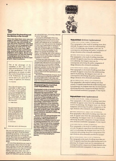
One of the advantages of the<br />
unjustified, or idiot tape, is that<br />
copy can be keyboarded in advance<br />
of type specifications. If the type<br />
specifications are already included,<br />
they can be changed before the type<br />
is set. Furthermore, the same tape<br />
can be used to set a given job in a<br />
variety of typefaces and measures.<br />
10/12 PALATINO<br />
One of the advantages of the<br />
unjustified, or idiot tape, is<br />
that copy can be keyboarded<br />
in advance of type specifications.<br />
If the type specifications<br />
are already included, they can<br />
be changed bef6re the type is<br />
set. Furthermore, the same<br />
tape can be used to set a given<br />
job in a variety of typefaces<br />
and measures.<br />
9/11 TIMES ROMAN<br />
One of the advantages of the<br />
unjustified, or idiot tape is that<br />
copy can be keyboarded in advance<br />
of type specifications.<br />
If the type specifications are<br />
already included, they can be<br />
changed before the type is set.<br />
Furthermore, the same tape<br />
can be used to set a given job<br />
in a variety of typefaces and<br />
measures.<br />
8/10 HELVETICA<br />
Same tape used to set three jobs.<br />
The non-counting keyboard, which is<br />
finding wide use in computer-based<br />
typesetting systems, is less expensive<br />
and simpler than the counting keyboard,<br />
requiring only an operator with<br />
the ability to type accurately at high<br />
speeds rather than with typographic<br />
skills.<br />
All end-of-line decisions are made by<br />
the computer rather than by the keyboard<br />
operator. All that the operator is<br />
concerned with is the copy and formatting<br />
instructions such as line length,<br />
leading, type style (italic, bold, etc.),<br />
and paragraph indents. As the copy is<br />
typed, the keyboard operator produces<br />
an unjustified tape, commonly referred<br />
to as an "idiot tape!'<br />
Among the advantages of the noncounting<br />
keyboard is that some of the<br />
formatting instructions such as line<br />
length and leading can be overridden at<br />
the photo-unit. This permits the designer<br />
to have copy keyboarded in advance of<br />
type specifications; that is, available<br />
copy can be keyboarded as it is received,<br />
and when the job is complete the designer<br />
can specify the typeface, line<br />
length, and leading. Also, if the operator<br />
wishes, the same tape can be used to set<br />
the same job in any number of different<br />
typefaces or measures.<br />
Perhaps the major advantage of the<br />
non-counting keyboard is speed. It is estimated<br />
that one-third of a counting keyboard<br />
operator's time is spent making<br />
end-of-line decisions. The non-counting<br />
keyboard operator, on the other hand, is<br />
free to type continuous copy at maximum<br />
speed, leaving it up to the computer<br />
to determine the hyphenation and<br />
justification.<br />
Because of the simplicity of input, there<br />
are more non-counting keyboards than<br />
counting keyboards in use today, and<br />
there is every indication that this will remain<br />
the direction in phototypesetting.<br />
Hyphenating the Justified<br />
(and Unjustified) Line<br />
Hyphenated words at the ends of lines<br />
exist because of word spacing and<br />
letterspacing requirements —the<br />
avoidance of unseemly spacing which<br />
would be required if words could not<br />
be broken at line endings to get an<br />
optimum number of characters into<br />
the line. With previous typesetting<br />
technology, word breaks were the<br />
sole responsibility of the keyboard<br />
operator; with the new systems, the<br />
machine often takes over this function,<br />
hyphenating words according to<br />
computer program logic. This affords<br />
the typographer both great opportunity<br />
and great hazards in achieving<br />
optimum spacing.<br />
Shown here are some principles and<br />
examples of computer-directed hyphenations.<br />
Most people think of<br />
hyphenation as being primarily used<br />
in setting justified text, but as some<br />
of these illustrations show, hyphenation<br />
has a role to play in the tasteful<br />
setting of unjustified copy as well.<br />
Far from being just a mechanical<br />
necessity, automatic hyphenation<br />
capability in a modern phototypesetting<br />
machine can play an important<br />
part in achieving typographic<br />
quality.<br />
Unjustified—(without hyphenations)<br />
1 NORMAL WORD SPACING—NORMAL LETTERSPACING<br />
Fine typography xs the result of nothing more than<br />
attitude. Its appeal comes from the understanding<br />
used in its planning; the designer must care. In<br />
contemporary advertising the perfect integration of<br />
design elements often demands unorthodox<br />
1A NORMAL WORD SPACING—MINUS 112 UNIT LETTERSPACING<br />
Fine typography is the result of nothing morthan<br />
attitude. Its appeal comes from the understanding used<br />
in its planning; the designer must care. In<br />
contemporary advertising the perfect integration of<br />
design elements often demands unorthodox<br />
2 TIGHT WORD SPACING—NORMAL LETTERSPACING<br />
Fine typography is the result of nothing more than<br />
attitude. Its appeal comes from the understanding<br />
used in its planning; the designer must care. In<br />
contemporary advertising the perfect integration of<br />
design elements often demands unorthodox<br />
2A TIGHT WORD SPACING—MINUS 1/2 UNIT LETTERSPACING<br />
Fine typography is the result of nothing more than<br />
attitude. Its appeal comes from the understanding used<br />
in its planning; the designer must care. In contemporary<br />
advertising the perfect integration of design elements<br />
often demands unorthodox typography. It may require<br />
Unjustified—(with hyphenations)<br />
3 NORMAL WORD SPACING—NORMAL LETTERSPACING<br />
Fine typography is the result of nothing more than<br />
attitude. Its appeal comes from the understanding<br />
used in its planning; the designer must care. In contemporary<br />
advertising the perfect integration of design<br />
elements often demands unorthodox typogra-<br />
3A NORMAL WORD SPACING—MINUS 1/2 UNIT LETTERSPACING<br />
Fine typography is the result of nothing more than attitude.<br />
Its appeal comes from the understanding used in<br />
its planning; the designer must care. In contemporary<br />
advertising the perfect integration of design elements<br />
often demands unorthodox typography. It may require<br />
4 TIGHT WORD SPACING—NORMAL LETTERSPACING<br />
Fine typography is the result of nothing more than<br />
attitude. Its appeal comes from the understanding<br />
used in its planning; the designer must care. In contemporary<br />
advertising the perfect integration of design<br />
elements often demands unorthodox typogra-<br />
4A TIGHT WORD SPACING—MINUS I/2 UNIT LETTERSPACING<br />
Fine typography is the result of nothing more than attitude.<br />
Its appeal comes from the understanding used in its<br />
planning; the designer must care. In contemporary advertising<br />
the perfect integration of design elements often<br />
demands unorthodox typography. It may require using<br />
' Copyright 1973 by TypoGraphics Communications. Inc.


