

Volume 2–3.pdf
Volume 2–3.pdf
Volume 2–3.pdf

You also want an ePaper? Increase the reach of your titles
YUMPU automatically turns print PDFs into web optimized ePapers that Google loves.
space that can be removed from between<br />
letters, shown in units or fractions of<br />
an inch. This category refers to overall<br />
minus letterspacing as compared with<br />
selective kerning (see item 4), which<br />
involves only certain letter combinations.<br />
Minus letterspacing not only affects<br />
the number of characters that can<br />
be set to a given measure but also the<br />
"color" of the setting the more characters<br />
set per line the blacker, or denser,<br />
the setting will appear.<br />
Note: when setting type with minus letterspa,cing,<br />
have a type specimen set<br />
that shows enough copy to enable you to<br />
properly judge the effect. You may find<br />
that the letterspacing is improved between<br />
straight letters, such as i's and l's,<br />
but that the round letters, such as o's<br />
and c's, tend to overlap. Good words to<br />
include in any sample setting are "hillbilly"<br />
and "schoolbook:' because they<br />
show the effect of minus letterspacing on<br />
both straight and round letters.<br />
4. Kerning. The ability to selectively reduce<br />
the letterspacing between certain<br />
letters while the rest of the setting remains<br />
the same. Shown in units. Usually<br />
used between certain letter combinations,<br />
such as Ye, Yo, Te , LY, and YA,<br />
that are generally improved by the deletion<br />
of one or two units of space. The<br />
ability to kern is particularly desirable<br />
when setting display type.<br />
5. Typeface Mixing Within a Line.<br />
The ability to mix a variety of typefaces<br />
in the same line. Note: this may or may<br />
not be an automatic change. On some<br />
machines the change is manual.<br />
6. Type Size Mixing Within a Line.<br />
The ability to mix a variety of type sizes in<br />
the same line. On some machines this<br />
change is by keyboard command, on<br />
others it is manual<br />
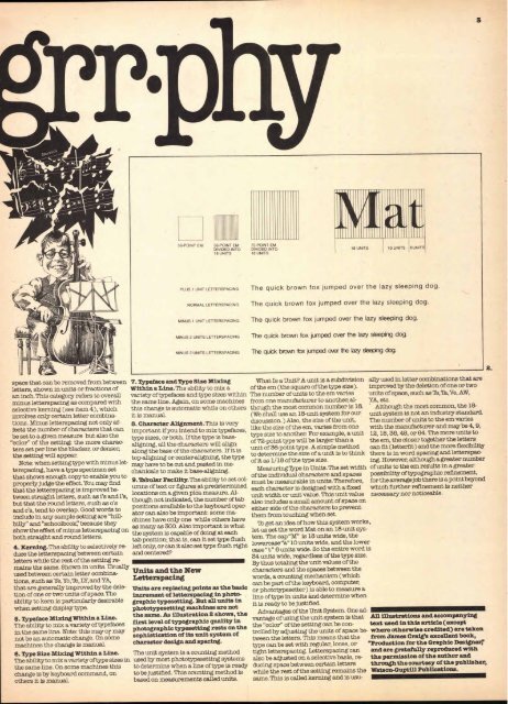
36-POINT EM 36 POINT EM<br />
D VIDEO INTO<br />
18 UNITS<br />
PLUS 1 UNIT LETTERSPACING<br />
NORMAL LETTERSPACING<br />
MINUS 1 UNIT LETTERSPACING<br />
MINUS 2 UNITS LETTERSPACING<br />
MINUS 3 UNITS LETTERSPACING<br />
72 POINT EM<br />
DIVIDED INTO<br />
18 UNITS<br />
18 UNITS 10 UNITS 6 UNITS<br />
The quick brown fox jumped over the lazy sleeping dog.<br />
The quick brown fox jumped over the lazy sleeping dog.<br />
The quick brown fox jumped over the lazy sleeping dog.<br />
The quick brown fox jumped over the lazy sleeping dog.<br />
The quick brown fox jumped over the lazy sleeping dog.<br />
7. Typeface and Type Size Mixing What Is a Unit? A unit is a subdivision ally used in letter combinations that are<br />
Within a Line. The ability to mix a of the em (the square of the type size). improved by the deletion of one or two<br />
variety of typefaces and type sizes within The number of units to the em varies units of space, such as Te,Ta,Ve, AW,<br />
the same line Again, on some machines from one manufacturer to another, al- Y A, etc.<br />
this change is automatic while on others though the most common number is 18. Although the most common, the 18-<br />
it is manual.<br />
(We shall use an 18-unit system for our unit system is not an industry standard.<br />
The number of units to the em varies<br />
8. Character Alignment. This is very<br />
discussion.) Also, the size of the unit,<br />
like the size of the em, varies from one with the manufacturer and may be 4, 9,<br />
important if you intend to mix typefaces,<br />
type size to another. For example, a unit 12, 18, 36, 48, or 64. The more units to<br />
type sizes, or both. If the type is baseof<br />
72-point type will be larger than a the em, the closer together the letters<br />
aligning, the e f characters ear bs il<br />
unit of 36-point type. A simple method can fit (letterfit) and the more flexibility<br />
Ttv rarang b he , iaarblas<br />
: of the h will ity If it is<br />
to determine the size of a unit is to think there is in word spacing and letterspac-<br />
top-aligning or center-aligning, r- the type<br />
of it as 1/18 of the type size.<br />
ing. However, although a greater number<br />
may have to be cut and pasted in me-<br />
of units to the em results in a greater<br />
chanicals to make it base-aligning. as<br />
Measuring Type in Units. The set width<br />
of the individual characters and spaces possibility of typographic refinement,<br />
to set col- must be measurable in units. Therefore, for the average job there is a point beyond<br />
umns of text or figures at predetermined each character is designed with a fixed which further refinement is neither<br />
locations on a given pica measure. Al- unit width or unit value. This unit value necessary nor noticeable.<br />
though not indicated, the number of tab also includes a small amount of space on<br />
positions available to the keyboard oper- either side of the characters to prevent<br />
ator can also be important: some ma- them from touching when set.<br />
chines have only one while others have<br />
'lb get an idea of how this system works,<br />
as many as 300. Also important is what<br />
let us set the word Mat on an 18-unit sys-<br />
the system is capable of doing at each<br />
tem. The cap "M" is 18 units wide, the<br />
tab position; that is, can it set type flush<br />
lowercase"a" 10 units wide, and the lower<br />
left only, or can it also set type flush right<br />
case " t" 6 units wide. So the entire word is<br />
and centered?<br />
34 units wide, regardless of the type size.<br />
By thus totaling the unit values of the<br />
Units and the New<br />
characters and the spaces between the<br />
Letterspacing<br />
words, a counting mechanism (which<br />
can be part of the keyboard, computer,<br />
Units are replacing points as the basic or phototypesetter) is able to measure a<br />
increment of letterspacing in photo- line of type in units and determine when<br />
graphic typesetting. But all units in it is ready to be justified.<br />
phototypesetting machines are not<br />
Advantages of the Unit System. One adthe<br />
same. As illustration 2 shows, the<br />
vantage of using the unit system is that All illustrations and accompanying<br />
first level of typographic quality in<br />
the "color" of the setting can be con- text used in this article (except<br />
photographic typesetting rests on the<br />
trolled by adjusting the units of space be- where otherwise credited) are taken<br />
sophistication of its unit system of<br />
tween the letters. This means that the from James Craig's excellent book,<br />
character design and spacing.<br />
type can be set with regular, loose, or "Production for the Graphic Designer;<br />
The unit system is a counting method tight letterspacing. Letterspacing can and are gratefully reproduced with<br />
used by most phototypesetting systems also be adjusted on a selective basis, re- the permission of the author and<br />
to determine when a line of type is ready diming space between certain letters through the courtesy of the publisher,<br />
to be justified. This counting method is while the rest of the setting remains the Watson-Guptill Publications.<br />
based on measurements called units. same. This is called kerning and is usu-<br />
2


