

Volume 2–3.pdf
Volume 2–3.pdf
Volume 2–3.pdf

Create successful ePaper yourself
Turn your PDF publications into a flip-book with our unique Google optimized e-Paper software.
4<br />
The gigo principle!<br />
Garbage in typography?<br />
Paul Doebler sounds an alarm<br />
that should be heeded seriously<br />
for, if the new technologies in<br />
typography are not used effectively<br />
and imaginatively, there<br />
probably will be chaos in the<br />
"word processed" future of typography.<br />
Quality standards and taste<br />
levels must be established first<br />
for the new computer "marvels"<br />
if they are ever to do the work of<br />
typography. Economics and efficiency<br />
factors are important<br />
considerations, but they cannot<br />
hold priority over qiiality if typography<br />
is to be the final goal.<br />
If this is to be otherwise, then let<br />
these "marvels" do the work of<br />
"typesetting" or "type-printouts"<br />
and let this work be called by<br />
these names. But without a concern<br />
for art and aesthetics, let<br />
it not be called "typography"<br />
Unfortunately for most of us<br />
who work with typography today,<br />
the major problems are ones of<br />
language and knowledge. We lack<br />
control of these and are at a disadvantage.<br />
Metal typesetting<br />
machines are being replaced by<br />
phototypesetting machines. In<br />
letterspacing, the point system is<br />
being replaced by the unit system.<br />
Most people know what a point<br />
looks like, but how many know<br />
what a unit looks like?<br />
This article, therefore, will<br />
attempt to draw a simple line<br />
from input to output — with some<br />
stop-offs in between — in an effort<br />
to fill in some of the gaps that<br />
exist in the basic knowledge and<br />
language that are required to understand<br />
today's new typographic<br />
technologies.<br />
It is also intended to suggest to<br />
the reader some of the enormous<br />
opportunities and challenges<br />
that await the creative user of<br />
the new typographic technologies.<br />
It is too brief to be called an<br />
article. In fact, it is only an introduction.<br />
But it is a start, nevertheless,<br />
in U&lc's educational<br />
efforts to ward off the gigo<br />
possibility. — AARON BURNS<br />
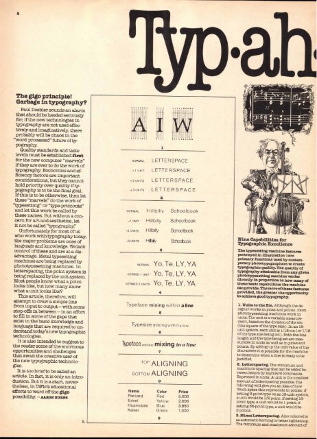
1.<br />
NORMAL LETTERSPACE<br />
+ 1 UNIT LETTERSPACE<br />
+2 UNITS LETTERSPACE<br />
1<br />
+3 UNITS LETTERSPACE<br />
2<br />
NORMAL Hillbilly Schoolbook<br />
-1 UNIT Hillbilly Schoolbook<br />
-2 UNITS Hillbilly Schoolbook<br />
-3 UNITS Hilbiy Sdloobock<br />
3<br />
NORMAL Yo, Te, LY, YA<br />
KERNED 1 UNIT Yo, Te, LY, YA<br />
KERNED 2 UNITS Yo, Te, LY, YA<br />
4<br />
Typeface mixing within a line<br />
5<br />
Typesize mixing within a line<br />
Typeface and size mixing in a line<br />
6<br />
7<br />
TOP ALIGNING<br />
BOTTOM ALIGNING<br />
Name<br />
Packard<br />
Edsel<br />
Hupmobile<br />
Kaiser<br />
a<br />
Color<br />
Red<br />
Yellow<br />
Blue<br />
Green<br />
9<br />
Price<br />
5,000<br />
2,000<br />
3,950<br />
1,000<br />
111,111,:a1=11■11■11111111711 ■1=3.<br />
WAMIIMIJIMMIN11017/512.11MINIM"<br />
IIIMIP911E<br />
111111IMMILM61■161 NV<br />
Nine Capabilities for<br />
Typographic Excellence<br />
The typesetting machine features<br />
portrayed in illustration 1 are<br />
primary functions used by contemporary<br />
phototypographers to create<br />
typographic quality. The quality of<br />
typography attainable from any given<br />
phototypesetting machine varies<br />
directly in proportion to how many of<br />
these basic capabilities the machine<br />
canprovide. The more of these features<br />
provided, the greater the opportunity<br />
to achieve good typography.<br />
1. Units to the Em. Although the designer<br />
works in picas and points, most<br />
phototypesetting machines work in<br />
units. The unit is a variable measurement,<br />
based on the division of the em<br />
(the square of the type size). In an 18unit<br />
system, each unit is 1/18 em (or 1/18<br />
of the type size being set). Both the line<br />
length and the type being set are measurable<br />
in units as well as in picas and<br />
points. By adding up the unit value of the<br />
characters it is possible for the machine<br />
to determine when a line is ready to be<br />
justified.<br />
2. Letterspacing. The minimum and<br />
maximum spacing that can be added between<br />
letters by keyboard commands.<br />
Expressed in units. A unit is the smallest<br />
amount of letterspacing possible. The<br />
following will give you an idea of how<br />
much space this represents in points: if<br />
setting 9-point type on an 18-unit system,<br />
a unit would be 1/2 point; if setting 18point<br />
type, a unit would be 1 point; if<br />
setting 36-point type, a unit would be<br />
2 points.<br />
3. Minus Letterspacing. Also referred to<br />
as automatic kerning or letter tightening.<br />
The minimum and maximum amount of


