

Volume 12–4 (Low Res).pdf - U&lc
Volume 12–4 (Low Res).pdf - U&lc
Volume 12–4 (Low Res).pdf - U&lc

You also want an ePaper? Increase the reach of your titles
YUMPU automatically turns print PDFs into web optimized ePapers that Google loves.
16<br />
reader than it does today. Particular styles<br />
of type were reserved for particular<br />
groups of readers. Aldus was not so<br />
much trying to save space, as appeal to<br />
the educated, worldly and wealthy.<br />
Aldus italic evolved from a<br />
popular writing style of the educated. Its<br />
heritage can be traced back to Niccolo<br />
de Niccoli, an Italian scholar of the early<br />
15th century. De Niccoli started to<br />
oblique and add flourish to his letters<br />
when, it is said, "he wished to write in a<br />
faster, more relaxed fashion than usual."<br />
By mid-century other scholars began to<br />
imitate his writing style, and by the late<br />
1400s italic became the official writing<br />
style of the learned and professional<br />
scribes of southern Italy. In fact, it came<br />
to be called cancellaresca because of the<br />
amount of work done in this hand for<br />
the city chancelleries.<br />
The cursive style of writing had<br />
been developed by the same scholars<br />
and learned government officials for<br />
whom Aldus created his books. In adapt-<br />
ing it to print, he and Griffo were making<br />
their books more comfortable for their<br />
intended audience. Today, we would call<br />
this creative marketing. The important<br />
thing is that Aldus took a somewhat<br />
exclusive writing style (almost an art<br />
form) and turned it into a typeface—a<br />
product that would appeal to, and benefit,<br />
a growing and eager audience.<br />
Like any astute business person,<br />
Aldus was very aware of the potential<br />
value of this product. And in an effort to<br />
defend his exclusive right to use it, he<br />
sought the first known privileges on an<br />
entire type style. This was breaking new<br />
ground; previously only specific titles<br />
were protected, but Aldus had friends in<br />
high places. In 1502, the Venetian senate<br />
granted his italics official protection. Not<br />
satisfied, Aldus sought additional, and<br />
what he believed was maximum, security<br />
from theft. He even had his types<br />
protected by papal decree. Aldus was<br />
one of the best protected publishers and<br />
type developers of his time, and perhaps<br />
for all time.<br />
Unfortunately this was to little<br />
avail. Aldus' italics were almost immediately<br />
copied. First by Griffo, who felt that<br />
the design was, after all, his; and later<br />
by contemporary Italian and French<br />
printers. The Italians called the design<br />
`Aldino," at least referring to its originator.<br />
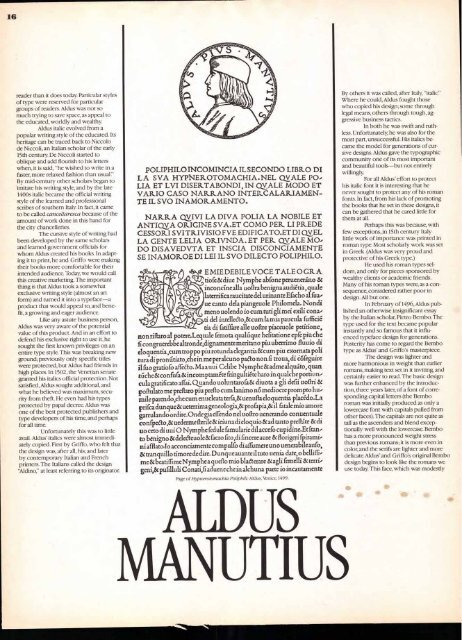
POLIPHILO INCOMINCIA IL SECONDO LIBR.0 DI<br />
LA SVA HYPNEROTOMACHIA . NEL 0,VALE PO ,<br />
LIA ET LVI DISER.TABONDI , IN QYALE MODO ET<br />
VAR.I0 CAS 0 NAR.R.ANO INTERCALARIAMEN-<br />
TE IL SVO INAMOR.AMENTO.<br />
NARRA czynn LA DIVA POLIA LA NOBILE ET<br />
ANTIQVA ORIGINE S VA,ET COMO PER LI NUDE<br />
CESSORI SVI TR.IVISIO FVE EDIFICATO.ET DI QV EL<br />
LA GENTE LELIA ORIVNDA . ET PER QyALE MO ,<br />
DO DISAVEDVTA ET INS CIA DISCONCIAMENTE<br />
SE INAMOR.OE DI LEI IL SVO DILECTO POLIPHILO.<br />
c EMIE DEBILE VOCE TALE 0 GR.A<br />
tiofe 8c diue Nymphe abfone peruenera'no &<br />
inconcine alla uoltra benigna audietia , quale<br />
laterrifica raucitate del urinante Efacho al fua ,<br />
tic canto dela piangeuole Philomela. Nondi<br />
meno uolendo io cum tuti gli mei exili co na,<br />
ti del intelleeto,& cum la mia paucula fu ffici6<br />
tia di fatifGre alle uoflre piaceuole petitions,<br />
non rift= al potere.Lequale femota qualaque hefitationc epfepiu che<br />
fi co ngruerebbe altro nde,dignamente meritan.o piu uberrimo fluuio di<br />
eloquentia,cumtroppo piu rotunda elegantia &cum piu exornata poli<br />
tura di pro n fitiato,che in me per a<strong>lc</strong>uno pa6to non fi troua, di e6feguire<br />
11 fuo gratiofo afl'eeto.Maauui Celibe Nymphe & adme alquato, quan.<br />
niche& co nfufa & incomptamete fringulti6te haro in qu a<strong>lc</strong>h e portiun'<br />
culagratificato affai. Quando uoluntarofa 8c diuota a gli defii uoflri &<br />
po flulato me preflaro piu preflo cum lanimo no mediocre prompt.) hu'<br />
mile parendo,che cum enucleataterfa,& uenuftaeloquentia plac'eclo.La<br />
prifca dung ue 8c ueterrima geneologia,& pro fapia,8c it fatale mio amore<br />
garrulando ordire.Onde giaeffendo nel uottro uenerando conuentu ale<br />
co nfpcdo,8c uedermeoeriIs & ieiuna di eloquio & ad tanto preftSte & di<br />
uo ceto di uui 0 Nymphe fed ule famularie dil accefo cupid ine.Et Iran,<br />
8c facro fito,di fincereaure 8c fiorigeri fpirami'<br />
to benign° & delefteuole<br />
ni affl ato.io acconciamente co mpulfo di afru mere uno uenerabileaufo,<br />
8c tramp& timore de dire. D unqueauanteiituto uenia date, o bellifiv<br />
me 8c bead ffi me Nymphe a queflo mio blgterare & agli femelli & terri ,<br />
geni,8c pufilluli Co nati,fi ad uenc che in a<strong>lc</strong>h una parte io incautamente<br />
Page of Hypnerotomacbia Pollphili. Aldus, Venice,1499<br />
ALDUS<br />
MANUTIUS<br />
By others it was called, after Italy, "italic"<br />
Where he could, Aldus fought those<br />
who copied his design; some through<br />
legal means, others through tough, aggressive<br />
business tactics.<br />
In both he was swift and ruthless.<br />
Unfortunately, he was also for the<br />
most part, unsuccessful. His italics became<br />
the model for generations of cursive<br />
designs. Aldus gave the typographic<br />
community one of its most important<br />
and beautiful tools—but not entirely<br />
willingly.<br />
For all Aldus' effort to protect<br />
his italic font it is interesting that he<br />
never sought to protect any of his roman<br />
fonts. In fact, from his lack of promoting<br />
the books that he set in these designs, it<br />
can be gathered that he cared little for<br />
them at all.<br />
Perhaps this was because, with<br />
few exceptions, in 15th century Italy<br />
little work of importance was printed in<br />
roman type. Most scholarly work was set<br />
in Greek. (Aldus was very proud and<br />
protective of his Greek type.)<br />
He used his roman types seldom,<br />
and only for pieces sponsored by<br />
wealthy clients or academic friends.<br />
Many of his roman types were, as a consequence,<br />
considered rather poor in<br />
design. All but one.<br />
In February of 1496, Aldus published<br />
an otherwise insignificant essay<br />
by the Italian scholar, Pietro Bembo. The<br />
type used for the text became popular<br />
instantly and so famous that it influenced<br />
typeface design for generations.<br />
Posterity has come to regard the Bembo<br />
type as Aldus' and Griffo's masterpiece.<br />
The design was lighter and<br />
more harmonious in weight than earlier<br />
romans, making text set in it inviting, and<br />
certainly easier to read. The basic design<br />
was further enhanced by the introduction,<br />
three years later, of a font of corresponding<br />
capital letters (the Bembo<br />
roman was initially produced as only a<br />
lowercase font with capitals pulled from<br />
other faces). The capitals are not quite as<br />
tall as the ascenders and blend exceptionally<br />
well with the lowercase. Bembo<br />
has a more pronounced weight stress<br />
than previous romans; it is more even in<br />
color, and the serifs are lighter and more<br />
delicate. Aldus' and Griffo's original Bembo<br />
design begins to look like the romans we<br />
use today. This face, which was modestly


