

Volume 12–4 (Low Res).pdf - U&lc
Volume 12–4 (Low Res).pdf - U&lc
Volume 12–4 (Low Res).pdf - U&lc

Create successful ePaper yourself
Turn your PDF publications into a flip-book with our unique Google optimized e-Paper software.
ITC AMERICAN TYPEWRITER<br />
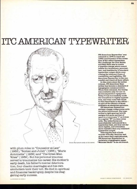
with plum roles in "Counselor at Law"<br />
(1933), "Romeo and Juliet" (1936), "Marie<br />
Antoinette" (1938) and "The Great Man<br />
Votes" (1939). But his personal traumas<br />
served to traumatize his career. His mother's<br />
early death, his father's mental deterioration,<br />
four chaotic marriages and his own<br />
a<strong>lc</strong>oholism took their toll. He died in spiritual<br />
and financial bankruptcy, despite his staggering<br />
early success.<br />
ILLUSTRATIONS BY JOE CIARDIELLO<br />
ITC American Typewriter' was<br />
released in 1974 to mark the<br />
100th anniversary of the invention<br />
of the office typewriter.<br />
The challenge for Joel Kaden<br />
and Tony Stan was to create<br />
a typeface design which would<br />
retain the immediacy, personalism,<br />
and familiarity of standard<br />
typewriter output while overcoming<br />
its inherent flaws of<br />
readability and legibility. ITC<br />
American Typewriter is the successful<br />
end result of their effort.<br />
In the years since its initial<br />
release, ITC American Typewriter<br />
has become a standard of<br />
typographic communication.<br />
When first released, the family<br />
was available only for use on<br />
photocomposition equipment.<br />
Today it has successfully made<br />
the transition to digital typesetters,<br />
and even come full circle<br />
to find itself back in the office—<br />
as part of the library of faces<br />
available on electronic printers.<br />
ITC American Typewriter<br />
strikes a happy compromise with<br />
its office forerunner. The typewriter's<br />
rigid spacing (which<br />
assigns the same amount of<br />
space to a lowercase "i" as it does<br />
to a capital "W") is done away<br />
with. The letterforms are<br />
unmistakably influenced by a<br />
typewriter font, yet they are far<br />
more legible, and ultimately<br />
more readable than any standard<br />
typewriter output.<br />
Offering the best of both<br />
worlds: friendly, familiar and<br />
at the same time sophisticated,<br />
ITC American Typewriter is<br />
certainly a typographic asset.<br />
"We<strong>lc</strong>ome Back!" to an old friend.<br />
HEADLINE: ITC AMERICAN TYPEWRITER MEDIUM<br />
TEXT. MEDIUM. BOLD<br />
31


