

Volume 12–4 (Low Res).pdf - U&lc
Volume 12–4 (Low Res).pdf - U&lc
Volume 12–4 (Low Res).pdf - U&lc

You also want an ePaper? Increase the reach of your titles
YUMPU automatically turns print PDFs into web optimized ePapers that Google loves.
sARy BY<br />
Ragged (Unjustified)<br />
The setting of text type with an irregular<br />
appearance on either one or both<br />
margins, such as ragged right or ragged<br />
left. In ragged setting, interword spaces<br />
are not varied for justification.Ragged<br />
setting is the opposite of flush setting in<br />
which even margins are achieved on<br />
both sides of the text.<br />
Roman<br />
Name often applied to the Latin alphabet<br />
as it is used in English and European<br />
languages. Also used to identify<br />
upright, as opposed to italic or cursive,<br />
alphabet designs.<br />
Roman Numerals<br />
Roman letters used as numerals until<br />
the tenth century A.D.: l=1, V= 5, X=10,<br />
L=50,C=100,D= 500, and M=1,000.<br />
Rule<br />
A typographic element in the form of a<br />
line; used for a variety of typographic<br />
purposes.<br />
Runaround<br />
Type set to fit around an illustration,<br />
box or irregular shape.<br />
Running Head<br />
A book title or chapter head repeated at<br />
the top of every page in a book.<br />
Sans Serif<br />
Typestyles without serifs.<br />
Script<br />
Type designed to suggest handwriting<br />
or writing with a brush.<br />
Serif<br />
A line crossing the main strokes of a<br />
character. There are many varieties.<br />
Shoulder<br />
The curved stroke of the "h," "m," and "n:<br />
Small Caps<br />
Letters the approximate size of lowercase<br />
x-height characters, but in the<br />
design of the capitals. Normally available<br />
in text typeface designs only.<br />
Spine<br />
The main curved stroke of a lowercase<br />
or capital "S."<br />
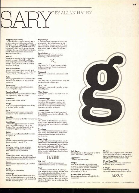
Spur<br />
A small projection off a main stroke;<br />
found on many capital "G"s.<br />
Stem<br />
A straight vertical stroke (or main<br />
straight diagonal stroke in a letter<br />
which has no vertical strokes).<br />
Stet<br />
Proofreaders' mark indicating copy<br />
marked for correction should stand as it<br />
was before the correction was marked.<br />
Stress<br />
The direction of thickening in a curved<br />
stroke.<br />
Stroke<br />
A straight or curved line.<br />
Subscript<br />
A small symbol, numeral or letter that<br />
prints below or below and to the side of<br />
another character, as in H 20. Also called<br />
inferior letter or figure.<br />
Superscript<br />
A small symbol, numeral or letter that<br />
prints above the x-height and to the<br />
side of another character, as in 3 4. Also<br />
called superior letter or figure, particularly<br />
when used to refer to a citation<br />
source.<br />
Swash Letters<br />
Characters with fancy flourishes<br />
replacing a terminal or serif.<br />
Tail<br />
The part of a "Q" which makes it look<br />
different than an "0," or the diagonal<br />
stroke of the "R."<br />
Terminal<br />
The end of a stroke not terminated with<br />
a serif.<br />
Text<br />
The body copy in a book or on a page, as<br />
distinct from the headings.<br />
Text Type<br />
Main body type, usually smaller in size<br />
than 14 point.<br />
Thin Space<br />
Usually one-fourth to one-fifth of an em<br />
space.<br />
Transfer Type<br />
Type, carried on sheets, that can be<br />
transferred to a working surface by<br />
cutting out self-adhesive letterforms<br />
(cut-out lettering), or by burnishing<br />
(pressure-sensitive lettering).<br />
Transitional<br />
A typestyle that combines features of<br />
both Old Style and Modern; Baskerville,<br />
for example.<br />
Type<br />
The letters of the alphabet and all the<br />
other characters used singly or collectively,<br />
to create words, sentences, blocks<br />
of text, etc.<br />
Typeface<br />
One of the variations or styles in a typeface<br />
family, such as roman, italic, bold,<br />
ultra, condensed, expanded, outline,<br />
contour, etc.<br />
Type Family<br />
A range of typeface designs that are all<br />
variations of one basic style of alphabet.<br />
The usual components of a type family<br />
are roman, italic, and bold. These<br />
can also include variations in width<br />
(condensed or extended) and in weight<br />
(light to extra bold). Some families have<br />
many versions.<br />
BBB B<br />
"U. & L.C."<br />
Also written u/<strong>lc</strong>. Commonly used<br />
abbreviation for upper and lower case.<br />
Unit<br />
A fraction of an em. In an 18-unit system,<br />
for example, the em is divided into<br />
18 equal units of width. Many phototypesetting<br />
machines have 36-unit,<br />
54-unit and even finer unit values. The<br />
more units to the em, the more latitude<br />
the type designer has in assigning character<br />
widths.<br />
AT iT JAN AT ,IHY<br />
Unit Value<br />
The fixed unit width assigned to either<br />
side of individual characters.<br />
Uppercase<br />
Capitals; see <strong>Low</strong>ercase.<br />
Weight<br />
This term refers to the relationship<br />
between a letter's solid strokes and its<br />
open counters. A letter is said to be<br />
"lightweight" if the strokes are thin;<br />
"heavyweight" if thick.<br />
White Space Reduction<br />
The reducing of space allocated to the<br />
characters.<br />
Widow<br />
The end of a paragraph or of a column<br />
of reading matter that is undesirably<br />
short; a single, short word; or the end of<br />
a hyphenated word, such as "ing."<br />
Wrong Font (W.F.)<br />
A type character set in a face, style or<br />
size other than that specified.<br />
x-Height<br />
The height of lowercase characters<br />
excluding ascenders and descenders.<br />
axce<br />
HEADLINE . ITC AMERICAN TYPEWRITER LIGHT SUBHEAD: ITC TIFFANY HEAVY TEXT: ITC BOOKMAN LIGHT WITH DEMI Q, G: ITC BOOKMAN CONTOUR<br />
23


