

Volume 12–4 (Low Res).pdf - U&lc
Volume 12–4 (Low Res).pdf - U&lc
Volume 12–4 (Low Res).pdf - U&lc

Create successful ePaper yourself
Turn your PDF publications into a flip-book with our unique Google optimized e-Paper software.
22<br />
Justified Composition<br />
Lines of type that are flush at both the<br />
left and right edges.<br />
Kern<br />
lb space two letters closer together than<br />
customary in order to create visually<br />
consistent spacing between all letters.<br />
Layout<br />
Preliminary plan of the basic elements<br />
of a design shown in their proper<br />
positions.<br />
Leaders<br />
Row of dots, periods, hyphens, or dashes<br />
used to lead the eye across the page. Leaders<br />
are specified as 2, 3, or 4 to the em.<br />
Leading<br />
See Line Space.<br />
Leg<br />
The bottom diagonal on the uppercase<br />
and lowercase "k."<br />
Letterspacing<br />
Adding space between individual<br />
letters in a line.<br />
Ligature<br />
11,vo or more characters linked together<br />
as a single element.<br />
ff fi ffi CA<br />
A TY -)OGRA ICGT os<br />
Lightface<br />
A lighter version of a standard weight of<br />
the typeface.<br />
Line Space<br />
White space between lines of composition.<br />
Formerly referred to as "leading:<br />
Lining Figures<br />
Numerals the same height as the capitals<br />
in any given typeface: 1, 2, 3,4,5,6,<br />
7, 8,9,0. Lining figures align on the<br />
baseline.<br />
LINING 1234<br />
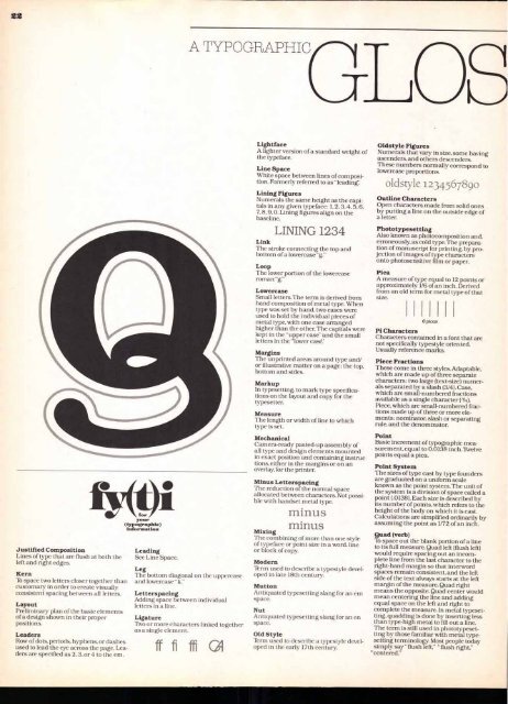
Link<br />
The stroke connecting the top and<br />
bottom of a lowercase "g."<br />
Loop<br />
The lower portion of the lowercase<br />
roman "g."<br />
<strong>Low</strong>ercase<br />
Small letters. The term is derived from<br />
hand composition of metal type. When<br />
type was set by hand, two cases were<br />
used to hold the individual pieces of<br />
metal type, with one case arranged<br />
higher than the other. The capitals were<br />
kept in the "upper case" and the small<br />
letters in the "lower case:<br />
Margins<br />
The unprinted areas around type and/<br />
or illustrative matter on a page: the top,<br />
bottom and sides.<br />
Markup<br />
In typesetting, to mark type specifications<br />
on the layout and copy for the<br />
typesetter.<br />
Measure<br />
The length or width of line to which<br />
type is set.<br />
Mechanical<br />
Camera-ready pasted-up assembly of<br />
all type and design elements mounted<br />
in exact position and containing instruc<br />
tions, either in the margins or on an<br />
overlay, for the printer.<br />
Minus Letterspacing<br />
The reduction of the normal space<br />
allocated between characters. Not possible<br />
with handset metal type.<br />
minus<br />
minus<br />
Mixing<br />
The combining of more than one style<br />
of typeface or point size in a word, line<br />
or block of copy.<br />
Modern<br />
Term used to describe a typestyle developed<br />
in late 18th century.<br />
Mutton<br />
Antiquated typesetting slang for an em<br />
space.<br />
Nut<br />
Antiquated typesetting slang for an en<br />
space.<br />
Old Style<br />
lbrm used to describe a typestyle developed<br />
in the early 17th century.<br />
Oldstyle Figures<br />
Numerals that vary in size, some having<br />
ascenders, and others descenders.<br />
These numbers normally correspond to<br />
lowercase proportions.<br />
oldstyle 1234567890<br />
Outline Characters<br />
Open characters made from solid ones<br />
by putting a line on the outside edge of<br />
a letter.<br />
Phototypesetting<br />
Also known as photocomposition and,<br />
erroneously, as cold type. The preparation<br />
of manuscript for printing, by pro-.<br />
jection of images of type characters<br />
onto photosensitive film or paper.<br />
Pica<br />
A measure of type equal to 12 points or<br />
approximately 1/6 of an inch. Derived<br />
from an old term for metal type of that<br />
size.<br />
6 picas<br />
Pi Characters<br />
Characters contained in a font that are<br />
not specifically typestyle oriented.<br />
Usually reference marks.<br />
Piece Fractions<br />
These come in three styles. Adaptable,<br />
which are made up of three separate<br />
characters: two large (text-size) numerals<br />
separated by a slash (3/4). Case,<br />
which are small-numbered fractions<br />
available as a single character (3/4).<br />
Piece, which are small-numbered fractions<br />
made up of three or more elements:<br />
nominator, slash or separating<br />
rule, and the denominator.<br />
Point<br />
Basic increment of typographic measurement,<br />
equal to 0.0138 inch.livelve<br />
points equal a pica.<br />
Point System<br />
The sizes of type cast by type founders<br />
are graduated on a uniform scale<br />
known as the point system.The unit of<br />
the system is a division of space called a<br />
point (.0138). Each size is described by<br />
its number of points, which refers to the<br />
height of the body on which it is cast.<br />
Ca<strong>lc</strong>ulations are simplified ordinarily by<br />
assuming the point as 1/72 of an inch.<br />
Quad (verb)<br />
lb space out the blank portion of a line<br />
to its full measure. Quad left (flush left)<br />
would require spacing out an incomplete<br />
line from the last character to the<br />
right-hand margin so that interword<br />
spaces remain consistent, and the left<br />
side of the text always starts at the left<br />
margin of the measure. Quad right<br />
means the opposite. Quad center would<br />
mean centering the line and adding<br />
equal space on the left and right to<br />
complete the measure. In metal typeset-<br />
ting, quadding is done by inserting less<br />
than type-high metal to fill out a line.<br />
The term is still used in phototypesetting<br />
by those familiar with metal typesetting<br />
terminology. Most people today<br />
simply say "flush left," "flush right,"<br />
"centered."


