

Volume 12–4 (Low Res).pdf - U&lc
Volume 12–4 (Low Res).pdf - U&lc
Volume 12–4 (Low Res).pdf - U&lc

You also want an ePaper? Increase the reach of your titles
YUMPU automatically turns print PDFs into web optimized ePapers that Google loves.
AND ITC NOVARESE<br />
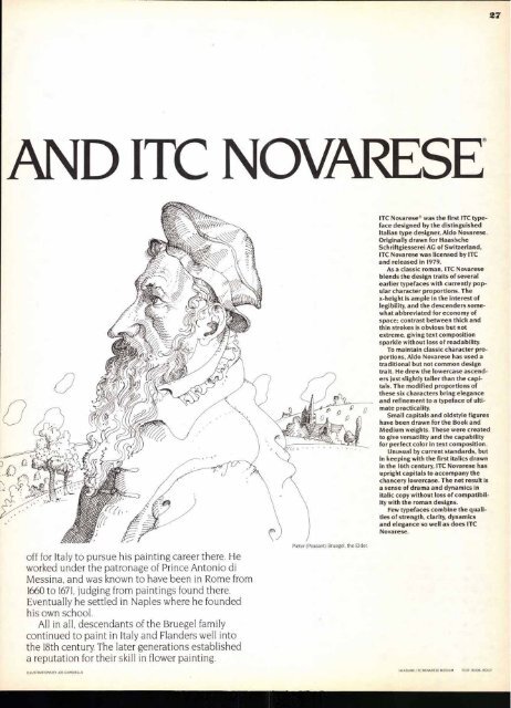
off for Italy to pursue his painting career there. He<br />
worked under the patronage of Prince Antonio di<br />
Messina, and was known to have been in Rome from<br />
1660 to 1671, judging from paintings found there.<br />
Eventually he settled in Naples where he founded<br />
his own school.<br />
All in all, descendants of the Bruegel family<br />
continued to paint in Italy and Flanders well into<br />
the 18th century. The later generations established<br />
a reputation for their skill in flower painting.<br />
ILLUSTRATIONS BY JOE CIARDIELLO<br />
ITC Novarese® was the first ITC typeface<br />
designed by the distinguished<br />
Italian type designer, Aldo Novarese.<br />
Originally drawn for Haas'sche<br />
Schriftgiesserei AG of Switzerland,<br />
ITC Novarese was licensed by ITC<br />
and released in 1979.<br />
As a classic roman, ITC Novarese<br />
blends the design traits of several<br />
earlier typefaces with currently popular<br />
character proportions. The<br />
x-height is ample in the interest of<br />
legibility, and the descenders somewhat<br />
abbreviated for economy of<br />
space; contrast between thick and<br />
thin strokes is obvious but not<br />
extreme, giving text composition<br />
sparkle without loss of readability.<br />
To maintain classic character proportions,<br />
Aldo Novarese has used a<br />
traditional but not common design<br />
trait. He drew the lowercase ascenders<br />
just slightly taller than the capitals.<br />
The modified proportions of<br />
these six characters bring elegance<br />
and refinement to a typeface of ultimate<br />
practicality.<br />
Small capitals and oldstyle figures<br />
have been drawn for the Book and<br />
Medium weights. These were created<br />
to give versatility and the capability<br />
for perfect color in text composition.<br />
Unusual by current standards, but<br />
in keeping with the first italics drawn<br />
in the 16th century, ITC Novarese has<br />
upright capitals to accompany the<br />
chancery lowercase. The net result is<br />
a sense of drama and dynamics in<br />
italic copy without loss of compatibility<br />
with the roman designs.<br />
Few typefaces combine the qualities<br />
of strength, clarity, dynamics<br />
and elegance so well as does ITC<br />
Novarese.<br />
HEADLINE: ITC NOVARESE MEDIUM TEXT BOOK. BOLD<br />
27


