

Volume 12–4 (Low Res).pdf - U&lc
Volume 12–4 (Low Res).pdf - U&lc
Volume 12–4 (Low Res).pdf - U&lc

You also want an ePaper? Increase the reach of your titles
YUMPU automatically turns print PDFs into web optimized ePapers that Google loves.
STRADIVARIS AND ITC BOOKMAN<br />
.Ps<br />
"s,71/.4.1.Ge<br />
..211/4<br />
.0karwle's<br />
-47:q<br />
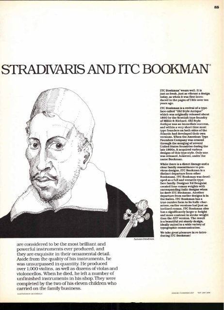
are considered to be the most brilliant and<br />
powerful instruments ever produced, and<br />
they are exquisite in their ornamental detail.<br />
Aside from the quality of his instruments, he<br />
was unsurpassed in quantity. He produced<br />
over 1,000 violins, as well as dozens of violas and<br />
violoncellos. When he died, he left a number of<br />
unfinished instruments in his shop. They were<br />
completed by the two of his eleven children who<br />
carried on the family business.<br />
ILLUSTRATIONS BY JOE CIARDIELLO<br />
ITC Bookman" wears well. It is<br />
just as fresh, just as vibrant a design<br />
today, as when it was first introduced<br />
in the pages of U&<strong>lc</strong> over ten<br />
years ago.<br />
ITC Bookman is a revival of a typeface<br />
called "Old Style Antique"<br />
which was originally released about<br />
1860 by the Scottish type foundry<br />
of Miller & Richard. Old Style<br />
Antique was an immediate success,<br />
and within a very short time most<br />
type founders on both sides of the<br />
Atlantic had developed their own<br />
versions. When the American Type<br />
Founders Company was created<br />
through the merging of several<br />
United States foundries during the<br />
late 1800s, it acquired various<br />
designs of this type style. Only one<br />
was released, however, under the<br />
name Bookman.<br />
While there is a direct lineage and a<br />
clear family resemblance to previous<br />
designs, ITC Bookman is a<br />
distinct departure from other<br />
Bookmans. ITC Bookman was developed<br />
as a full and versatile type-<br />
face family. Designer Ed Benguiat<br />
created four roman weights with<br />
corresponding italic designs when<br />
he drew ITC Bookman. Another<br />
departure from earlier designs is in<br />
the italics. ITC Bookman has a<br />
true cursive form to its italic characters;<br />
earlier versions had just an<br />
inclined roman. ITC Bookman also<br />
has a significantly larger x- height<br />
and more contrast in stroke weight<br />
than the ATF version. The result<br />
is a beautiful yet sturdy design,<br />
ideally suited to a wide variety of<br />
typographic communication.<br />
We take great pleasure in re-introducing<br />
ITC Bookman!<br />
HEADLINE' ITC BOOKMAN LIGHT<br />
TEXT: LIGHT. DEMI<br />
35


