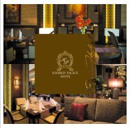
PREMIER PALACE â CENTENARY IN STYLE
PREMIER PALACE â CENTENARY IN STYLE
PREMIER PALACE â CENTENARY IN STYLE

Create successful ePaper yourself
Turn your PDF publications into a flip-book with our unique Google optimized e-Paper software.
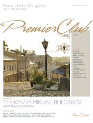
Premier Club Magazine #4 51<br />
premierinsight<br />
premier<br />
insight<br />
50<br />
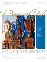
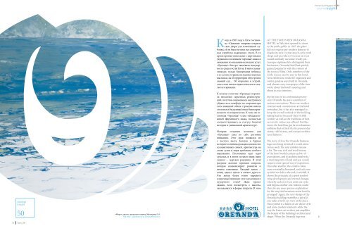
«Море», картон, авторская техника, Милокумов С.А.<br />
“Sea View”, pasteboard, by Sergey Milokumov<br />
Когда в 1907 году в Ялте гостиница<br />
«Ореанда» впервые открыла<br />
свои двери для изысканной публики,<br />
ей не были нужны все современные<br />
атрибуты выражения стиля. В то<br />
время яркими вывесками с картинками<br />
украшали в основном торговые лавки и<br />
заведения по оказанию всяческих услуг.<br />
«Ореанда» быстро завоевала популярность<br />
среди гостей Ялты. В ней останавливалась<br />
только благородная публика,<br />
в ее салоне устраивали художественные<br />
выставки, на ее территории обустроили<br />
зимний сад… Об открытии и устройстве<br />
отеля писали практически все газеты<br />
того времени.<br />
К своему столетию «Ореанда» пережила<br />
несколько серьезных реконструкций,<br />
получив современное внутреннее<br />
убранство и комфорт, но сохранив при<br />
этом внешний облик строения начала<br />
столетия и бесценный опыт безукоризненного<br />
гостеприимства. К тому же гостиница<br />
«Ореанда» стала обладательницей<br />
фирменного знака, полностью<br />
соответствующего ее статусу, богатой<br />
истории и уникальной архитектуре.<br />
История создания логотипа для<br />
«Ореанды» сама по себе достойна<br />
внимания. Этот знак появился не<br />
с чистого листа. Богатая и бурная<br />
история гостиницы рождала множество<br />
ассоциативных связей, архитектура на<br />
стыке суши и моря требовала особого<br />
выражения. Постепенно круг идей<br />
сужался, и в итоге остался лишь один<br />
символ – морская раковина. В этой<br />
ракушке заложен принцип спирали,<br />
которая символизирует развитие и<br />
вечное изменение. Каждый виток –<br />
конец одного цикла и начало другого.<br />
Что могло более точно выразить<br />
жизненный принцип этого роскошного<br />
курортного отеля? Даже проект<br />
здания, если посмотреть с высоты,<br />
закладывался в форме спирали. В этом<br />
At THE TIME WHEN OREANDA<br />
HOTEL in Yalta first opened its doors<br />
to the noble public in 1907, the place<br />
did not require any modern features to<br />
display its style. In that epoch, only retail<br />
shops and providers of various services<br />
would normally use some vividly picturesque<br />
signboards to distinguish their<br />
businesses. Oreanda Hotel had quickly<br />
gained popularity with the visitors of<br />
the town of Yalta. Only members of the<br />
noble classes used to stay in this hotel.<br />
Arts exhibitions would be organized and<br />
winter gardens were built in Oreanda,<br />
and almost every newspaper of the time<br />
wrote about the hotel’s opening and<br />
about its nice interiors.<br />
By the time of its centennial anniversary,<br />
Oreanda has seen a number of<br />
serious renovations. There are modern<br />
interiors and conveniences at the hotel<br />
nowadays, but it has also managed to<br />
keep the overall outlook of the building<br />
dating back to the early days of 20th<br />
century as well as the traditions of best<br />
service its visitors are offered. Furthermore,<br />
the hotel has got its own business<br />
emblem that entirely fits its present-day<br />
status, rich history, and unique architectural<br />
features.<br />
The story of how the Oreanda business<br />
logo was being invented is worth attention<br />
as well. The said emblem means<br />
a lot. The very rich and vivid history<br />
of the hotel would conjure up lots of<br />
associations, and its architectural style,<br />
a meeting point of land and sea, would<br />
require some special way of expression.<br />
One after another, the creative ideas<br />
were eventually dismissed, and only one<br />
symbol was left in the end; a seashell. It<br />
shows the principle of a spiral symbolizing<br />
development and eternal changes<br />
whereby each new turn ends one cycle<br />
and begins another one. Indeed, could<br />
there be any more precise explanation<br />
for the way this luxurious resort hotel is<br />
arranged? Again, the very design of the<br />
Oreanda building resembles a spiral if<br />
one takes a bird’s eye view at the place.<br />
This symbol is a fusion of art-décor style<br />
and some modern elements while the<br />
way the letters are written just amplifies<br />
the beauty of the building’s architectural<br />
shape. When the Oreanda logo was<br />
50 Spring ‘09