

Smalltalk and Object Orientation: an Introduction - Free
Smalltalk and Object Orientation: an Introduction - Free
Smalltalk and Object Orientation: an Introduction - Free

Create successful ePaper yourself
Turn your PDF publications into a flip-book with our unique Google optimized e-Paper software.
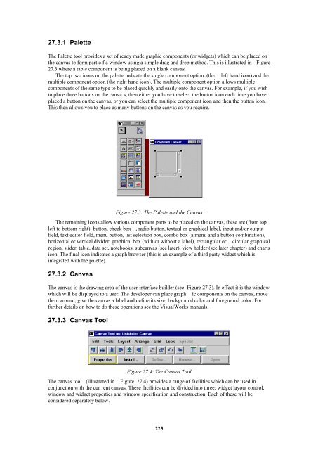
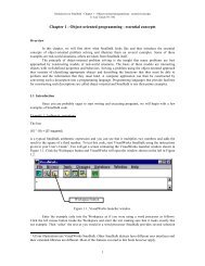
27.3.1 Palette<br />
The Palette tool provides a set of ready made graphic components (or widgets) which c<strong>an</strong> be placed on<br />
the c<strong>an</strong>vas to form part o f a window using a simple drag <strong><strong>an</strong>d</strong> drop method. This is illustrated in Figure<br />
27.3 where a table component is being placed on a bl<strong>an</strong>k c<strong>an</strong>vas.<br />
The top two icons on the palette indicate the single component option (the left h<strong><strong>an</strong>d</strong> icon) <strong><strong>an</strong>d</strong> the<br />
multiple component option (the right h<strong><strong>an</strong>d</strong> icon). The multiple component option allows multiple<br />
components of the same type to be placed quickly <strong><strong>an</strong>d</strong> easily onto the c<strong>an</strong>vas. For example, if you wish<br />
to place three buttons on the c<strong>an</strong>va s, then either you have to select the button icon each time you have<br />
placed a button on the c<strong>an</strong>vas, or you c<strong>an</strong> select the multiple component icon <strong><strong>an</strong>d</strong> then the button icon.<br />
This then allows you to place as m<strong>an</strong>y buttons on the c<strong>an</strong>vas as you require.<br />
Figure 27.3: The Palette <strong><strong>an</strong>d</strong> the C<strong>an</strong>vas<br />
The remaining icons allow various component parts to be placed on the c<strong>an</strong>vas, these are (from top<br />
left to bottom right): button, check box , radio button, textual or graphical label, input <strong><strong>an</strong>d</strong>/or output<br />
field, text editor field, menu button, list selection box, combo box (a menu <strong><strong>an</strong>d</strong> a button combination),<br />
horizontal or vertical divider, graphical box (with or without a label), rect<strong>an</strong>gular or circular graphical<br />
region, slider, table, data set, notebooks, subc<strong>an</strong>vas (see later), view holder (see later chapter) <strong><strong>an</strong>d</strong> charts<br />
icon. The final icon indicates a graph browser (this is <strong>an</strong> example of a third party widget which is<br />
integrated with the palette).<br />
27.3.2 C<strong>an</strong>vas<br />
The c<strong>an</strong>vas is the drawing area of the user interface builder (see Figure 27.3). In effect it is the window<br />
which will be displayed to a user. The developer c<strong>an</strong> place graph ic components on the c<strong>an</strong>vas, move<br />
them around, give the c<strong>an</strong>vas a label <strong><strong>an</strong>d</strong> define its size, background color <strong><strong>an</strong>d</strong> foreground color. For<br />
further details on how to do these operations see the VisualWorks m<strong>an</strong>uals.<br />
27.3.3 C<strong>an</strong>vas Tool<br />
Figure 27.4: The C<strong>an</strong>vas Tool<br />
The c<strong>an</strong>vas tool (illustrated in Figure 27.4) provides a r<strong>an</strong>ge of facilities which c<strong>an</strong> be used in<br />
conjunction with the cur rent c<strong>an</strong>vas. These facilities c<strong>an</strong> be divided into three: widget layout control,<br />
window <strong><strong>an</strong>d</strong> widget properties <strong><strong>an</strong>d</strong> window specification <strong><strong>an</strong>d</strong> construction. Each of these will be<br />
considered separately below.<br />
225


 Change language