


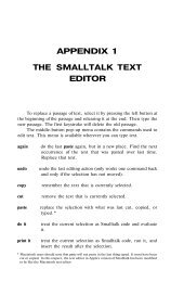
Smalltalk and Object Orientation: an Introduction - Free
Smalltalk and Object Orientation: an Introduction - Free
Smalltalk and Object Orientation: an Introduction - Free

Create successful ePaper yourself
Turn your PDF publications into a flip-book with our unique Google optimized e-Paper software.
import<strong>an</strong>t, as these facilities h<strong><strong>an</strong>d</strong>le everything from creating the window to h<strong><strong>an</strong>d</strong>ling user<br />
interaction (e.g. input <strong><strong>an</strong>d</strong> output).<br />
2. The other major ch<strong>an</strong>ge is that we have broken the Org<strong>an</strong>izer class down into its constituent<br />
parts. i.e. we now have separate classes for the address, appointments <strong><strong>an</strong>d</strong> notes functionality. the<br />
Org<strong>an</strong>izer class now acts as a composite class which obtains its functionality from the inst<strong>an</strong>ces<br />
it will possess.<br />
The VisualOrg<strong>an</strong>izer now works by displaying a Launcher window when the<br />
VisualOrg<strong>an</strong>izer is sent the message open. This message is like new except it not only creates a<br />
new inst<strong>an</strong>ce of a class, it also causes that inst<strong>an</strong>ce to open whatever window is defined in the default<br />
window definition method. This method is called windowSpec <strong><strong>an</strong>d</strong> is maintained on the class side. The<br />
VisualOrg<strong>an</strong>izer Launcher is illustrated in Figure 28.1.<br />
28.2.1 Constructing the Launcher<br />
First of all we need to define the class category we are going to put our classes in. The category will be<br />
called 'Visual Org<strong>an</strong>izer Classes’. If you wish to follow the example in this chapter yourself, you should<br />
create this category now.<br />
Next we will define the layout of the VisualOrg<strong>an</strong>izer Launcher window. To do this we use the<br />
VisualWorks User interface builder. As we are creating a completely new application you should launch<br />
the user interface builder from the VisualWorks Launcher using the easel icon (if you are unclear on<br />
what the user interface builder does see the last chapter).<br />
Having launched the user interface builder, the first thing to do is to give the window as a whole a<br />
label. This c<strong>an</strong> be done using the properties option available from the right mouse button menu (or<br />
middle if you have a three button mouse). Note that the properties window will display the properties of<br />
the selected widget or the window as a whole if no widget is selected.<br />
I have chosen to use the label “Visual Org<strong>an</strong>izer” for my window, however you c<strong>an</strong> use whatever<br />
label you feel is most appropriate as the label is not signific<strong>an</strong>t for the operation of the system. Once<br />
you have provided a suitable label select accept <strong><strong>an</strong>d</strong> close the properties window. Next resize the c<strong>an</strong>vas<br />
as appropriate. You are now ready to begin constructing the Visual Org<strong>an</strong>izer Launcher.<br />
The window layout for the Launcher is illustrated in Figure 28.2. It shows that four buttons have<br />
been placed on the window. The text boxes with arrows indicate the action properties assigned to each<br />
button.<br />
Action: openDiary<br />
Action: openNotes<br />
Action: openAddresses<br />
Action: doExit<br />
Figure 28.2: Defining the actions for the Launcher's buttons<br />
Each button is a basic action button with a textual label rather th<strong>an</strong> <strong>an</strong> icon. Place each button on the<br />
window using the palette as indicated in Figure 28.2. Remember you c<strong>an</strong> use the button widget with the<br />
multiple placement option (the box in the top right h<strong><strong>an</strong>d</strong> corner of the Palette) to place more th<strong>an</strong> one<br />
button. Then use the properties tool to ensure that the button properties match those in the diagram.<br />
The Exit button also possesses a number of look preferences. These are set using the Color option in<br />
the properties tool. The actual colors selected are:<br />
• Foreground color: white <strong><strong>an</strong>d</strong> Background color: Royal Blue<br />
• Selection Foreground Color: Pale Blue <strong><strong>an</strong>d</strong> Selection Background Color: Red<br />
The first two colors are used to display the button on the window. The Foreground color relates to<br />
the color in which the text on the button is displayed <strong><strong>an</strong>d</strong> the background color the is the main color of<br />
237


 Change language