Download the documentation - True BASIC
Download the documentation - True BASIC
Download the documentation - True BASIC

Create successful ePaper yourself
Turn your PDF publications into a flip-book with our unique Google optimized e-Paper software.
78 Statistics Graphics Toolkit<br />
The datasets’ point styles are taken in order from <strong>the</strong> GraphPoint set – plus, asterisk,<br />
circle, and so on – and cycle through <strong>the</strong> set if you plot more than 12 datasets in one<br />
graph. (Style #1 isn’t used since it’s hard to see.)<br />
If connect is nonzero, each data point is connected to its neighbors by a straight line.<br />
You can use SortPoints2 to make sure your data points are in order. If you’ve used<br />
SetLS to turn on fitted lines, each dataset gets its own line. Confidence bands and connecting<br />
or fitted lines have <strong>the</strong> same colors and line styles. To distinguish <strong>the</strong>m, use<br />
PlotScat and AddPlotScat to control colors and line styles.<br />
Size(x,1) gives <strong>the</strong> number of datasets. Each is identified by a label from legends$() just<br />
below <strong>the</strong> graph’s title, so Size(x,1) must equal Size(legends$).<br />
The col$ string gives <strong>the</strong> color scheme; thus “red yellow green blue” gives a red title,<br />
yellow frame, and green and blue datasets. If you give more datasets than data colors,<br />
PlotManyScat uses different line styles to distinguish <strong>the</strong> connecting or fitted lines.<br />
First it draws solid lines in <strong>the</strong> colors you’ve chosen. Then it switches to dashed, dotted,<br />
and <strong>the</strong>n dash-dotted lines. So if you graph five datasets with connecting lines in <strong>the</strong><br />
color scheme above, you get (in order): solid green, solid blue, dashed green, dashed<br />
blue, dotted green. See <strong>the</strong> “Making Graphs” section for more help.<br />
Compare <strong>the</strong> output of Figures 43.04 and 43.05 to see <strong>the</strong> correlation differences.<br />
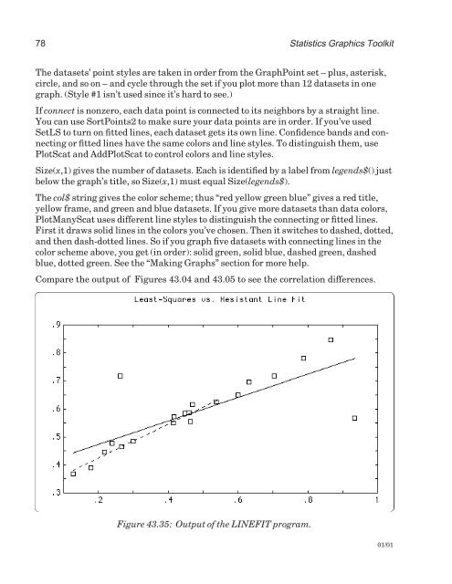
Figure 43.35: Output of <strong>the</strong> LINEFIT program.<br />
01/01