Download the documentation - True BASIC
Download the documentation - True BASIC
Download the documentation - True BASIC

You also want an ePaper? Increase the reach of your titles
YUMPU automatically turns print PDFs into web optimized ePapers that Google loves.
8 Statistics Graphics Toolkit<br />
Finally, PlotScat draws <strong>the</strong> scatter plot. Each point is marked in point style 10 (solid<br />
block). Line style 0 means that connecting lines between <strong>the</strong> points are omitted. And<br />
finally, PlotScat also gives <strong>the</strong> color scheme.<br />
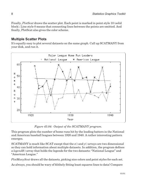
Multiple Scatter Plots<br />
It’s equally easy to plot several datasets on <strong>the</strong> same graph. Call up SCATMANY from<br />
your disk, and run it.<br />
Figure 43.04: Output of <strong>the</strong> SCATMANY program.<br />
This program plots <strong>the</strong> number of home runs hit by <strong>the</strong> leading batters in <strong>the</strong> National<br />
and American baseball leagues between 1920 and 1940. A ra<strong>the</strong>r interesting pattern<br />
emerges.<br />
SCATMANY is much like SCAT except that <strong>the</strong> x() and y() arrays are two dimensional<br />
so <strong>the</strong>y can hold information about multiple datasets. In addition, <strong>the</strong> program defines<br />
a legend$() array that holds <strong>the</strong> legends for <strong>the</strong> two datasets: “National League” and<br />
“American League.”<br />
PlotManyScat draws all <strong>the</strong> datasets, picking nice colors and point styles for each set.<br />
As always, you should be wary of bli<strong>the</strong>ly fitting least-squares lines to data! Compare<br />
01/01