Embroidery Basics Articles

Create successful ePaper yourself
Turn your PDF publications into a flip-book with our unique Google optimized e-Paper software.
10/28/2016 Working With Photographs <strong>Embroidery</strong> Article<br />
Not Yet Rated<br />
Working With Photographs<br />
By Barbara Geer on October 01, 2008<br />
(Click Image to Enlarge)<br />
Share Your Project<br />
0 0 0<br />
Most digitizers do not like to work from photos of any kind. The reason? Concrete lines are harder to find than on most logo artwork.<br />
Also, with photos there are many shadows that either can be hard to create in a realistic fashion or can be left out altogether .<br />
Some digitizers prefer to turn their artwork into vector files before they begin the process of digitizing. On a photograph, that can be<br />
a long and arduous project.<br />
My solution to this problem is to create the outline first. I chose a photograph of a car as<br />
my example. I digitize many cars, and they all come to me as photos, often taken at car<br />
shows. Sometimes, without a concrete outline, it is dif ficult to see where one car ends and<br />
the other car begins, especially if the cars next to each other are the same color . This<br />
particular photograph doesn’t have that problem, however .<br />
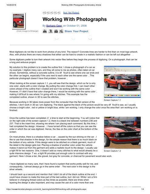
When looking at the screen capture 1.1, you will see that the design, which so far is only<br />
one color, starts with a color change. By putting the color change first, I can insert other<br />
colors ahead of the outline that I created and won’t be working with the same color .<br />
However, if I didn’t have that color change there, I would be working with the same color ,<br />
making it dif ficult to see where I’m going with my stitches. This example has the<br />
completed outline, shown in 3D to see the stitches.<br />
Screen Capture 1.1<br />
Because working in 3D takes more power from the computer than the flat version of the<br />
stitches, I don’t work in 3D as I am digitizing. The black against the black of the picture would be very dif ficult to see, so I usually<br />
choose a bright color , red or yellow or bright blue, while I am working. I only change the color once the area that I am working on is<br />
finished.<br />
Once the outline has been completed, it’ s time to start at the beginning. Y ou will notice that<br />
on the right side of the screen capture 1.2, there is a black line between numbers 236 and<br />
237. That is the insert line, showing me where I am placing each command. By this time, I<br />
had completed the design. However , I have turned off the colors so that you can see the<br />
order in which the car was digitized. Hence, the Xes on the color chart at the bottom of the<br />
screen.<br />
On most photos, there is a shadow below a car , caused by the sun shining on the car . I<br />
like to use that shadow in the design, for the simple reason that there is so much black on<br />
the bottom of any vehicle. If this design were to be stitched on a black garment, much of<br />
the detail in the design gets lost. Placing a shadow of another color under the vehicle<br />
makes it stand out from the garment and adds a realistic touch to the design. I usually use<br />
a light fill for two reasons. One, it doesn’t add so many stitches to what would already be a Screen Capture 1.2<br />
quite intensive design. T wo, a light fill provides just enough color to contrast with any<br />
garment. Here I chose a tan, like gravel, but gray for concrete, or charcoal for pavement would also work.<br />
I have digitized so many cars, that I have found a system that works pretty well for me, and<br />
consequently, I almost always go in the same order . The next color in the design is the<br />
silver wheels.<br />
I should back up a second and mention that I didn’t do all of the black outline at the end. I<br />
could have chosen to make the tires part of the last outline, but I did not. While I am a firm<br />
believer in changing thread colors as few times as possible, there are times when<br />
layering the design is also important, and may cause the use of a color more than one<br />
time. This is one of those times.<br />
https://www.embroiderydesigns.com/emb_learning/article/564/workingwithphotographs.aspx 1/4