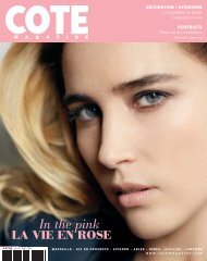
SPECIAL MODE / fASHION FEATURE EVASION ... - Cote Magazine
SPECIAL MODE / fASHION FEATURE EVASION ... - Cote Magazine
SPECIAL MODE / fASHION FEATURE EVASION ... - Cote Magazine

Create successful ePaper yourself
Turn your PDF publications into a flip-book with our unique Google optimized e-Paper software.
DÉCO OPTIMISTE INTERIORS<br />
70<br />
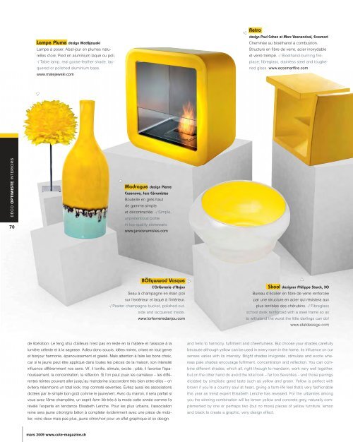
Lampe Plume design Mat&jewski<br />
Lampe à poser. Abat-jour en plumes naturelles<br />
d’oie. Pied en aluminium laqué ou poli.<br />
-/ Table lamp; real goose-feather shade, lacquered<br />
or polished aluminium base.<br />
www.matejewski.com<br />
▼<br />
mars 2009 www.cote-magazine.ch<br />
▼<br />
Madrague design Pierre<br />
Casenove, Jars Céramistes<br />
Bouteille en grès haut<br />
de gamme simple<br />
et décontractée. -/ Simple,<br />
unpretentious bottle<br />
in top-quality stoneware.<br />
www.jarsceramistes.com<br />
BÖllywwod Vasque<br />
L’Orfèvrerie d’Anjou<br />
Seau à champagne en étain poli<br />
sur l’extérieur et laqué à l’intérieur.<br />
-/ Pewter champagne bucket, polished outside<br />
and lacquered inside.<br />
www.lorfevreriedanjou.com<br />
de libération. Le feng shui d’ailleurs n’est pas en reste en la matière et l’associe à la<br />
lumière céleste et à la sagesse. Adieu donc soucis, idées noires, crises en tout genre<br />
et bonjour harmonie, épanouissement et gaieté. Mais attention à faire les bons choix,<br />
car si le jaune peut être appliqué dans toutes les pièces de la maison, son intensité<br />
influence différemment nos sens. Vif, il tonifie, stimule, excite ; pâle, il favorise l’épanouissement,<br />
la concentration, la réflexion. Si l’on peut jouer les camaïeux – les différentes<br />
teintes pouvant aller jusqu’au mandarine s’accordent très bien entre elles – on<br />
évitera néanmoins un total look, trop connoté seventies. Évitez aussi les associations<br />
dictées par le simple bon goût comme le jaune/vert. Avec du marron, il sera parfait si<br />
vous avez l’âme champêtre, un esprit farm life très à la mode cette année comme l’a<br />
révélé l’experte en tendance Elisabeth Leriche. Pour les plus urbains, l’association<br />
reine sera jaune citron/gris béton à compléter évidemment avec une pièce de mobilier,<br />
voire deux mais pas plus, jaune citron/noir pour un effet graphique et so design.<br />
▼<br />
▼<br />
Retro<br />
design Paul Cohen et Marc Veenendaal, Ecosmart<br />
Cheminée au bioéthanol à combustion.<br />
Structure en fibre de verre, acier inoxydable<br />
et verre trempé. -/ Bioethanol-burning fireplace;<br />
fibreglass, stainless steel and toughened<br />
glass. www.ecosmartfire.com<br />
▼<br />
Skool designer Philippe Starck, XO<br />
Bureau d’écolier en fibre de verre renforcée<br />
par une structure en acier qui résistera aux<br />
plus terribles des chérubins. -/ Fibreglass<br />
school desk reinforced with a steel frame so as<br />
to withstand the worst the little darlings can do!<br />
www.etatdesiege.com<br />
and hello to harmony, fulfilment and cheerfulness. But choose your shades carefully<br />
because although yellow can be used in every room in the home, its influence on our<br />
senses varies with its intensity. Bright shades invigorate, stimulate and excite whereas<br />
pale shades encourage fulfilment, concentration and reflection. You can combine<br />
different shades, which all, right through to mandarin, work very well together,<br />
but on the other hand do avoid the total look – far too Seventies – and those pairings<br />
dictated by simplistic good taste such as yellow and green. Yellow is perfect with<br />
brown if you’re a country soul at heart, giving a farm-life feel that’s very fashionable<br />
this year as trend expert Elisabeth Leriche has revealed. For the urbanites among<br />
you the winning combination will be lemon yellow and concrete grey, naturally complemented<br />
by one or perhaps two (but no more) pieces of yellow furniture, lemon<br />
and black to create a graphic, very design effect.