Technical Guidelines for Integrated Disease Surveillance ... - PHRplus
Technical Guidelines for Integrated Disease Surveillance ... - PHRplus
Technical Guidelines for Integrated Disease Surveillance ... - PHRplus

Create successful ePaper yourself
Turn your PDF publications into a flip-book with our unique Google optimized e-Paper software.
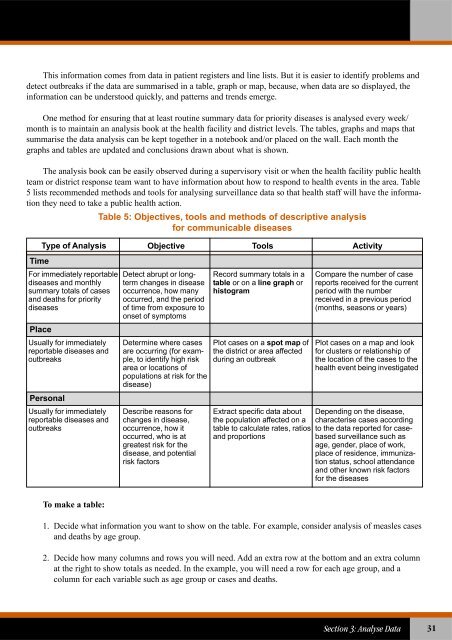
This in<strong>for</strong>mation comes from data in patient registers and line lists. But it is easier to identify problems anddetect outbreaks if the data are summarised in a table, graph or map, because, when data are so displayed, thein<strong>for</strong>mation can be understood quickly, and patterns and trends emerge.One method <strong>for</strong> ensuring that at least routine summary data <strong>for</strong> priority diseases is analysed every week/month is to maintain an analysis book at the health facility and district levels. The tables, graphs and maps thatsummarise the data analysis can be kept together in a notebook and/or placed on the wall. Each month thegraphs and tables are updated and conclusions drawn about what is shown.The analysis book can be easily observed during a supervisory visit or when the health facility public healthteam or district response team want to have in<strong>for</strong>mation about how to respond to health events in the area. Table5 lists recommended methods and tools <strong>for</strong> analysing surveillance data so that health staff will have the in<strong>for</strong>mationthey need to take a public health action.Table 5: Objectives, tools and methods of descriptive analysis<strong>for</strong> communicable diseasesType of AnalysisTimeFor immediately reportablediseases and monthlysummary totals of casesand deaths <strong>for</strong> prioritydiseasesPlaceUsually <strong>for</strong> immediatelyreportable diseases andoutbreaksPersonalUsually <strong>for</strong> immediatelyreportable diseases andoutbreaksObjective Tools ActivityDetect abrupt or longtermchanges in diseaseoccurrence, how manyoccurred, and the periodof time from exposure toonset of symptomsDetermine where casesare occurring (<strong>for</strong> example,to identify high riskarea or locations ofpopulations at risk <strong>for</strong> thedisease)Describe reasons <strong>for</strong>changes in disease,occurrence, how itoccurred, who is atgreatest risk <strong>for</strong> thedisease, and potentialrisk factorsRecord summary totals in atable or on a line graph orhistogramPlot cases on a spot map ofthe district or area affectedduring an outbreakExtract specific data aboutthe population affected on atable to calculate rates, ratiosand proportionsCompare the number of casereports received <strong>for</strong> the currentperiod with the numberreceived in a previous period(months, seasons or years)Plot cases on a map and look<strong>for</strong> clusters or relationship ofthe location of the cases to thehealth event being investigatedDepending on the disease,characterise cases accordingto the data reported <strong>for</strong> casebasedsurveillance such asage, gender, place of work,place of residence, immunizationstatus, school attendanceand other known risk factors<strong>for</strong> the diseasesTo make a table:1. Decide what in<strong>for</strong>mation you want to show on the table. For example, consider analysis of measles casesand deaths by age group.2. Decide how many columns and rows you will need. Add an extra row at the bottom and an extra columnat the right to show totals as needed. In the example, you will need a row <strong>for</strong> each age group, and acolumn <strong>for</strong> each variable such as age group or cases and deaths.Section 3: Analyse Data31