- Page 3: Technical Guidelines forIntegrated
- Page 6 and 7: 3.3.1 Review the updated charts, ta
- Page 8 and 9: 7.1.2 Monitor timeliness and comple
- Page 10 and 11: List of TablesTable 1: Surveillance
- Page 13: AcronymsAFROAFPAIDSCBSCBSWCDCDHMTE-
- Page 18 and 19: An ill person presents to medical a
- Page 20 and 21: How are surveillance functions desc
- Page 22 and 23: 4.0 Investigate** 5.0 Respond 6.0 P
- Page 24 and 25: National4.0 Investigate** 5.0 Respo
- Page 26 and 27: In general, the health of Ghanaians
- Page 28 and 29: How does Ghana’s MOH/GHS support
- Page 30 and 31: 1.0 Identify Cases of Priority Dise
- Page 32 and 33: 1.2 Improve district procedures for
- Page 35 and 36: Section 2Report Priority Diseases a
- Page 37 and 38: Name of diseaseRoutine summary repo
- Page 39 and 40: Identify and train CBS volunteers o
- Page 41: Clinicians, ward nurses or other re
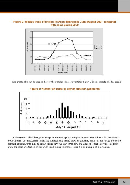
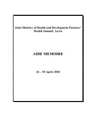
- Page 44 and 45: 3.0 Analyse DataAnalysing trends of
- Page 48 and 49: Figure 4: Meningitis cases from Bol
- Page 50 and 51: The first step in analysing data by
- Page 52 and 53: 3.2.3.3 Calculate case fatality rat
- Page 54 and 55: Table 6: Alert and epidemic/action
- Page 56 and 57: 3.4 Use the analysis results to imp
- Page 58 and 59: 4.0 Investigate Reported Outbreaks
- Page 60 and 61: 4.4 Prepare to conduct an investiga
- Page 62 and 63: Review laboratory results with the
- Page 64 and 65: Draw a histogram representing the c
- Page 66 and 67: If the shape of the curve suddenly
- Page 68 and 69: 5.0 Prepare and Respond to Outbreak
- Page 70 and 71: Periodically review and update othe
- Page 72 and 73: 3. Select appropriate communication
- Page 74 and 75: Improve safe disposal of human wast
- Page 76 and 77: Table 7: Daily water needs per pers
- Page 78 and 79: Recommendations for improving epide
- Page 80 and 81: 6.0 Provide FeedbackData are report
- Page 82 and 83: The newsletter can be produced simp
- Page 84 and 85: 7.0 Evaluate and Improve Surveillan
- Page 86 and 87: Table 8 lists possible indicators t
- Page 88 and 89: Priority diseases are recorded in t
- Page 90 and 91: Indicators for measuring quality of
- Page 93 and 94: Section 8Community-based Surveillan
- Page 95 and 96: members to take action in the event
- Page 97 and 98:
Participate in information dissemin
- Page 99 and 100:
Section 9Summary Guidelines for Spe
- Page 101 and 102:
Analyse and interpretdataReferenceT
- Page 103 and 104:
Buruli UlcerBackground Buruli ulce
- Page 105 and 106:
Cholera may cause severe dehydratio
- Page 107 and 108:
Respond to epidemicthresholdIf a su
- Page 109 and 110:
In Ghana, the disease was endemic i
- Page 111 and 112:
ReferenceA guide to eliminating lep
- Page 113 and 114:
Promote environmental sanitation: c
- Page 115 and 116:
Surveillance goal Use a rapid late
- Page 117 and 118:
OnchocerciasisBackground Filarial
- Page 119 and 120:
Poliomyelitis (Acute flaccid paraly
- Page 122 and 123:
Public health action Conduct activ
- Page 124 and 125:
The global HIV pandemic has been a
- Page 126 and 127:
Respond toepidemicAnalyse and inter
- Page 128 and 129:
Public health action Case finding
- Page 131 and 132:
Annex 1Using Assessment Results to
- Page 133:
Tally, compile and report summary t
- Page 136 and 137:
Diseases of special public health f
- Page 138 and 139:
Pneumonia in childrenless than 5 ye
- Page 140 and 141:
Other diseases of public health imp
- Page 143 and 144:
Annex 5Laboratory Tests for Confirm
- Page 145 and 146:
Suspected disease orconditionCholer
- Page 147 and 148:
Suspected disease orconditionDiagno
- Page 149 and 150:
Suspected disease orconditionDiagno
- Page 151 and 152:
Suspected disease orconditionDiagno
- Page 153:
Annex 6List of Laboratories for Con
- Page 157 and 158:
Annex 8Case-based Surveillance Repo
- Page 159 and 160:
If laboratory specimen collectedFor
- Page 161:
16. When the investigation of the c
- Page 164 and 165:
(For reporting from health facility
- Page 166 and 167:
13. For vaccine-preventable disease
- Page 169 and 170:
Annex 11Total Number of Patients Se
- Page 171:
Annex 12Year ___________ Quarter __
- Page 174 and 175:
Analysis, interpretations, comments
- Page 176 and 177:
C. Location of Lesion(s)19. Upper l
- Page 179 and 180:
Annex 15Monthly Registration of Bur
- Page 181:
Classification a Location of Lesion
- Page 185:
Annex 17Managing Public Health Surv
- Page 189 and 190:
Annex 19Sample Tables for Person An
- Page 191 and 192:
Annex 20Log of Suspected Outbreaks
- Page 193:
Instructions for filling suspected
- Page 196 and 197:
INITIAL CLINICAL HISTORYPlease use
- Page 198 and 199:
SPECIMEN COLLECTIONDate Sent toDate
- Page 200 and 201:
186Technical Guidelines for Integra
- Page 202 and 203:
188Technical Guidelines for Integra
- Page 205 and 206:
Annex 25Treat Cases During an Outbr
- Page 207 and 208:
Also give home-based fluids as foll
- Page 209 and 210:
3. Give vitamin A to children with
- Page 211:
Annex 26Preparing Disinfectant Solu
- Page 214 and 215:
If the health facility does not kee
- Page 216 and 217:
Message:DO YOU PREPARE FOOD SAFELY?
- Page 218 and 219:
Reducing exposure to mosquitoesPERS
- Page 221 and 222:
Annex 30Estimating Vaccine Supplies
- Page 223:
Annex 31Recommended Immunization Pr
- Page 226 and 227:
Lab analysis and results:With text,
- Page 228 and 229:
District Epidemic Management Commit
- Page 231 and 232:
Annex 35Checklist for Supervising S
- Page 233 and 234:
Activity Supervisory Question Answe
- Page 235 and 236:
Annex 36Indicators for Monitoring t
- Page 238:
Partners for HealthReformplusU.S. A