- Page 1 and 2:
Reference Manual Version 11.0 for M
- Page 3 and 4:
Content Part 1 Introduction Content
- Page 5 and 6:
Contents 14.10 Search 113 14.11 Adv
- Page 7 and 8:
Contents 29.9 Inherited Access Rest
- Page 9 and 10:
Contents 39.6 Caption 538 40 Text O
- Page 11 and 12:
Contents 51.11 Colors 643 51.12 Num
- Page 13 and 14:
Contents 58.5 Expressions 696 58.6
- Page 15 and 16:
Contents 73 Calculated Formulas 851
- Page 17:
Part 1 Introduction Part 1 Introduc
- Page 20 and 21:
Mouse Conventions l The description
- Page 22 and 23:
The most important difference betwe
- Page 24 and 25:
Alert E-mail to Document Administra
- Page 27:
3 Compatibility Issues for Earlier
- Page 31 and 32:
Part 2 Installation Part 2 Installa
- Page 33 and 34:
5.3 Serialization Part 2 Installati
- Page 35 and 36:
6 OLE DB and ODBC 6.1 OLE DB QlikVi
- Page 37 and 38:
Part 3 Navigation and Basics Part 3
- Page 39 and 40:
7.2 The Start Page The Getting Star
- Page 41 and 42:
Part 3 Navigation and Basics QlikVi
- Page 43 and 44:
QlikView Publisher Part 3 Navigatio
- Page 45 and 46:
8 Getting Started Wizard The Gettin
- Page 47 and 48:
Step 3 - Save File The Save As dial
- Page 49:
Step 6 - Add Expression Step 6 of t
- Page 52 and 53:
l TX.xml l LA.xml l SL.xml l SO.xml
- Page 54 and 55:
Save Saves the present configuratio
- Page 56 and 57:
Export Export Contents... This alte
- Page 58 and 59:
Advanced Search Opens the Advanced
- Page 60 and 61:
Promote Sheet Moves the (tab of the
- Page 62 and 63:
More... Opens the Bookmarks dialog,
- Page 64 and 65:
Document The name of the .qvw docum
- Page 67 and 68:
11 Toolbars and Status Bar 11.1 Too
- Page 69 and 70:
11.3 Navigation Toolbar The QlikVie
- Page 71 and 72:
Format Painter This button makes it
- Page 73 and 74:
New Creates a new toolbar. Rename R
- Page 75:
11.8 Status Bar Below the sheet, th
- Page 78 and 79:
Shift Inhibits Macros This setting
- Page 80 and 81:
Search Settings In this group setti
- Page 82 and 83:
Save AutoRecover Info Here rules fo
- Page 84 and 85:
Expression in Chart Normal Text Tex
- Page 86 and 87:
Design Grid Settings Snap Step (mm)
- Page 88 and 89:
Click in Chart background Clears Se
- Page 90 and 91:
Data Area Only If this option is ch
- Page 92 and 93:
12.8 User Preferences: Printing Use
- Page 94 and 95:
User ID The user ID used for authen
- Page 96 and 97:
Modify... When a folder resource is
- Page 99 and 100:
13 Exporting and Printing 13.1 Prin
- Page 101 and 102:
Margins In the Margins group you ca
- Page 103 and 104:
13.4 Date & Time The Date & Time di
- Page 105 and 106:
Quoting In this group, the quoting
- Page 107 and 108:
14 Logic and Selections 14.1 Single
- Page 109 and 110:
Logical Behavior The logical behavi
- Page 111 and 112:
To unlock a previously set lock, op
- Page 113 and 114:
Block Charts In block charts indivi
- Page 115 and 116:
any characters at all (for Normal S
- Page 117 and 118:
Aggregation In this drop-down it is
- Page 119 and 120:
Note that Tab2 shown here is a tabl
- Page 121 and 122:
This means that the total amount so
- Page 123 and 124:
Features in Alternate States The fo
- Page 125 and 126:
15 Bookmarks 15.1 Bookmark Types Th
- Page 127 and 128:
Create as a server bookmark Share B
- Page 129 and 130:
Edit Info Here it is possible to ed
- Page 131 and 132:
when used in QlikView 11. Bookmarks
- Page 133 and 134:
16 Reports Printing a report often
- Page 135 and 136:
Available Reports Document Reports
- Page 137 and 138:
Edit Menu Copy Copies the currently
- Page 139 and 140:
New Text... Creates a new text obje
- Page 141 and 142:
Align Right Only available when two
- Page 143 and 144:
The Margins Tab Report Settings, Ma
- Page 145 and 146:
General Page Settings, General tab
- Page 147 and 148:
Report Editor: Item Settings Dialog
- Page 149 and 150:
17 Alerts 17.1 Creating Alerts The
- Page 151 and 152:
17.4 The Alerts Dialog The Alerts d
- Page 153 and 154:
Events The Events group is used for
- Page 155 and 156:
The first start page of the Alert W
- Page 157 and 158:
In this step you define the alert c
- Page 159 and 160:
Trigger Level The firing of automat
- Page 161 and 162:
18 Variable Overview The Variable O
- Page 163 and 164:
19 Expression Overview The Expressi
- Page 165 and 166:
20 Internal Files 20.1 File Referen
- Page 167 and 168:
Part 4 Script Part 4 Script 167
- Page 169 and 170:
22 Variables and Fields This chapte
- Page 171 and 172:
=0 no change. There are also Automa
- Page 173 and 174:
23 Edit Script Dialog The Edit Scri
- Page 175 and 176:
Edit Menu Undo Undoes the latest ch
- Page 177 and 178:
Syntax Check Checks the syntax of y
- Page 179 and 180:
Function Name This drop-down list c
- Page 181 and 182:
Down Mark this radio button to sear
- Page 183 and 184:
Click on Field in Table Highlights
- Page 185 and 186:
Generic Data Sources Select Data So
- Page 187 and 188:
23.7 Create Select Statement The Cr
- Page 189 and 190:
Script The Script tab shows the scr
- Page 191 and 192:
23.9 Open Internet Files or Open Ql
- Page 193 and 194:
Click OK to close the dialog and ge
- Page 195 and 196:
File Wizard: Source File Wizard, So
- Page 197 and 198:
File Wizard, Type This page contain
- Page 199 and 200:
Analyze Fix Positions Clear Fix Pos
- Page 201 and 202:
Analyze Fix Positions Analyzes and
- Page 203 and 204:
Columns and rows can both be remove
- Page 205 and 206:
In an HTML table more information t
- Page 207 and 208:
Rotate File Wizard: Transform, Rota
- Page 209 and 210:
The Specify Row Condition dialog Th
- Page 211 and 212:
Cells and Columns Source Column Set
- Page 213 and 214:
Simple Choose what Field(s) should
- Page 215 and 216:
Belongs To Parameters File Wizard:
- Page 217 and 218:
Debug This group contains settings
- Page 219 and 220:
24 Script Syntax In the script, the
- Page 221 and 222:
Replace page 260 Right page 259 Sam
- Page 223 and 224:
During partial reload, data is load
- Page 225 and 226:
Bundle info Load * from flagoecd.cs
- Page 227 and 228:
tablelist := (table{,table}) mapnam
- Page 229 and 230:
64-bit 32-bit connect64 uses a 64-b
- Page 231 and 232:
Example: disconnect; Back to Script
- Page 233 and 234:
Exit Script The exit script control
- Page 235 and 236:
var is a script variable name which
- Page 237 and 238:
All nodes without a parent id or wi
- Page 239 and 240:
if x>0 then load * from pos.csv; el
- Page 241 and 242:
Back to Script Statements and Keywo
- Page 243 and 244:
08:00 4 Start of shift 2 D 07:23 11
- Page 245 and 246:
1 xx 4 yy QVTable QVTable: select *
- Page 247 and 248:
field ::= ( fieldref | expression )
- Page 249 and 250:
Selecting certain records Load dist
- Page 251 and 252:
Table Format txt In a delimited tex
- Page 253 and 254:
XML (XML Files Only) xmlsax xmlsimp
- Page 255 and 256:
NullAsValue By default, QlikView co
- Page 257 and 258:
*fieldlist is a comma separated lis
- Page 259 and 260:
Right The Join (page 243) and Keep
- Page 261 and 262:
During partial reload, any QlikView
- Page 263 and 264:
join is a qualifier stating if seve
- Page 265 and 266:
SQLColumns The sqlcolumns statement
- Page 267 and 268:
where: string is an arbitrary text.
- Page 269 and 270:
switch expression { case valuelist
- Page 271 and 272:
Unmap The unmap statement disables
- Page 273 and 274:
There are three separate domains fo
- Page 275 and 276:
QvWorkRoot Returns the root directo
- Page 277 and 278:
Example: Set MoneyThousandSep=',';
- Page 279 and 280:
3 Syntax Error 4 General ODBC Error
- Page 281 and 282:
The parameter $0 returns the number
- Page 283 and 284:
25 Script Expressions Expressions c
- Page 285 and 286:
Relational Operators All relational
- Page 287 and 288:
min( expression[, rank] ) Returns t
- Page 289 and 290:
Load Month, count(Sales) as NumberO
- Page 291 and 292:
Load Month, stdev(Sales) as SalesSt
- Page 293 and 294:
for a series of coordinates represe
- Page 295 and 296:
eturns the aggregated net present v
- Page 297 and 298:
Example: Load Year, ttest_upper(Gro
- Page 299 and 300:
eturns the aggregated student's t-t
- Page 301 and 302:
TTest1w_upper (weight, value [, sig
- Page 303 and 304:
Load Year, ztestw_conf(Weight,Value
- Page 305 and 306:
frac(x) floor( 1.1 , 1 , 0.5 ) retu
- Page 307 and 308:
fact( 5 ) returns 120 ( 1 * 2 * 3 *
- Page 309 and 310:
angemax(expr1 [ , expr2, ... exprN
- Page 311 and 312:
angemode ('a',4,'a',4) returns NULL
- Page 313 and 314:
log10(x ) The 10-logarithm (base 10
- Page 315 and 316:
eturns the probability for the Stud
- Page 317 and 318:
pv(rate, nper, pmt [ ,fv [ , type ]
- Page 319 and 320:
RowNo( ) Returns an integer for the
- Page 321 and 322:
The ASCII character corresponding t
- Page 323 and 324:
In its three-parameter version, thi
- Page 325 and 326:
Example: Returns the number of time
- Page 327 and 328:
it possible to refer also to fields
- Page 329 and 330:
Example: match( M, 'Jan','Feb','Mar
- Page 331 and 332:
getcurrentselections() getcurrentse
- Page 333 and 334:
This function can be used in the sc
- Page 335 and 336:
C:\UserFiles\abc.txt Will return 't
- Page 337 and 338:
Returns the name of the field with
- Page 339 and 340:
day(date) Day. Returns an integer r
- Page 341 and 342:
makeweekdate(1999,6) returns 1999-0
- Page 343 and 344:
inyear ( '2005-01-25', '2006-01-01'
- Page 345 and 346:
inweek ( '2006-01-12', '2006-01-20'
- Page 347 and 348:
yearend ( '2001-10-19', 0, 4 ) retu
- Page 349 and 350:
Examples: script. N must be (1), 2,
- Page 351 and 352:
lunarweekstart ( '2006-01-12' ) ret
- Page 353 and 354:
Examples: Returns the latest starti
- Page 355 and 356:
Example: Set MoneyThousandSep=',';
- Page 357 and 358:
Setting 1 Setting 2 String 35,648.0
- Page 359 and 360:
time( A ) where A=35648.375 returns
- Page 361 and 362:
Setting 1 Setting 2 String 97-08-06
- Page 363 and 364:
Returns the RGB color representatio
- Page 365 and 366:
26 Data Structures 26.1 Data Loadin
- Page 367 and 368:
26.5 Associations between Logical T
- Page 369 and 370:
26.6 Renaming Fields Sometimes it i
- Page 371 and 372:
exists in the left (right) table. A
- Page 373 and 374:
QVTable: Select * from Table1; left
- Page 375 and 376:
27 Evaluating the Loaded Data 27.1
- Page 377 and 378:
A 1993 65 56 22 79 12 56 A 1994 45
- Page 379 and 380:
l The intervals are always closed,
- Page 381 and 382:
to transform an adjacent nodes tabl
- Page 383 and 384:
If the relations are between field
- Page 385 and 386:
names. This is the reason why we ha
- Page 387 and 388:
The entire script should have the f
- Page 389 and 390:
Associating/Selecting NULL Values f
- Page 391 and 392:
A =NULL returns FALSE (0) A > NULL
- Page 393 and 394:
28 QVD Files A QVD (QlikView Data)
- Page 395 and 396:
The complexity of the actual soluti
- Page 397 and 398:
Script Example: QV_Table: SQL SELEC
- Page 399 and 400:
Script Example: Let ThisExecTime =
- Page 401 and 402:
29 Security A security mechanism in
- Page 403 and 404:
NTNAME A field that should contain
- Page 405 and 406:
Example: section access; load * inl
- Page 407 and 408:
Part 5 Sheet and Sheet Objects Part
- Page 409 and 410:
Part 5 Sheet and Sheet Objects Help
- Page 411 and 412:
Part 5 Sheet and Sheet Objects Tabr
- Page 413 and 414:
Any color settings can be previewed
- Page 415 and 416:
Initial Data Reduction Based on Sec
- Page 417 and 418:
Type Clarifies the object type. Cap
- Page 419 and 420:
Client Refresh Initiation Mode Part
- Page 421 and 422:
30.6 Input Box Properties: Constrai
- Page 423 and 424:
Part 5 Sheet and Sheet Objects List
- Page 425 and 426:
30.8 Document Properties: Triggers
- Page 427 and 428:
Variable Event Triggers Part 5 Shee
- Page 429 and 430:
Part 5 Sheet and Sheet Objects Add
- Page 431 and 432:
Part 5 Sheet and Sheet Objects Comm
- Page 433 and 434:
The Reset button sort order is sort
- Page 435 and 436:
The Default from Input button sets
- Page 437 and 438:
30.15 Font The Font dialog Here the
- Page 439 and 440:
Part 5 Sheet and Sheet Objects Stre
- Page 441 and 442:
Part 5 Sheet and Sheet Objects Scro
- Page 443 and 444:
Part 5 Sheet and Sheet Objects Show
- Page 445 and 446:
31 The Sheet A QlikView document ca
- Page 447 and 448:
31.5 Sheet Properties: General Shee
- Page 449 and 450:
31.6 Select Fields/Sheet Properties
- Page 451 and 452:
Layer The layers are set on the She
- Page 453 and 454:
QlikView Server. Please study the s
- Page 455 and 456:
32 Sheet Objects The following type
- Page 457 and 458:
33 List Box The list box is the mos
- Page 459 and 460:
Print Possible... Opens the Print:
- Page 461 and 462:
Field Select a field from the list.
- Page 463 and 464:
Default Search Mode Specifies the i
- Page 465 and 466:
Line Style Only applicable on line,
- Page 467 and 468:
Representation The following altern
- Page 469 and 470:
Only available when the Mini Charts
- Page 471 and 472:
33.5 List Box Properties: Presentat
- Page 473 and 474:
Color If this setting is enabled th
- Page 475 and 476:
33.7 Font The Font dialog Here the
- Page 477 and 478:
Stretch Image If the Image border t
- Page 479 and 480:
Scroll Style Sets the scroll bar st
- Page 481 and 482:
Caption and Border Properties The C
- Page 483 and 484:
34 Statistics Box The statistics bo
- Page 485 and 486:
Remove Removes the sheet object. 34
- Page 487 and 488:
Sample consists of all not excluded
- Page 489 and 490:
35 Multi Box Due to its unique opti
- Page 491 and 492:
Linked Objects Opens a menu with th
- Page 493 and 494:
Sort by Applicability When this opt
- Page 495 and 496:
Frequency Show Toggles the status f
- Page 497 and 498:
Image Options Representation The fo
- Page 499 and 500:
This property page provides formatt
- Page 501 and 502:
36 Table Box The table box is a she
- Page 503 and 504:
Print as PDF... Opens the Print dia
- Page 505 and 506:
Sample Text This is the preview cel
- Page 507 and 508:
Load Order Sorts the fields in the
- Page 509 and 510:
Alignment The default alignment of
- Page 511 and 512:
Cell Borders Transparency Sets how
- Page 513 and 514:
37 Current Selections Box In the cu
- Page 515 and 516:
Restore Restores a minimized or max
- Page 517 and 518:
37.5 Caption On the Caption tab you
- Page 519 and 520:
38 Input Box The input box is a she
- Page 521 and 522:
Minimize Iconizes the object. Click
- Page 523 and 524:
38.4 Input Box Properties: Presenta
- Page 525 and 526:
Custom Input values will be checked
- Page 527 and 528:
38.7 Font On the Font tab you can c
- Page 529 and 530:
39 Button Buttons can be created an
- Page 531 and 532:
Text Entering a text in the text fi
- Page 533 and 534:
The following actions can be added
- Page 535 and 536:
External Export Exports a table con
- Page 537 and 538:
Export to In this group you can cho
- Page 539 and 540:
40 Text Object Text objects are use
- Page 541 and 542:
Text Object Properties, General For
- Page 543 and 544:
Background In the Background group
- Page 545 and 546:
41 Line/Arrow Object Line/arrow obj
- Page 547 and 548:
In the Background group you may def
- Page 549 and 550:
42 Slider/Calendar Object Slider/Ca
- Page 551 and 552:
42.3 Slider/Calendar Object Propert
- Page 553 and 554:
42.4 Slider/Calendar Object Propert
- Page 555 and 556:
42.6 Sort On the Sort tab the sort
- Page 557 and 558:
43 Bookmark Object The bookmark obj
- Page 559 and 560:
Bookmark Object Properties, General
- Page 561 and 562:
44 Search Object Search objects can
- Page 563 and 564:
Show Fields from Table This drop-do
- Page 565 and 566:
44.4 Search Object Properties: Sort
- Page 567 and 568:
45 Container The container is an ob
- Page 569 and 570:
Container Properties, General Exist
- Page 571 and 572:
Display Object Type Icons Enable th
- Page 573 and 574:
46 Custom Object The custom object
- Page 575 and 576:
Currently Selected OCX The name of
- Page 577 and 578:
47 Server Objects Pane The Server O
- Page 579 and 580:
My Server Objects Server Objects, M
- Page 581 and 582:
48 Layout Themes 48.1 About QlikVie
- Page 583 and 584:
All properties in the theme which a
- Page 585 and 586:
Set as default theme for this docum
- Page 587 and 588:
Part 6 Charts Part 6 Charts 587
- Page 589 and 590:
Grid chart Gauge chart Block chart
- Page 591 and 592:
49.2 Selections in Charts and Table
- Page 593 and 594:
Part 6 Charts Once a chart is creat
- Page 595 and 596:
Chart Types Part 6 Charts Charts ar
- Page 597 and 598:
50 Bar Chart The bar chart is the m
- Page 599 and 600:
Print as PDF... Opens the Print dia
- Page 601 and 602:
Available Fields/Groups Lists all f
- Page 603 and 604:
Settings for Selected Dimension In
- Page 605 and 606:
Play Once Enable this option if you
- Page 607 and 608:
Limits Restrict Which Values are Di
- Page 609 and 610:
50.6 Chart Properties: Expressions
- Page 611 and 612:
The relative width of the line can
- Page 613 and 614:
Display Options This group is used
- Page 615 and 616:
Display Options Representation This
- Page 617 and 618:
Trendlines In selected QlikView cha
- Page 619 and 620:
By clicking the Default button, dim
- Page 621 and 622:
Plot Color Style This control can b
- Page 623 and 624:
In the Values on Data Points group
- Page 625 and 626:
Legend Settings The Legend Settings
- Page 627 and 628:
Line Formatting Defines the layout
- Page 629 and 630:
In this dialog the appearance of th
- Page 631 and 632:
50.11 Chart Properties: Colors Char
- Page 633 and 634:
In the this dialog, color settings
- Page 635 and 636:
Timestamp Shows values that can be
- Page 637 and 638:
51 Line Chart An example of a Line
- Page 639 and 640:
Clear All Selections Clears all sel
- Page 641 and 642:
51.9 Chart Properties: Presentation
- Page 643 and 644:
In the Legend group you can control
- Page 645 and 646:
52 Combo Chart An example of a Comb
- Page 647 and 648:
Copy to Clipboard This cascade menu
- Page 649 and 650:
Cluster Distance (0 - 8) Denotes th
- Page 651 and 652:
Delete Highlight an existing text i
- Page 653 and 654:
53 Radar Chart An example of a Rada
- Page 655 and 656:
Copy to Clipboard This cascade menu
- Page 657 and 658:
Cluster Distance (0 - 8) Denotes th
- Page 659 and 660:
Delete Highlight an existing text i
- Page 661 and 662:
54 Scatter Chart An example of a Sc
- Page 663 and 664:
Copy to Clipboard This cascade menu
- Page 665 and 666:
54.7 Style In this page you can sor
- Page 667 and 668:
Enable X-Axis Scrollbar Enable this
- Page 669 and 670:
54.9 Chart Properties: Axes (Scatte
- Page 671 and 672:
54.11 Number On the Number page you
- Page 673 and 674:
55 Grid Chart An example of a grid
- Page 675 and 676:
Copy to Clipboard This cascade menu
- Page 677 and 678:
Trendline Width This setting determ
- Page 679 and 680:
Reference Lines The Reference Lines
- Page 681 and 682:
56 Pie Chart An example of a pie ch
- Page 683 and 684:
Copy to Clipboard This cascade menu
- Page 685 and 686:
Highlight If enabled, hovering with
- Page 687 and 688:
57 Funnel Chart An example of a Fun
- Page 689 and 690:
Copy to Clipboard This cascade menu
- Page 691 and 692:
Reversed Orientation Enable this ch
- Page 693 and 694:
58 Block Chart An example of a Bloc
- Page 695 and 696:
Copy to Clipboard This cascade menu
- Page 697 and 698:
1st Dimension Relative Total 2nd Di
- Page 699 and 700:
59 Gauge Chart Some examples of Gau
- Page 701 and 702:
Copy to Clipboard This cascade menu
- Page 703 and 704:
Add Click this button to add a new
- Page 705 and 706:
Chart Properties, Presentation (LED
- Page 707 and 708:
60 Mekko Chart An example of a Mekk
- Page 709 and 710:
Minimize Iconizes the object. Click
- Page 711 and 712:
In the Values on Data Points group
- Page 713 and 714:
60.11 Number On the Number page you
- Page 715 and 716:
61 Pivot Table An example of a Pivo
- Page 717 and 718:
Note! It is possible to disable the
- Page 719 and 720:
Attach Attaches a detached pivot ta
- Page 721 and 722:
Help Opens QlikView help. Remove Re
- Page 723 and 724:
In the Multiline Settings (Expressi
- Page 725 and 726:
Cell Borders Transparency 61.10 Num
- Page 727 and 728:
62 Straight Table An example of a S
- Page 729 and 730:
Change Value Only available for exp
- Page 731 and 732:
62.7 Chart Properties: Sort (Straig
- Page 733 and 734:
Conditional The column will be show
- Page 735 and 736:
Values can be specified for three d
- Page 737 and 738:
63 Edit Expression Dialog The Edit
- Page 739 and 740:
Show System Variables Check this al
- Page 741 and 742:
Step 1 - Enter a Value Expression T
- Page 743 and 744:
Step 3 - Finalize In this page you
- Page 745 and 746:
64 Boxplot Wizard The first time yo
- Page 747 and 748:
65 Quick Chart Wizard The Quick Cha
- Page 749 and 750:
Step 3: Define Expression The chart
- Page 751 and 752:
Step 4: Chart format (pie chart) In
- Page 753 and 754:
Step 4: Chart format (gauge chart)
- Page 755 and 756:
66 Time Chart Wizard The time chart
- Page 757 and 758:
Expression and time references This
- Page 759 and 760:
Define comparison period In this pa
- Page 761 and 762:
67 Statistics Chart Wizard The Stat
- Page 763 and 764:
Click Finish to finalize the chart
- Page 765 and 766:
68 Chart Expressions Expressions ar
- Page 767 and 768:
This syntax uses the selections in
- Page 769 and 770:
Less than A numeric comparison is m
- Page 771 and 772:
Expression must not contain aggrega
- Page 773 and 774:
Examples: MinString( Currency ) Min
- Page 775 and 776:
Expression must not contain aggrega
- Page 777 and 778:
linest_b( Y, X, 1, 1 linest_r2 ([{s
- Page 779 and 780:
linest_df ([{set_expression}][ dist
- Page 781 and 782:
correl ([{set_expression}] [ distin
- Page 783 and 784:
fields are not fixed. Listing all o
- Page 785 and 786:
the entire data-pair to be disregar
- Page 787 and 788:
The same limitations with regard to
- Page 789 and 790:
value can be counted one or more ti
- Page 791 and 792:
value [, eq_var = true]) (page 788)
- Page 793 and 794:
eturns the aggregated value for the
- Page 795 and 796:
TTest1w_upper ([set_expression][ to
- Page 797 and 798: The same limitations with regard to
- Page 799 and 800: The distribution_mode values above
- Page 801 and 802: The most common case, however, is a
- Page 803 and 804: Set Modifiers with Implicit Field V
- Page 805 and 806: Chart General Numeric Functions In
- Page 807 and 808: numsum( null( ) ) returns 0 Note! T
- Page 809 and 810: Examples: sign(x) odd( 3 ) returns
- Page 811 and 812: angemax (above(sum(x),-1,3)) return
- Page 813 and 814: Examples: rangenullcount (1,2,4) re
- Page 815 and 816: angecorrel(x-value , y-value { , x-
- Page 817 and 818: If the table or table equivalent ha
- Page 819 and 820: after([ total ] expression [ , offs
- Page 821 and 822: If the pivot table has multiple hor
- Page 823 and 824: ank( sum( Sales ), 2 ) rank( sum( S
- Page 825 and 826: getselectedcount ( Year ) getselect
- Page 827 and 828: Money# money#(expression [ , format
- Page 829 and 830: timestamp#( A, 'YYYY-MM-DD hh_mm' )
- Page 831 and 832: 69 Examples 69.1 Examples of Aggreg
- Page 833 and 834: count({$} DISTINCT [Invoice Number]
- Page 835 and 836: 70.1 Examples of Chart Ranking Func
- Page 837 and 838: Mode 1 In both cases the lower rank
- Page 839 and 840: 71.1 Examples of Chart Inter Record
- Page 841 and 842: Above Function Examples These examp
- Page 843 and 844: Column 6 With the total qualifier,
- Page 845 and 846: 72 Nested Aggregations and Related
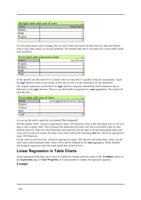
- Page 847: Two things are to be noted: The sec
- Page 851 and 852: 73 Calculated Formulas In the prope
- Page 853 and 854: 74 Field Groups One main difference
- Page 855 and 856: 75 Custom Error Messages The Custom
- Page 857 and 858: Part 7 Number Formats Part 7 Number
- Page 859 and 860: Data Without Type Information Part
- Page 861 and 862: 76.3 Dates and Times Part 7 Number
- Page 863 and 864: A3) With number format date 'MM/DD/
- Page 865 and 866: 77 Format Codes for Interpretation
- Page 867 and 868: num(199, '(rom)') returns cxcix num
- Page 869 and 870: Part 8 Macros and Automation Part 8
- Page 871 and 872: Field events: Part 8 Macros and Aut
- Page 873 and 874: 79 Internal Macro Interpreter QlikV
- Page 875 and 876: name = qvlib.InputBox("What is your
- Page 877 and 878: 79.4 Macro Debugger The Macro Debug
- Page 879 and 880: 80 Getting Hold of a QlikView Docum
- Page 881 and 882: 81 VBScript Function Calls from Scr
- Page 883 and 884: 82 Using Macros in QV Documents on
- Page 885 and 886: Part 9 Appendix Part 9 Appendix 885
- Page 887 and 888: Additional Requirements for QlikVie
- Page 889 and 890: B Keyboard Command Shortcuts In thi
- Page 891 and 892: B.8 Object Menu Command Shortcuts (
- Page 893 and 894: C Application Performance Optimizat
- Page 895 and 896: table_3: Load Alfa, If ( Flag = 1,
- Page 897 and 898: D Frequently Asked Questions D.1 In
- Page 899 and 900:
Q: Can I use Where clauses, Group B
- Page 901 and 902:
Q: Which sheet objects can be minim
- Page 903 and 904:
E Data Protection Issues Most of th
- Page 905 and 906:
F Backus-Naur Formalism The QlikVie
- Page 907 and 908:
Glossary A absolute path The locati
- Page 909 and 910:
column Term commonly used instead o
- Page 911 and 912:
F field Equivalent to column in dat
- Page 913 and 914:
list box A sheet object that displa
- Page 915 and 916:
QlikView OCX QlikView packaged as a
- Page 917 and 918:
Section Access A section of the Qli
- Page 919 and 920:
U URL Universal Resource Locator. A
- Page 921 and 922:
Index - - 284, 768 $ $ 273 $fields
- Page 923 and 924:
Chart Properties: Presentation (Sca
- Page 925 and 926:
Export 105 Export Action Settings d
- Page 927 and 928:
InWeek 344 InWeekToDate 345 InYear
- Page 929 and 930:
nPer 316 NPV 294, 784 null 330 Null
- Page 931 and 932:
Scatter Chart: Object Menu 661 Sche
- Page 933 and 934:
TTest_sterr 296, 787 TTest_t 295, 7