PDF 2,88Mb - Vilenica
PDF 2,88Mb - Vilenica
PDF 2,88Mb - Vilenica

Create successful ePaper yourself
Turn your PDF publications into a flip-book with our unique Google optimized e-Paper software.
<strong>Vilenica</strong> Overall Design<br />
Celostna podoba Vilenice<br />
126 127<br />
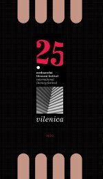
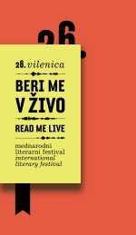
The Overall <strong>Vilenica</strong> Design Redefined<br />
The novelty of this year's <strong>Vilenica</strong> is its new overall design<br />
which has been developed under the menthorship<br />
of prof. Ranko Novak by the third year student of the<br />
Academy of Fine Arts and Design, Goran Ivašić. The new<br />
image contains a reconstructed sign, a feather, as a symbol<br />
of a writer's act, which opens up as a book or sheets<br />
of paper representing the medium of written words.<br />
The organised structure of the sign becomes a place for<br />
the play of shadow and light, and as such it is the exact<br />
opposite of the more dynamic logo. The entire image is<br />
marked by black and white photos of the Karst, which<br />
are blurred and compose an almost abstract foundation,<br />
yet still exert the information about the countryside.<br />
The photos bear the <strong>Vilenica</strong> sign, which, distinct as it is,<br />
functions as the focus of the square. The selected colours<br />
of the image are the nuances of the Karst hues. Apart<br />
from the combination of the sign and logo the consecutive<br />
number of the festival also stands out, asserting its<br />
long year tradition.<br />
Prenovljena celostna podoba Vilenice<br />
Novost letošnje Vilenice je tudi njena celostna podoba,<br />
ki jo je pod mentorstvom prof. Ranka Novaka razvil<br />
študent tretjega letnika Akademije za likovno umetnost<br />
in oblikovanje Goran Ivašić. Nova podoba vsebuje prenovljen<br />
znak, pero, kot simbol pisateljskega dejanja, ki<br />
se razpira v knjigo oz. liste papirja kot prenosnike pisane<br />
besede. Urejena struktura v znaku postane prostor za<br />
igro svetlobe in sence, njenemu redu nasproti pa stoji<br />
bolj razgiban logotip. Celostno podobo zaznamujejo<br />
črno-bele fotografije Krasa, ki so zamegljene in tvorijo<br />
skoraj abstraktno podlago, vendar še vedno posredujejo<br />
informacijo o pokrajini. Na njih je postavljen znak<br />
Vilenice, ki s svojo ostrino učinkuje kot kvadrat fokusa.<br />
Izbrane barve celostne podobe so nianse kraškega<br />
kolorita. Poleg kombinacije znaka in logotipa izstopa<br />
tudi zaporedna številka festivala, ki opozorja na njegovo<br />
dolgo tradicijo.