
Create successful ePaper yourself
Turn your PDF publications into a flip-book with our unique Google optimized e-Paper software.
114 appealing accent shade, PANTONE Living Coral provides a<br />
HTE<br />
striking contrast across the color spectrum.<br />
EVENTS<br />
In Beauty<br />
As a life-affirming hue that complements all skin tones,<br />
PANTONE Living Coral brings natural color to beauty in<br />
blush, eye and lip. Uninhibited, playful looks are also emboldened<br />
by Living Coral, which, as the center of a kaleidoscope<br />
of color, encourages experimentation in beauty with<br />
palettes, textures, shimmers and sheens.<br />
In Product Design<br />
Living Coral is naturally suited for product across all ages<br />
and genders. Materials with texture and convivial colors<br />
such as PANTONE 16-1546 Living Coral appeal to our desire<br />
for products exhibiting humanizing and heartening characteristics.<br />
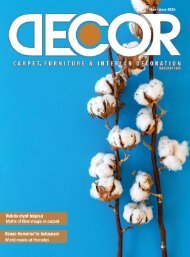
In Interior Décor and Furnishings<br />
When used as a bold statement in settings and décor, Living<br />
Coral fosters immersive experiences such as pop-up installations<br />
and interactive spaces, tied to a playful spirit. As a<br />
color linked to tactility and human connection, PANTONE<br />
Living Coral in shag rugs, cozy blankets and lush upholsteries<br />
create a warm, comforting and nurturing feeling in the<br />
home. With its ebullient nature, PANTONE Living Coral adds<br />
a dramatic pop of color to any room setting whether in decorative<br />
accessories, tabletop, or on the wall.<br />
In Packaging Design<br />
Living Coral is naturally ideal for packaging applications.<br />
Warm and welcoming, this life affirming shade invites us to<br />
reach out and touch.<br />
•PANTONE 18-3838 Ultra Violet (2018)<br />
•PANTONE 15-0343 Greenery (2017)<br />
•PANTONE 15-3919 Serenity and PANTONE 13-1520 Rose<br />
Quartz (2016)<br />
•PANTONE 18-1438 Marsala (2015)<br />
•PANTONE 18-3224 Radiant Orchid (2014)<br />
•PANTONE 17-5641 Emerald (2013)<br />
•PANTONE 17-1463 Tangerine Tango (2012)<br />
•PANTONE 18-2120 Honeysuckle (2011)<br />
•PANTONE 15-5519 Turquoise (2010)<br />
•PANTONE 14-0848 Mimosa (2009)<br />
•PANTONE 18-3943 Blue Iris (2008)<br />
•PANTONE 19-1557 Chili Pepper (2007)<br />
•PANTONE 13-1106 Sand Dollar (2006)<br />
•PANTONE 15-5217 Blue Turquoise (2005)<br />
•PANTONE 17-1456 Tigerlily (2004)<br />
•PANTONE 14-4811 Aqua Sky (2003)<br />
•PANTONE 19-1664 True Red (2002)<br />
•PANTONE 17-2031 Fuchsia Rose (2001)<br />
•PANTONE 15-4020 Cerulean (2000)<br />
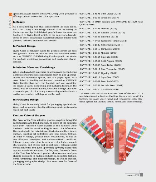
The color selected as our Pantone Color of the Year <strong>2019</strong><br />
was taken from the Pantone Fashion, <strong>Home</strong> + Interiors Color<br />
System, the most widely used and recognized color standards<br />
system for fashion, textile, home, and interior design.<br />
Pantone Color of the year<br />
The Color of the Year selection process requires thoughtful<br />
consideration and trend analysis. To arrive at the selection<br />
each year, Pantone’s color experts at the Pantone Color<br />
Institute comb the world looking for new color influences.<br />
This can include the entertainment industry and films in production,<br />
traveling art collections and new artists, fashion,<br />
all areas of design, popular travel destinations, as well as<br />
new lifestyles, playstyles, and socio-economic conditions.<br />
Influences may also stem from new technologies, materials,<br />
textures, and effects that impact color, relevant social<br />
media platforms and even up-coming sporting events that<br />
capture worldwide attention. For 20 years, Pantone’s Color<br />
of the Year has influenced product development and purchasing<br />
decisions in multiple industries, including fashion,<br />
home furnishings, and industrial design, as well as product,<br />
packaging and graphic design. Past selections for Color of<br />
the Year include:<br />
<strong>January</strong> <strong>2019</strong>