
You also want an ePaper? Increase the reach of your titles
YUMPU automatically turns print PDFs into web optimized ePapers that Google loves.
132 HTE<br />
TRENDS<br />
on request to go with this book.<br />
Besides that, there is a list of the<br />
compatible Pantone® cotton colours.<br />
Every theme is shown with it’s<br />
corresponding colour card, plus<br />
more than 150 inspiring materials<br />
that match the themes in<br />
colour and character. At the end<br />
of the book is a list of sources,<br />
designers and manufacturers<br />
that are featured in this Interiors<br />
book.<br />
The interest to explore innovation<br />
and sustainability will<br />
continue. The research for alternative<br />
resources has become<br />
so urgent, that it is high on the<br />
agenda. The design of products<br />
is more in the background.<br />
Colour has been more accepted.<br />
Textures have become even<br />
more important, aged and worn<br />
aspects provide warmth, and familiarity<br />
to the interior. We see<br />
traces of wear and use. Nature<br />
remains a strong source of inspiration.<br />
In general the interior<br />
has become more colourful.<br />
White is important, but we see<br />
also some cool pastel colours.<br />
They can be combined with the<br />
range of fresh pastel colours,<br />
and even with an accent of the<br />
bright colours. Dark moody colours<br />
are accepted, as paint colour<br />
but also for furniture, especially<br />
for velvets.<br />
The first theme, with light and<br />
cool neutrals and some refined<br />
pastel colours, is called “Urban<br />
Tranquillity”, to create a quiet<br />
environment to relax and unwind.<br />
The second theme, “Soft<br />
Focus”, is influenced by fresh<br />
pastel colours, for geometric<br />
or more organic design with a<br />
friendly and rounded character.<br />
The third theme, called “Beyond<br />
Borders” is based on the mix<br />
of influences from all over the<br />
world. Deep, warm colours prevail,<br />
but also materials are rich,<br />
such as velvet. In the fourth<br />
theme “Colour Matters” bright<br />
and primary colours are combined<br />
with black and white for<br />
ideas inspired by Pop- and Op-<br />
Art and the Memphis movement.<br />
In the theme “Vintage Green”<br />
green shades from nature are<br />
combined with the colours of<br />
oxidized steel and affected<br />
wood from the industrial age. In<br />
the theme “Eclectic Heritage” we<br />
see how opulent and even baroque<br />
elements are combined<br />
with historic ideas from the<br />
Dutch Golden Age, Art Deco and<br />
ideas from the Curiosity Cabinet<br />
for an eclectic retro mix, with a<br />
dark background in combination<br />
with more brilliant colours.<br />
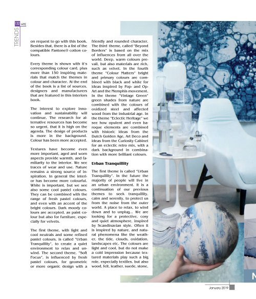
Urban Tranquillity<br />
The first theme is called “Urban<br />
Tranquillity”. In the future the<br />
majority of people will live in<br />
an urban environment. It is a<br />
continuation of our previous<br />
themes to seek tranquillity,<br />
calm and serenity, to protect us<br />
from the noise from the outer<br />
world. A place to relax, to wind<br />
down and to unplug... We are<br />
looking for a protective, cosy<br />
and quiet atmosphere, inspired<br />
by Scandinavian style. Often it<br />
is inspired by nature, and natural<br />
phenomena like the weather,<br />
the tide, clouds, oxidation,<br />
landscapes etc. The colours are<br />
light and cool, but do not make<br />
a cold impression because textured<br />
materials play such a big<br />
role, especially textiles, but also<br />
wood, felt, leather, suede, stone,<br />
<strong>January</strong> <strong>2019</strong>