- Page 3 and 4:
Changing Horizons inGeography Educa
- Page 5 and 6:
ContributorsAnouk AdangFaculty of G
- Page 7 and 8:
Margaret C. KeaneSt Mary’s Univer
- Page 9 and 10:
Artur ReligaDepartment of Geography
- Page 11 and 12:
Contents1. Exciting Geography......
- Page 13:
Barbara Katharina Mayerhofer, Teach
- Page 17 and 18:
How to design and implement excitin
- Page 19 and 20:
only increase their motivation to l
- Page 21 and 22:
Ministry of Education. Having in mi
- Page 23 and 24:
eEurope and the Bologna agendaIn hi
- Page 25 and 26:
The main learning approachesencoura
- Page 27 and 28:
as a vibrant exciting subject at un
- Page 29 and 30:
include ICT as part of the educatio
- Page 31 and 32:
19. RICHARDSON J. A. 2001. Collabor
- Page 33 and 34:
class using identical instructions
- Page 35 and 36:
ability to hold and move a load is
- Page 37 and 38:
the range of practical activities.
- Page 39 and 40:
Multimedia learning of geographical
- Page 41 and 42: • an organizer and manager of a l
- Page 43 and 44: Geographical fieldwork in forestsJa
- Page 45 and 46: One of these field study laboratori
- Page 47 and 48: learning“, to develop and then in
- Page 49 and 50: egin). It is referred to the inter-
- Page 51 and 52: overruled by the judge and some sus
- Page 53 and 54: esses or their reciprocal relations
- Page 55 and 56: formulated one of key principles in
- Page 57 and 58: Dress rehearsalHow should a present
- Page 59 and 60: of the world, but multiple maps of
- Page 61 and 62: focused on landscape, climate, popu
- Page 63 and 64: ments in academic geography, could
- Page 65 and 66: Training geography teachers in Pola
- Page 67 and 68: a series of intellectual as well as
- Page 69 and 70: • optional subject (30 hours) use
- Page 71 and 72: of the lower levels of education. H
- Page 73 and 74: • the one-subject model: the cont
- Page 75 and 76: delivery, and the methods of the pa
- Page 77 and 78: • Pathways signal important tasks
- Page 79 and 80: Geography competitions as stimuli f
- Page 81 and 82: Figure 1. Changes in the structure
- Page 83 and 84: Challenges for the futureNowadays t
- Page 85 and 86: A perspective from the United State
- Page 87 and 88: The process of GIS inquiry - Thinki
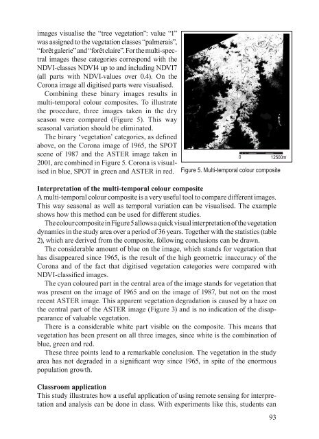
- Page 89 and 90: Remote Sensing in Geography Educati
- Page 91: IntroductionThe Democratic Republic
- Page 95: PART TWOProfessional Developmentand
- Page 98 and 99: Key elements of an introductory stu
- Page 100 and 101: Some textbooks also provide self-le
- Page 102 and 103: Geography programs and BolognaThere
- Page 104 and 105: equirements. In the faculties of Ar
- Page 106 and 107: Even though this only is a short an
- Page 108 and 109: Background of international student
- Page 110 and 111: students in their language skills.
- Page 112 and 113: International collaboration in dist
- Page 114 and 115: Designing and teaching the distance
- Page 116 and 117: audio lectures - one for presenting
- Page 118 and 119: enrolled in geography courses at po
- Page 120 and 121: development experience. Whilst Craf
- Page 122 and 123: Networking and social diffusion of
- Page 124 and 125: is mistreated, the culture is a-cul
- Page 126 and 127: 3. ABALAR. 2004. “Editorial”, i
- Page 128 and 129: to gather process and store spatial
- Page 130 and 131: 1. Fundamental to understanding GIS
- Page 132 and 133: The Future of Geography and Geograp
- Page 134 and 135: of geography. In Singapore Social S
- Page 136 and 137: geography should become much more s
- Page 138 and 139: the handful of disciplines that has
- Page 140 and 141: and respected and the institutional
- Page 142 and 143:
3. The strength of school and unive
- Page 144 and 145:
It is quite clear that Vidal de la
- Page 146 and 147:
Effective Practices in Distance Edu
- Page 148 and 149:
on to the other satellite school. O
- Page 150 and 151:
4. Ministry of Education. 1999. The
- Page 152 and 153:
schools is the result of the role e
- Page 154 and 155:
• A statistically significant dif
- Page 156 and 157:
Charles University geography gradua
- Page 158 and 159:
Table 1. First job in studied field
- Page 160 and 161:
importance in geography study progr
- Page 162 and 163:
The Anglo-Saxon model was collectiv
- Page 164 and 165:
academic science. I do believe that
- Page 166 and 167:
can convene. Details of these modul
- Page 168 and 169:
preparation and to some extent, tea
- Page 170 and 171:
The assessment must form the basis
- Page 172 and 173:
The teaching shall build on the pup
- Page 174 and 175:
The Relationship between Geography
- Page 176 and 177:
Geography and Territory Planning ha
- Page 178 and 179:
we wished, of course we have obtain
- Page 180 and 181:
Why Managers from Multinational Com
- Page 182 and 183:
able to have training in different
- Page 184 and 185:
ContextUtrecht University is a larg
- Page 186 and 187:
Typical is the very open atmosphere
- Page 188 and 189:
Times of Change for Geography Educa
- Page 190 and 191:
where it is divided into specific b
- Page 192 and 193:
• traditional versus progressive
- Page 194 and 195:
on European Dimension of Teaching g
- Page 196 and 197:
With the ongoing development of tel
- Page 198 and 199:
Figure 2. Present at Annual Congres
- Page 200 and 201:
It is expected that the more active
- Page 202 and 203:
An evaluation of geographyand geogr
- Page 204 and 205:
The problems of geography and geogr
- Page 206 and 207:
Europe in geographical education -
- Page 208 and 209:
Then these results were compared to
- Page 210 and 211:
Figure 9. Countries mentioned by th
- Page 212 and 213:
Internationalizing geography in hig
- Page 214 and 215:
nationalize their undergraduate and
- Page 216 and 217:
Groups also focus on international
- Page 218 and 219:
The Position of Geography Graduates
- Page 220 and 221:
have also affected the number ofGeo
- Page 222 and 223:
The majority answered that they wou
- Page 224 and 225:
In the Primary school curriculum, G
- Page 226 and 227:
the efficacy of the teaching and le
- Page 228 and 229:
228
- Page 230 and 231:
What Europe do we teach?A view from
- Page 232 and 233:
The regional approach is used in on
- Page 234 and 235:
The syllabi reflect mainly that the
- Page 236 and 237:
Geography Forum: Intercultural Lear
- Page 238 and 239:
Was Intercultural Competence promot
- Page 240 and 241:
of geographical education in our un
- Page 242 and 243:
Higher education (University) as a
- Page 244 and 245:
This table shows the importance of
- Page 246 and 247:
the studies on what exists, to cons
- Page 248 and 249:
248taught in the foreign language e
- Page 250 and 251:
as K. De Bot calls it, is a variety
- Page 252 and 253:
Do you speak European? or: Why even
- Page 254 and 255:
Years’ Religious War in the 17 th
- Page 256 and 257:
Why geographers should be able to s
- Page 258 and 259:
Intercultural education in Italian
- Page 260 and 261:
of geography in the process of inte
- Page 262 and 263:
9. BRUSA C., ed. 2002. Processi di
- Page 264 and 265:
Nowadays, according to the literatu
- Page 266 and 267:
In the gymnasium and in high school
- Page 268 and 269:
3. Dziennik Ustaw nr 61 z dnia 19 c
- Page 270 and 271:
Crick advocates these principles by
- Page 272 and 273:
dropping litter. There is circle ti
- Page 274 and 275:
and learning. Kerala is an exporter
- Page 276 and 277:
The role of geographical education
- Page 278 and 279:
ole: they form attitudes, views, pr
- Page 280 and 281:
Field lessons can engage the pupil
- Page 282 and 283:
to explore regional issues when tea
- Page 284 and 285:
Some backgroundFor a number of year
- Page 286 and 287:
issues that will shape the future g
- Page 288 and 289:
Geography and Environmental Science
- Page 290 and 291:
(2000) cautioned an awareness of cu
- Page 292 and 293:
Geography and Languages in Intercul
- Page 294 and 295:
Table 1. The most widely taught for
- Page 296 and 297:
the whole world will, according to
- Page 298 and 299:
References1. CALVET L. J. 2002. Le
- Page 300 and 301:
Sustainable development: let geogra
- Page 302 and 303:
predecessor “green,” or the pre
- Page 304 and 305:
8. GUNN A. S., “Professional Ethi
- Page 306 and 307:
Much research in Environmental Educ
- Page 308 and 309:
Sustainability, Development and Sec
- Page 310 and 311:
includes geography. The context is,
- Page 312 and 313:
• protected areas8. Landscape sec
- Page 314 and 315:
Developing geographical professiona
- Page 316 and 317:
tion contributes to the growth of e
- Page 318 and 319:
cooperative learning using as theor
- Page 320 and 321:
Studyng climate and water resources
- Page 322 and 323:
By signing and ratifying the Kyoto
- Page 324 and 325:
and political implications of plann
- Page 326 and 327:
8. UNITED NATIONS 1997. Kyoto Proto
- Page 328:
Conference Changing Horizons in Geo