- Page 2:
This page intentionally left blank
- Page 8:
Brief ContentsPrefacexiPART IGenera
- Page 12:
Contents vINDIRECT (UNOBTRUSIVE) OB
- Page 16:
Contents viiQUASI-EXPERIMENTS 321Th
- Page 20:
About the AuthorsJOHN J. SHAUGHNESS
- Page 24:
PrefaceWith this 9th edition we mar
- Page 28:
Preface xiiimuch information that n
- Page 32:
Preface xvFor StudentsMultiple choi
- Page 36:
PART ONEGeneral Issues
- Page 40:
CHAPTER 1: Introduction 3THE SCIENC
- Page 44:
CHAPTER 1: Introduction 5FIGURE 1.1
- Page 48:
CHAPTER 1: Introduction 7Key Concep
- Page 52:
CHAPTER 1: Introduction 9FIGURE 1.2
- Page 56:
CHAPTER 1: Introduction 11character
- Page 60:
CHAPTER 1: Introduction 13an exampl
- Page 64:
CHAPTER 1: Introduction 15THINKING
- Page 68:
CHAPTER 1: Introduction 17and stati
- Page 72:
CHAPTER 1: Introduction 19• A mul
- Page 76:
CHAPTER 1: Introduction 21STRETCHIN
- Page 80:
CHAPTER 1: Introduction 23Key Conce
- Page 84:
CHAPTER 1: Introduction 25CHALLENGE
- Page 88:
CHAPTER TWOThe Scientific MethodCHA
- Page 92:
CHAPTER 2: The Scientific Method 29
- Page 96:
CHAPTER 2: The Scientific Method 31
- Page 100:
CHAPTER 2: The Scientific Method 33
- Page 104:
CHAPTER 2: The Scientific Method 35
- Page 108:
CHAPTER 2: The Scientific Method 37
- Page 112:
CHAPTER 2: The Scientific Method 39
- Page 116:
CHAPTER 2: The Scientific Method 41
- Page 120:
CHAPTER 2: The Scientific Method 43
- Page 124:
CHAPTER 2: The Scientific Method 45
- Page 128:
CHAPTER 2: The Scientific Method 47
- Page 132:
CHAPTER 2: The Scientific Method 49
- Page 136:
CHAPTER 2: The Scientific Method 51
- Page 140:
CHAPTER 2: The Scientific Method 53
- Page 144:
CHAPTER 2: The Scientific Method 55
- Page 148:
CHAPTER THREEEthical Issues in the
- Page 152:
CHAPTER 3: Ethical Issues in the Co
- Page 156:
CHAPTER 3: Ethical Issues in the Co
- Page 160:
CHAPTER 3: Ethical Issues in the Co
- Page 164:
CHAPTER 3: Ethical Issues in the Co
- Page 168:
CHAPTER 3: Ethical Issues in the Co
- Page 172:
CHAPTER 3: Ethical Issues in the Co
- Page 176:
CHAPTER 3: Ethical Issues in the Co
- Page 180:
CHAPTER 3: Ethical Issues in the Co
- Page 184:
CHAPTER 3: Ethical Issues in the Co
- Page 188:
CHAPTER 3: Ethical Issues in the Co
- Page 192:
CHAPTER 3: Ethical Issues in the Co
- Page 196:
CHAPTER 3: Ethical Issues in the Co
- Page 200:
CHAPTER 3: Ethical Issues in the Co
- Page 204:
CHAPTER 3: Ethical Issues in the Co
- Page 208:
CHAPTER 3: Ethical Issues in the Co
- Page 212:
CHAPTER 3: Ethical Issues in the Co
- Page 216:
PART TWODescriptive Methods
- Page 220:
CHAPTER 4: Observation 93OVERVIEWWe
- Page 224:
CHAPTER 4: Observation 95four 30-mi
- Page 228:
CHAPTER 4: Observation 97FIGURE 4.1
- Page 232:
CHAPTER 4: Observation 99including
- Page 236:
CHAPTER 4: Observation 101Participa
- Page 240:
CHAPTER 4: Observation 103too well.
- Page 244:
CHAPTER 4: Observation 105FIGURE 4.
- Page 248:
CHAPTER 4: Observation 107TABLE 4.1
- Page 252:
CHAPTER 4: Observation 109FIGURE 4.
- Page 256:
CHAPTER 4: Observation 111BOX 4.3TH
- Page 260:
CHAPTER 4: Observation 113RECORDING
- Page 264:
CHAPTER 4: Observation 115• Ratin
- Page 268:
CHAPTER 4: Observation 117A checkli
- Page 272:
CHAPTER 4: Observation 119monitor o
- Page 276:
CHAPTER 4: Observation 121measureme
- Page 280:
CHAPTER 4: Observation 123coded tri
- Page 284:
CHAPTER 4: Observation 125The way i
- Page 288:
CHAPTER 4: Observation 127Key Conce
- Page 292:
CHAPTER 4: Observation 129into the
- Page 296:
CHAPTER 4: Observation 131Observer
- Page 300:
CHAPTER 4: Observation 133indirect
- Page 304:
CHAPTER 4: Observation 135CHALLENGE
- Page 308:
CHAPTER FIVESurvey ResearchCHAPTER
- Page 312:
CHAPTER 5: Survey Research 139decep
- Page 316:
CHAPTER 5: Survey Research 141Key C
- Page 320:
CHAPTER 5: Survey Research 143Key C
- Page 324:
CHAPTER 5: Survey Research 145sampl
- Page 328:
CHAPTER 5: Survey Research 147Fresh
- Page 332:
CHAPTER 5: Survey Research 149Key C
- Page 336:
CHAPTER 5: Survey Research 151Telep
- Page 340:
CHAPTER 5: Survey Research 153“in
- Page 344:
CHAPTER 5: Survey Research 155Key C
- Page 348:
CHAPTER 5: Survey Research 157well-
- Page 352:
CHAPTER 5: Survey Research 159FIGUR
- Page 356:
CHAPTER 5: Survey Research 161can l
- Page 360:
CHAPTER 5: Survey Research 163FIGUR
- Page 364:
CHAPTER 5: Survey Research 165the t
- Page 368:
CHAPTER 5: Survey Research 167BOX 5
- Page 372:
CHAPTER 5: Survey Research 169simil
- Page 376:
CHAPTER 5: Survey Research 171do yo
- Page 380:
CHAPTER 5: Survey Research 173perio
- Page 384:
CHAPTER 5: Survey Research 175FIGUR
- Page 388:
CHAPTER 5: Survey Research 177chaot
- Page 392:
CHAPTER 5: Survey Research 179ident
- Page 396:
CHAPTER 5: Survey Research 181met t
- Page 400:
PART THREEExperimental Methods
- Page 404:
CHAPTER 6: Independent Groups Desig
- Page 408:
CHAPTER 6: Independent Groups Desig
- Page 412:
CHAPTER 6: Independent Groups Desig
- Page 416:
CHAPTER 6: Independent Groups Desig
- Page 420:
CHAPTER 6: Independent Groups Desig
- Page 424:
CHAPTER 6: Independent Groups Desig
- Page 428:
CHAPTER 6: Independent Groups Desig
- Page 432:
CHAPTER 6: Independent Groups Desig
- Page 436:
CHAPTER 6: Independent Groups Desig
- Page 440:
CHAPTER 6: Independent Groups Desig
- Page 444:
CHAPTER 6: Independent Groups Desig
- Page 448:
CHAPTER 6: Independent Groups Desig
- Page 452:
CHAPTER 6: Independent Groups Desig
- Page 456:
CHAPTER 6: Independent Groups Desig
- Page 460:
CHAPTER 6: Independent Groups Desig
- Page 464:
CHAPTER 6: Independent Groups Desig
- Page 468:
CHAPTER 6: Independent Groups Desig
- Page 472:
CHAPTER 6: Independent Groups Desig
- Page 476:
CHAPTER 6: Independent Groups Desig
- Page 480:
CHAPTER 6: Independent Groups Desig
- Page 484:
CHAPTER SEVENRepeated Measures Desi
- Page 488:
CHAPTER 7: Repeated Measures Design
- Page 492:
CHAPTER 7: Repeated Measures Design
- Page 496:
CHAPTER 7: Repeated Measures Design
- Page 500:
CHAPTER 7: Repeated Measures Design
- Page 504:
CHAPTER 7: Repeated Measures Design
- Page 508:
CHAPTER 7: Repeated Measures Design
- Page 512:
CHAPTER 7: Repeated Measures Design
- Page 516:
CHAPTER 7: Repeated Measures Design
- Page 520:
CHAPTER 7: Repeated Measures Design
- Page 524:
CHAPTER 7: Repeated Measures Design
- Page 528:
CHAPTER 7: Repeated Measures Design
- Page 532:
CHAPTER EIGHTComplex DesignsCHAPTER
- Page 536:
CHAPTER 8: Complex Designs 251The s
- Page 540:
CHAPTER 8: Complex Designs 253Keep
- Page 544:
CHAPTER 8: Complex Designs 255TABLE
- Page 548:
CHAPTER 8: Complex Designs 257STRET
- Page 552:
CHAPTER 8: Complex Designs 259FIGUR
- Page 556:
CHAPTER 8: Complex Designs 261FIGUR
- Page 560:
CHAPTER 8: Complex Designs 263TABLE
- Page 564:
CHAPTER 8: Complex Designs 265TABLE
- Page 568:
CHAPTER 8: Complex Designs 267FIGUR
- Page 572:
CHAPTER 8: Complex Designs 269of pr
- Page 576:
CHAPTER 8: Complex Designs 271Key C
- Page 580:
CHAPTER 8: Complex Designs 273The n
- Page 584:
CHAPTER 8: Complex Designs 275Step
- Page 588:
CHAPTER 8: Complex Designs 277CHALL
- Page 592:
PART FOURApplied Research
- Page 596:
CHAPTER 9: Single-Case Designs and
- Page 600:
CHAPTER 9: Single-Case Designs and
- Page 604:
CHAPTER 9: Single-Case Designs and
- Page 608:
CHAPTER 9: Single-Case Designs and
- Page 612:
CHAPTER 9: Single-Case Designs and
- Page 616:
CHAPTER 9: Single-Case Designs and
- Page 620:
CHAPTER 9: Single-Case Designs and
- Page 624:
CHAPTER 9: Single-Case Designs and
- Page 628:
CHAPTER 9: Single-Case Designs and
- Page 632:
CHAPTER 9: Single-Case Designs and
- Page 636:
CHAPTER 9: Single-Case Designs and
- Page 640:
CHAPTER 9: Single-Case Designs and
- Page 644:
CHAPTER 9: Single-Case Designs and
- Page 648:
CHAPTER 9: Single-Case Designs and
- Page 652:
CHAPTER TENQuasi-Experimental Desig
- Page 656:
CHAPTER 10: Quasi-Experimental Desi
- Page 660:
CHAPTER 10: Quasi-Experimental Desi
- Page 664:
CHAPTER 10: Quasi-Experimental Desi
- Page 668:
CHAPTER 10: Quasi-Experimental Desi
- Page 672:
CHAPTER 10: Quasi-Experimental Desi
- Page 676:
CHAPTER 10: Quasi-Experimental Desi
- Page 680:
CHAPTER 10: Quasi-Experimental Desi
- Page 684:
CHAPTER 10: Quasi-Experimental Desi
- Page 688:
CHAPTER 10: Quasi-Experimental Desi
- Page 692:
CHAPTER 10: Quasi-Experimental Desi
- Page 696:
CHAPTER 10: Quasi-Experimental Desi
- Page 700:
CHAPTER 10: Quasi-Experimental Desi
- Page 704:
CHAPTER 10: Quasi-Experimental Desi
- Page 708:
CHAPTER 10: Quasi-Experimental Desi
- Page 712:
CHAPTER 10: Quasi-Experimental Desi
- Page 716:
CHAPTER 10: Quasi-Experimental Desi
- Page 720:
CHAPTER 10: Quasi-Experimental Desi
- Page 724:
PART FIVEAnalyzing and ReportingRes
- Page 728:
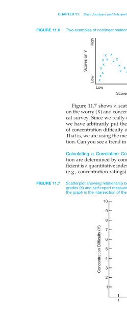
CHAPTER 11: Data Analysis and Inter
- Page 732: CHAPTER 11: Data Analysis and Inter
- Page 736: CHAPTER 11: Data Analysis and Inter
- Page 740: CHAPTER 11: Data Analysis and Inter
- Page 744: CHAPTER 11: Data Analysis and Inter
- Page 748: CHAPTER 11: Data Analysis and Inter
- Page 752: CHAPTER 11: Data Analysis and Inter
- Page 756: CHAPTER 11: Data Analysis and Inter
- Page 760: CHAPTER 11: Data Analysis and Inter
- Page 764: CHAPTER 11: Data Analysis and Inter
- Page 768: CHAPTER 11: Data Analysis and Inter
- Page 772: CHAPTER 11: Data Analysis and Inter
- Page 776: CHAPTER 11: Data Analysis and Inter
- Page 780: CHAPTER 11: Data Analysis and Inter
- Page 786: 376 PART V: Analyzing and Reporting
- Page 790: 378 PART V: Analyzing and Reporting
- Page 794: 380 PART V: Analyzing and Reporting
- Page 798: or382 PART V: Analyzing and Reporti
- Page 802: 384 PART V: Analyzing and Reporting
- Page 806: 386 PART V: Analyzing and Reporting
- Page 810: 388 PART V: Analyzing and Reporting
- Page 814: 390 PART V: Analyzing and Reporting
- Page 818: 392 PART V: Analyzing and Reporting
- Page 822: 394 PART V: Analyzing and Reporting
- Page 826: 396 PART V: Analyzing and Reporting
- Page 830: 398 PART V: Analyzing and Reporting
- Page 834:
400 PART V: Analyzing and Reporting
- Page 838:
402 PART V: Analyzing and Reporting
- Page 842:
404 PART V: Analyzing and Reporting
- Page 846:
406 PART V: Analyzing and Reporting
- Page 850:
408 PART V: Analyzing and Reporting
- Page 854:
410 PART V: Analyzing and Reporting
- Page 858:
412 PART V: Analyzing and Reporting
- Page 862:
414 PART V: Analyzing and Reporting
- Page 866:
416 PART V: Analyzing and Reporting
- Page 870:
418 PART V: Analyzing and Reporting
- Page 874:
420 PART V: Analyzing and Reporting
- Page 878:
422 PART V: Analyzing and Reporting
- Page 882:
424 PART V: Analyzing and Reporting
- Page 886:
426 PART V: Analyzing and Reporting
- Page 890:
428 PART V: Analyzing and Reporting
- Page 894:
430 PART V: Analyzing and Reporting
- Page 898:
432 PART V: Analyzing and Reporting
- Page 902:
434 PART V: Analyzing and Reporting
- Page 906:
436 PART V: Analyzing and Reporting
- Page 910:
438 PART V: Analyzing and Reporting
- Page 914:
440 PART V: Analyzing and Reporting
- Page 918:
AppendixStatistical TablesAPPENDIX
- Page 922:
444 APPENDIX: Statistical TablesTAB
- Page 926:
446 APPENDIX: Statistical TablesTAB
- Page 930:
448 Glossarycomparison of two means
- Page 934:
450 Glossaryinformed consent Explic
- Page 938:
452 Glossaryparticipant observation
- Page 942:
454 Glossarysimple main effect Effe
- Page 946:
ReferencesAbelson, R. P. (1995). St
- Page 950:
458 ReferencesBoring, E. G. (1954).
- Page 954:
460 ReferencesEvans, R., & Donnerst
- Page 958:
462 ReferencesHolden, C. (1987). An
- Page 962:
464 ReferencesKruglanski, A. W., Cr
- Page 966:
466 ReferencesMiles, M. B., & Huber
- Page 970:
468 ReferencesRichardson, J. & Parn
- Page 974:
470 ReferencesSokal, M. M. (1992).
- Page 978:
CreditsChapter 1Figure 1.1a: © Ima
- Page 982:
474 Credits9.1b: © Bettmann/Corbis
- Page 986:
476 Name IndexDolan, C. A., 119Donn
- Page 990:
478 Name IndexRosenthal, R., 45-46,
- Page 994:
480 Subject IndexBlock randomizatio
- Page 998:
482 Subject IndexExperiment (Contin
- Page 1002:
484 Subject IndexNonprobability sam
- Page 1006:
486 Subject IndexResearch report wr
- Page 1010:
488 Subject IndexVariables (types)d


